Unconventional promos -- boxes full of toys, food, elaborate scavenger hunts, etc -- are getting a lot of attention these days. Despite the fact that a lot of art buyers and editors say they prefer simple promos, photographers are still churning out these pricey and attention-grabbing promos. Lately, it seems blogging about the promo sometimes gets more attention that the promo itself (Clint Davis and Casey Templeton come to mind). I like that people are documenting the process and sharing the promos in so many ways. Seeing a video of someone's promo go viral makes all the work, and often expense, more worth it.
When planning to do a promo like these, you need to really think about who your target market is and if it's worth the time and expense to reach them. You may be more effective doing something less expensive. Obviously the scale of these promos means they are not being sent to huge lists, so working on a really tight list of existing clients you love and dream clients you want to love you is key to making the most of your marketing dollar.
Below are Maggie's critiques of a few "out of the box" promos she has received recently.
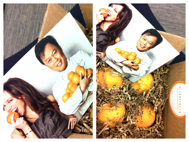
Michel Leroy http://www.michelleroyphoto.com/ New York, NY What: 4 oranges and a promo card. Oranges are a great gift and they were a good tie-in back to photo on the promo card. The package colors, imagery, theme and design were all in-sync with each other. The promo card is a commercial/editorial portrait that is professional and a little weird (who bites into an orange?). It is different enough to grab my attention but not so weird as to confuse me.
Eric Schwabel http://schwabelstudio.com/ Los Angeles, CA What: Create-A-Face game. Peal and stick (re-stickable) photo decals to place on the face of a dude and build different (slightly frightening) characters. This was designed to impress creative directors and art buyers and I bet it will! I can imagine it was quite pricey to produce. But Eric thinks big and different. And, I think this is an unforgettable promo for tough to impress art buyers and ad agency creatives. For editorial, I think this might work with major newsstand publications but is slightly wasted on a business magazine photo editor like me.
Tony Gale http://www.tonygale.com New York, NY What: Remote control monster truck, ransom note, and promo card. The ransom note said that; in order to get the controller for the car, I need to make an appointment to see Tony’s new book. I have heard he is getting a great response. He has an all new website and this is his best promo card so far. My main complaint with this promo is that the red monster truck toy has nothing to do with his work, his subjects or the enclosed promo card and ransom note.
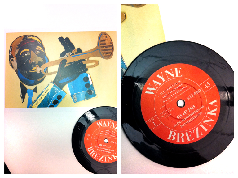
Wayne Brezinka (illustrator) http://www.brezinkadesign.com/ Nashville, TN What: 45 rpm coaster and a promo card. So cool I had to pick include an illustrator. When you go to his site the postcard image is top of page. Everything ties in beautifully. I really liked this promo, Wayne’s work, and his website. It’s a total coincidence that one of our art directors commissioned him the same week the promos arrived on their desks. (editor's note: also check out Matt Barnes' vinyl record themed promo)
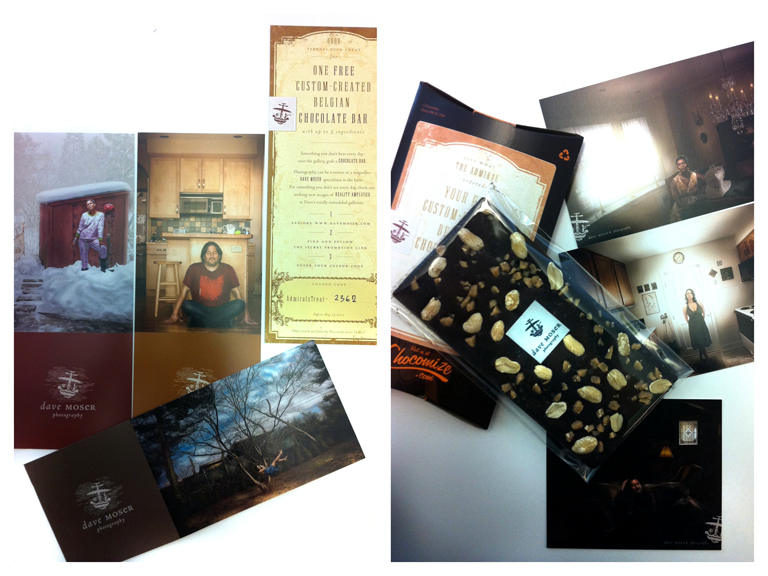
Dave Moser http://davemoser.com/ Philadelphia, PA What: Custom Chocomize chocolate bar and two sets of promos. The first part of this promo was series of long elaborately branded cards. I almost didn’t notice that one of the long cards was a coupon for a free custom designed chocolate bar. Score! I designed a dark chocolate bar with toffee, peanuts, and sea salt. It is incredibly good. This sweet promo cost him a decent amount at $10. I don’t know if it will pay off for him with me because his style and subjects don’t mesh with the styles I hire for at my magazines. What does totally work for Dave is that I spent quality time on his site and I won’t forget his name (certainly not while there is still some chocolate left in my drawer).
Jen Judge http://www.jenjudge.com/ Santa Fe, NM What: Newspaper This mini newspaper has images and stories from her work in post-earthquake Haiti. All of the images are black & white, incredibly simple, and totally effective on the paper stock. I emailed her immediately, or maybe I called. (I do that sometimes). She told me that she just got the idea to print the newspaper and send it out. She hadn’t ever really promoted her work before but this was important to her. I love the idea. It works too because all the portraits are from the same project.
***
Are you one of the photographers' mentioned in this post (or have you done a similarly unconventional self promo piece)? It'd be great to hear from you about the response you've been getting, how much you spent on the promo and how you decided who to send them to.


