John Michael Fulton

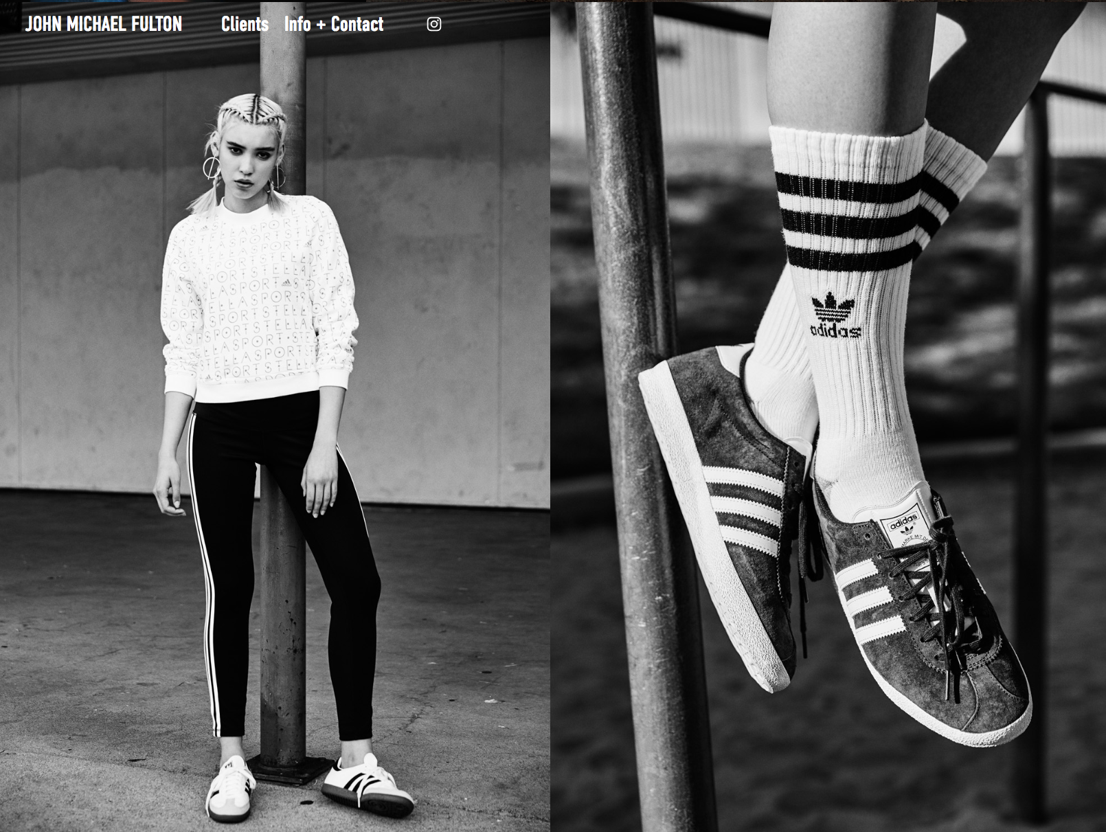
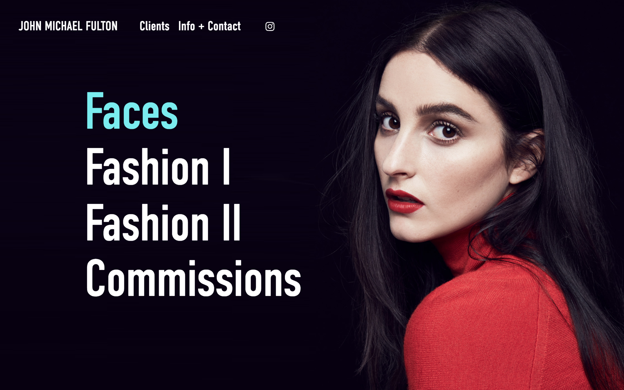
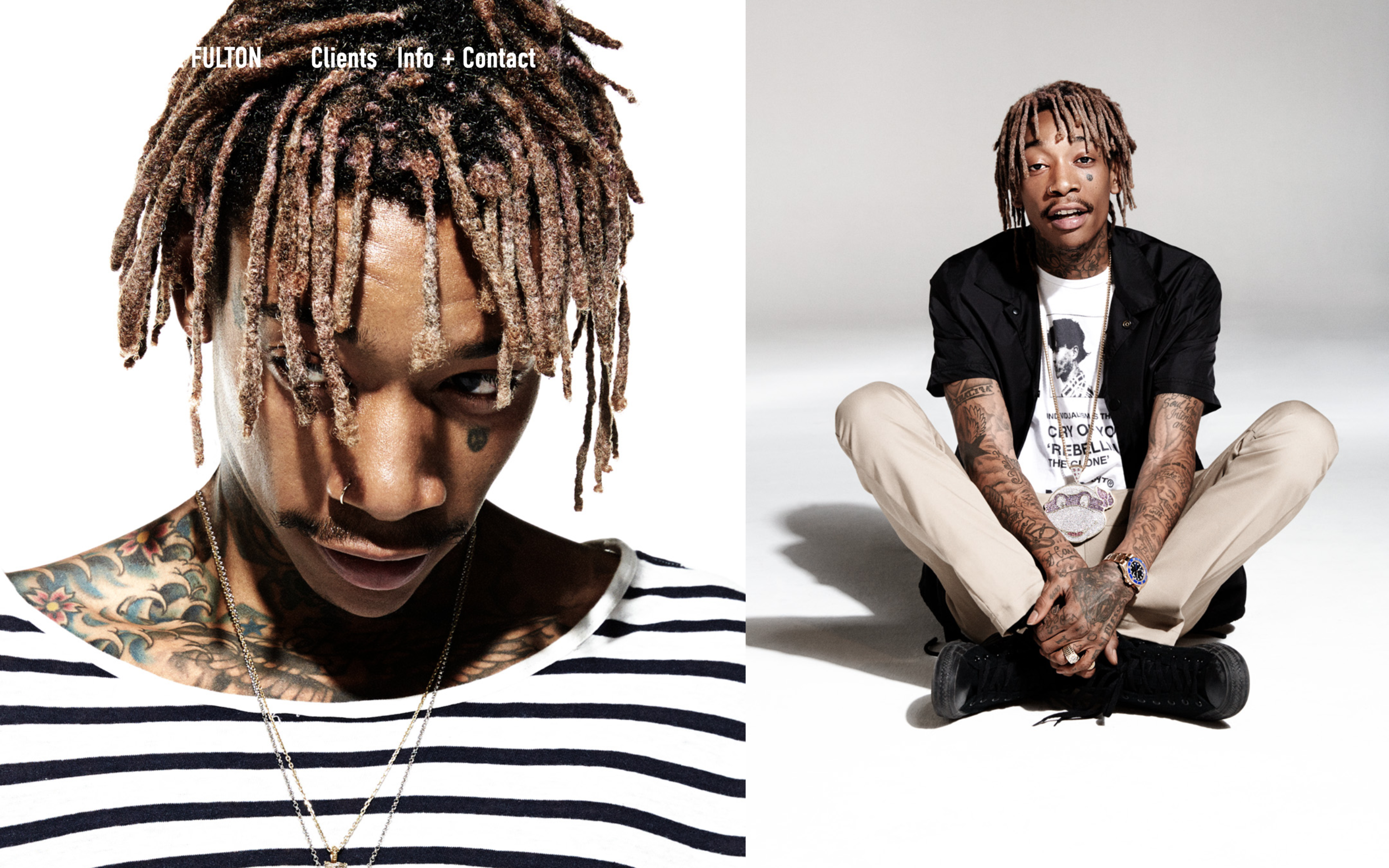
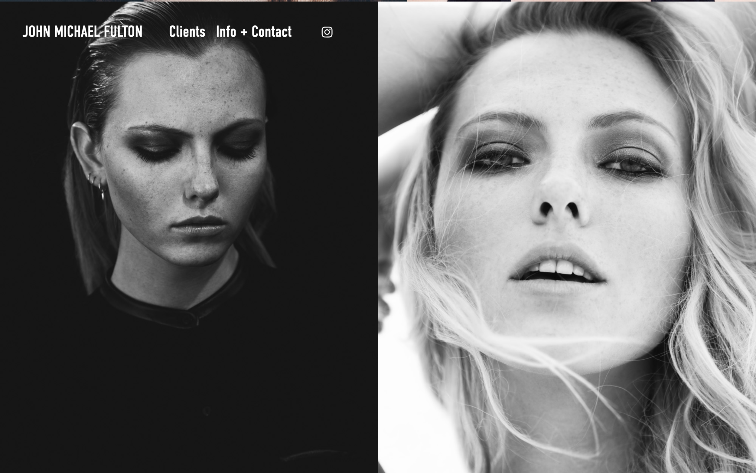
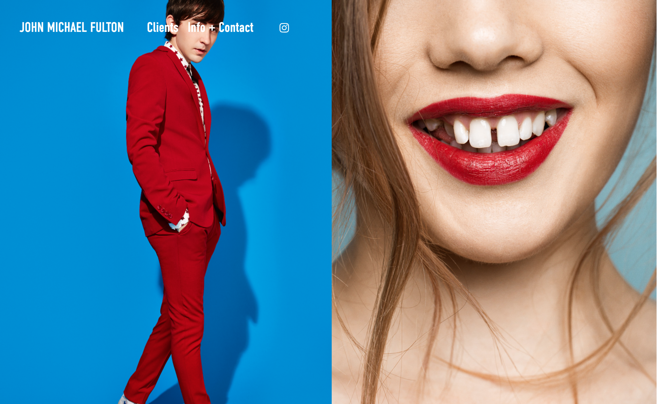
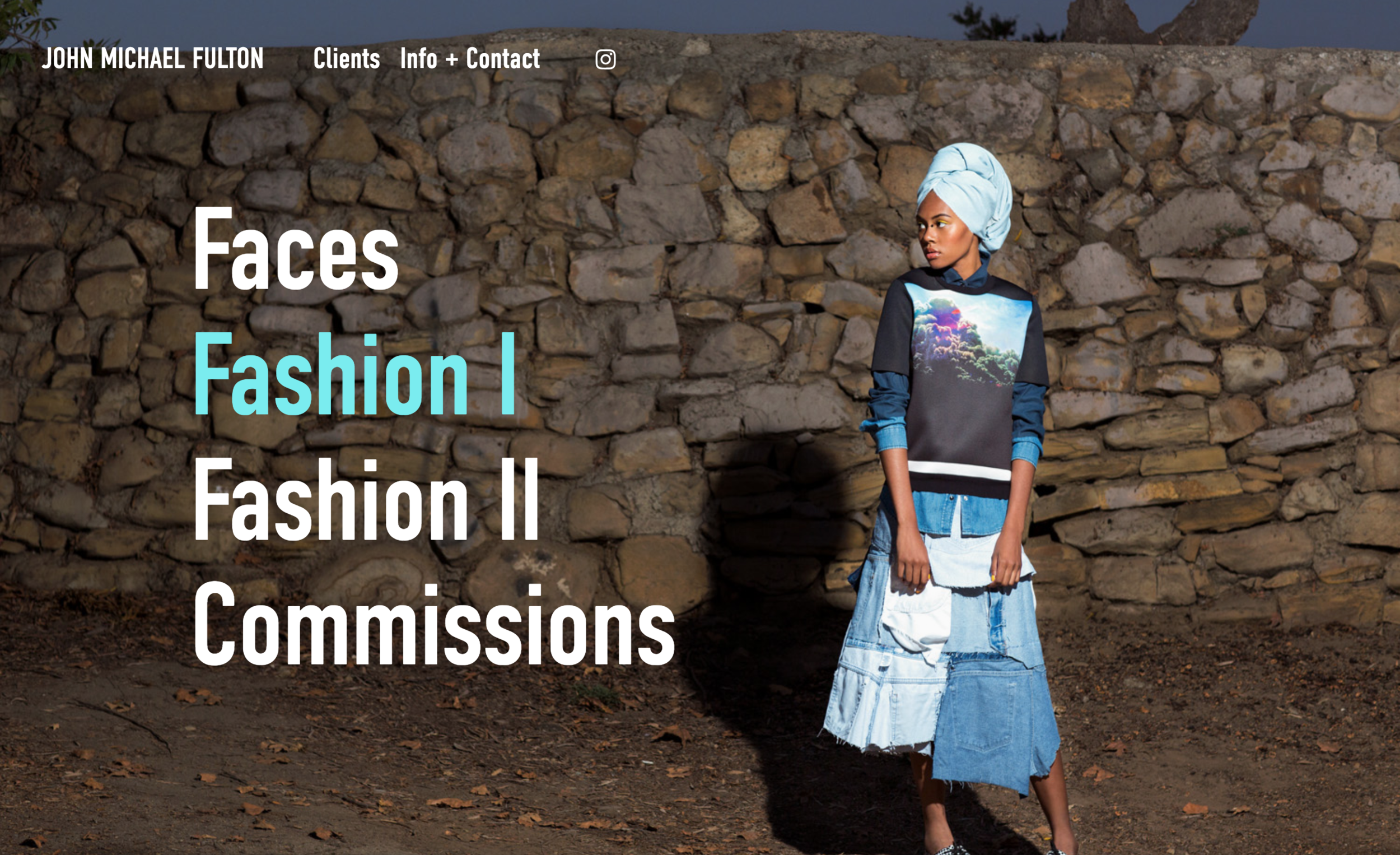
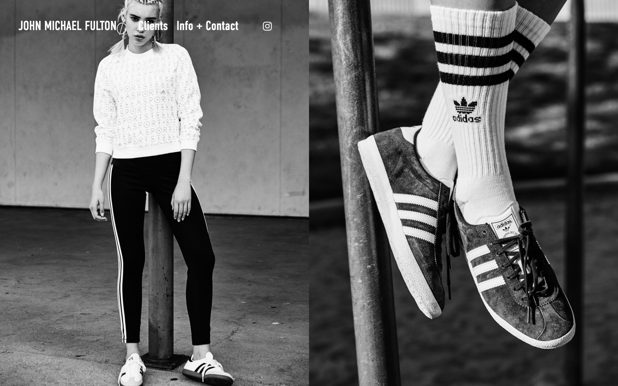
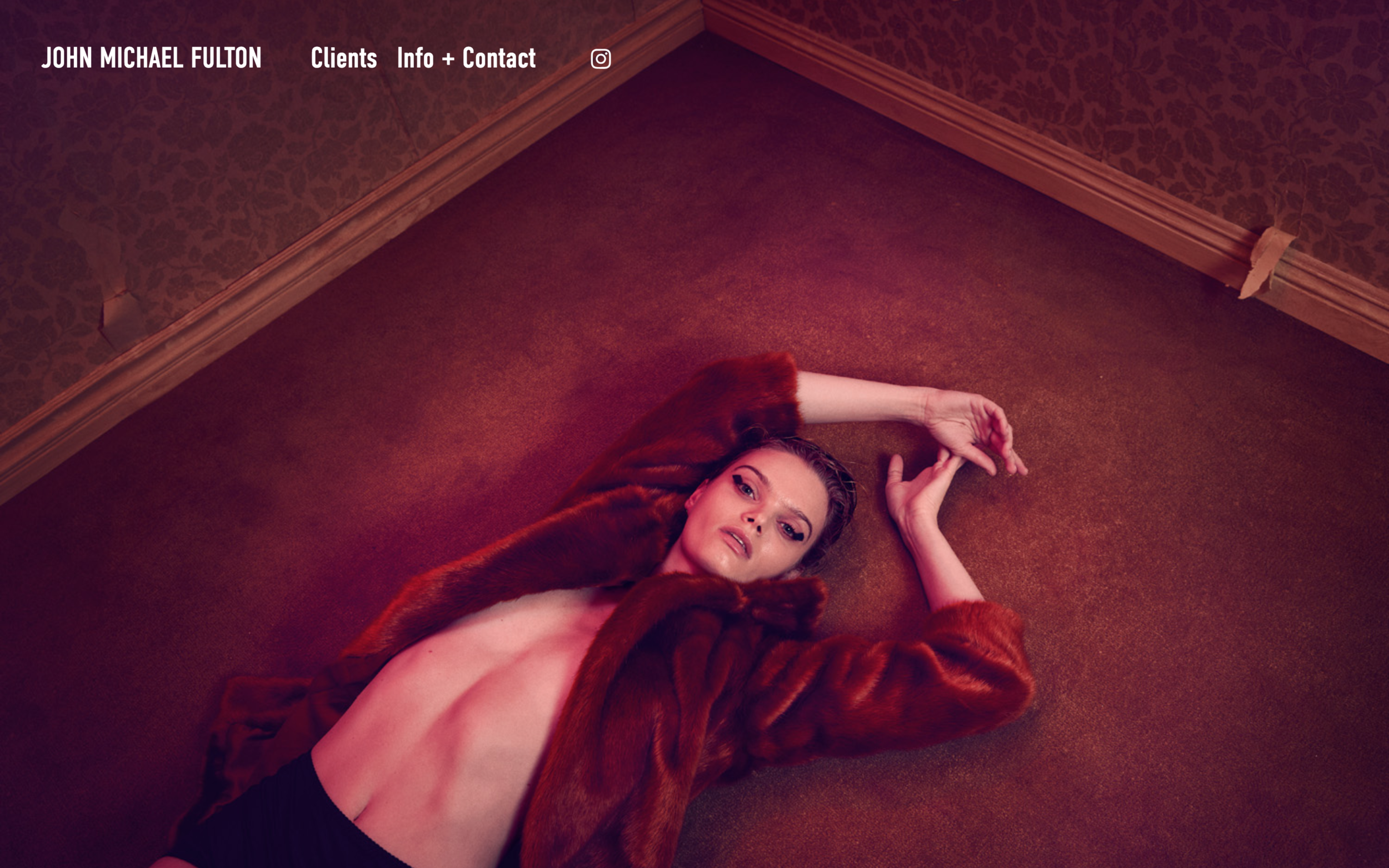
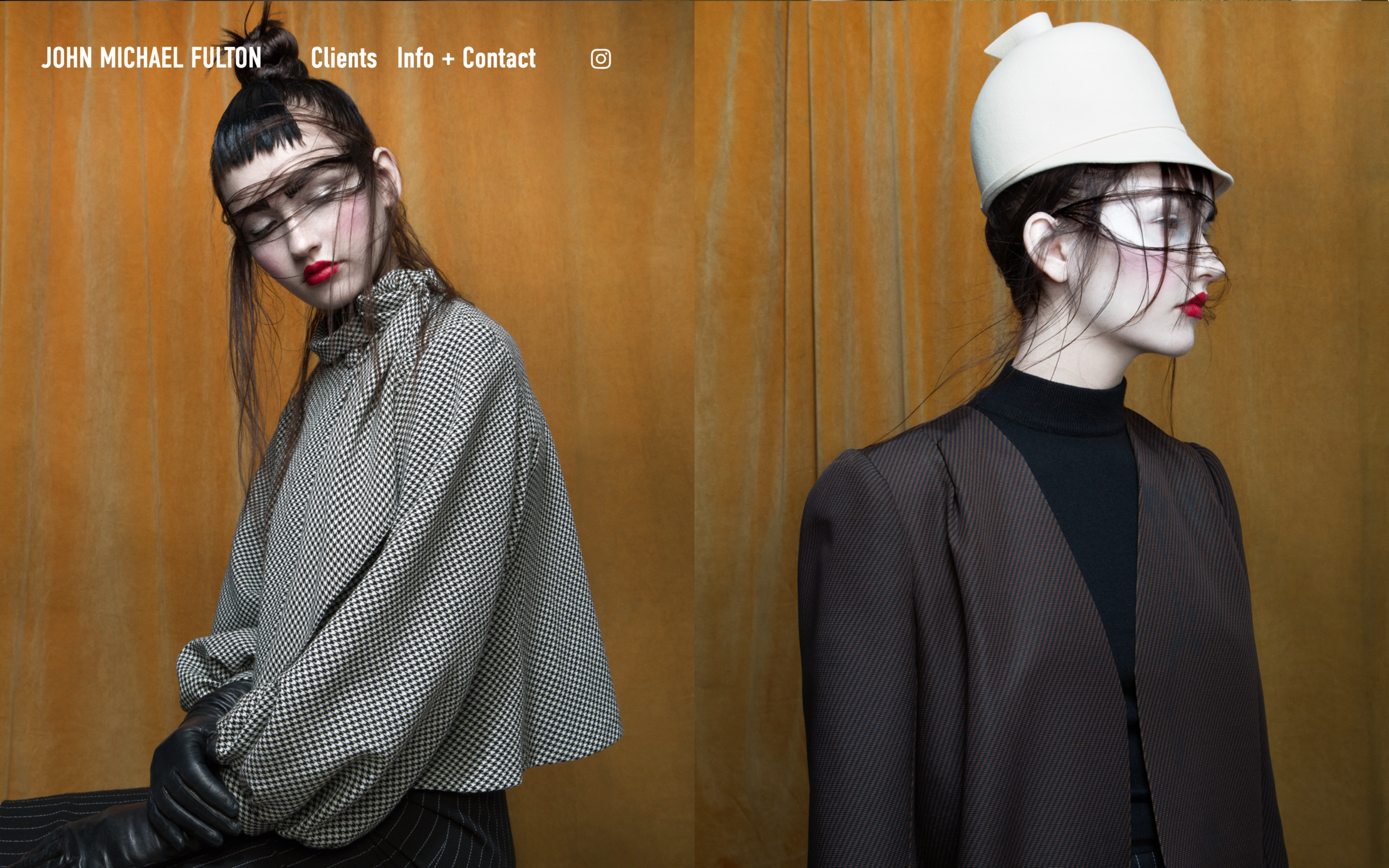
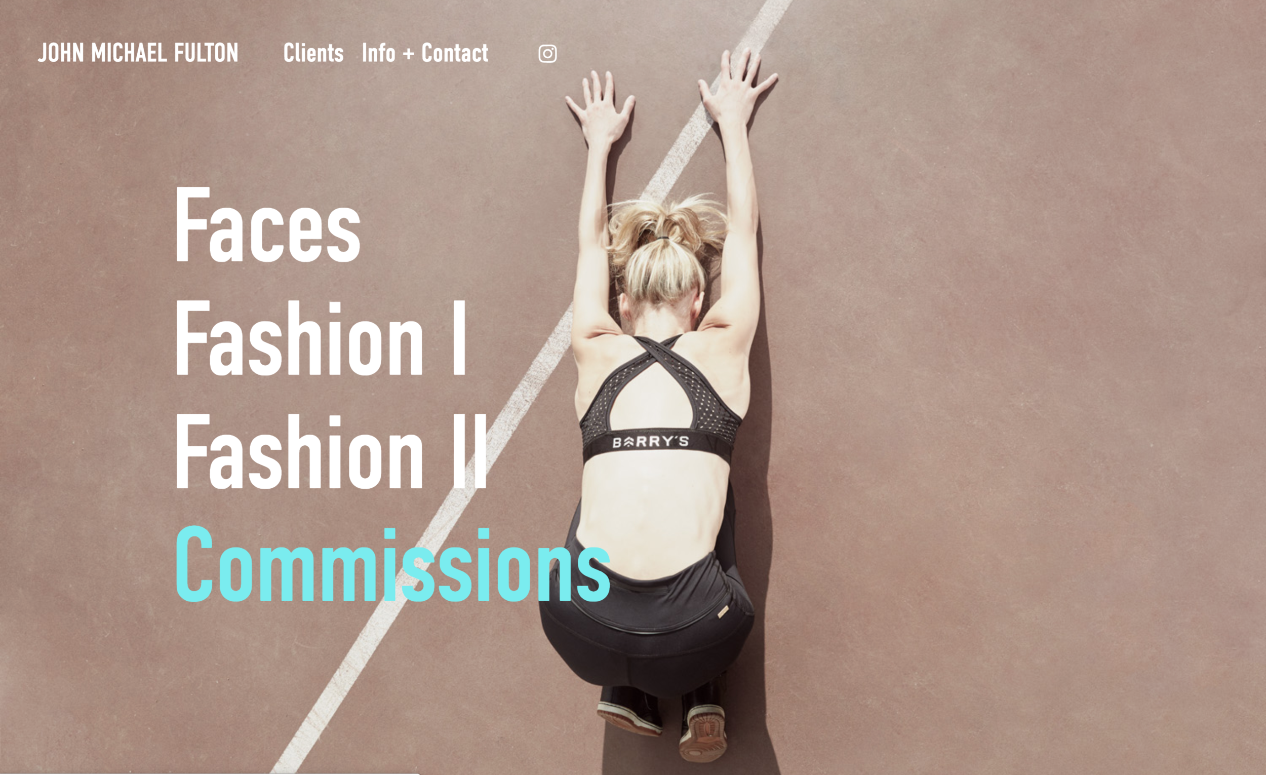
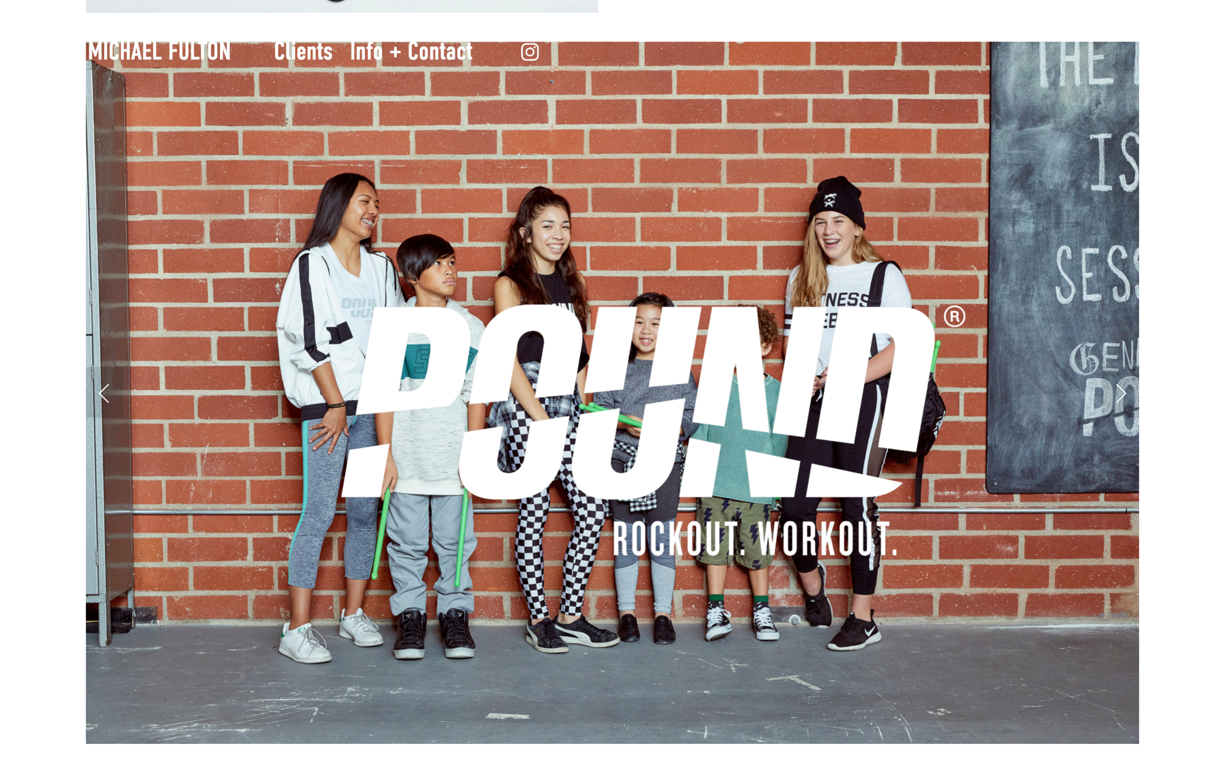
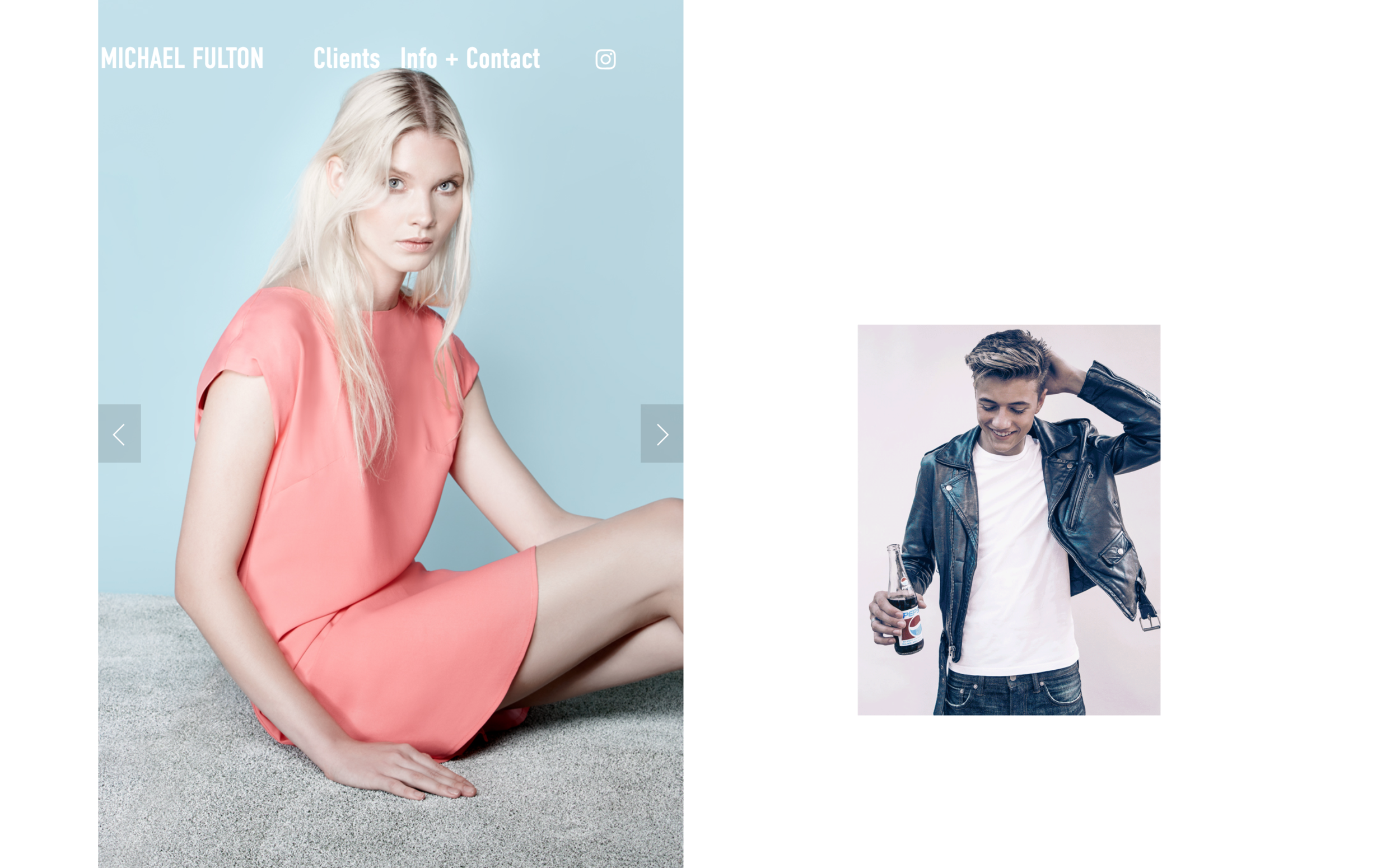
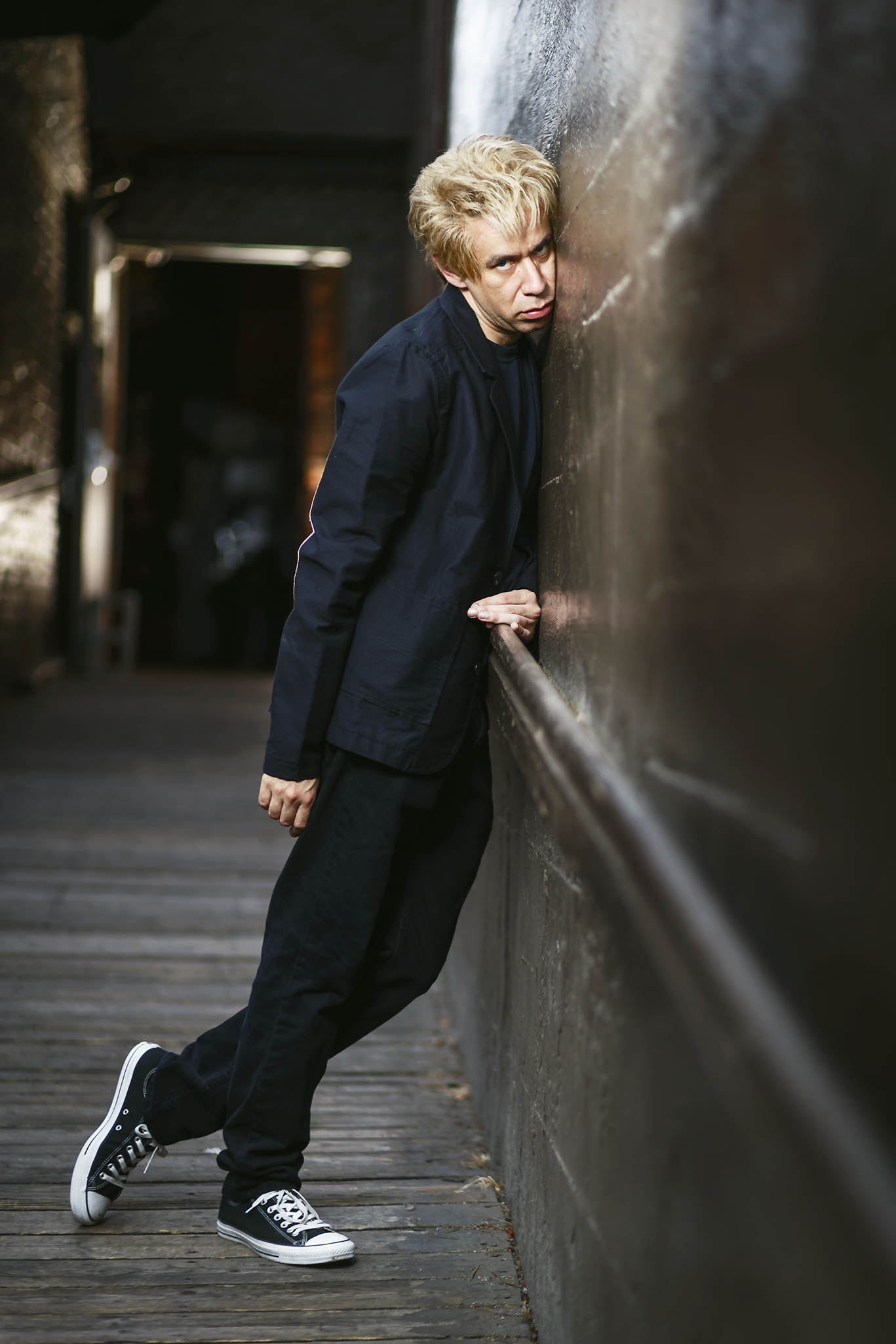
Last year I had the opportunity to work with John Michael Fulton. Together we created a brand new website that highlights his fashion, lifestyle and portrait photography.

JM works with editorial and commercial clients like 7 For All Mankind, Nylon Magazine, Mod Cloth, Rachel Zoe and many more.

I’m looking forward to following his work and seeing future projects. See more of his work at www.johnmichaelfulton.com.

Susie Mann

Screen Shot 2019-01-27 at 10.55.22 PM.png

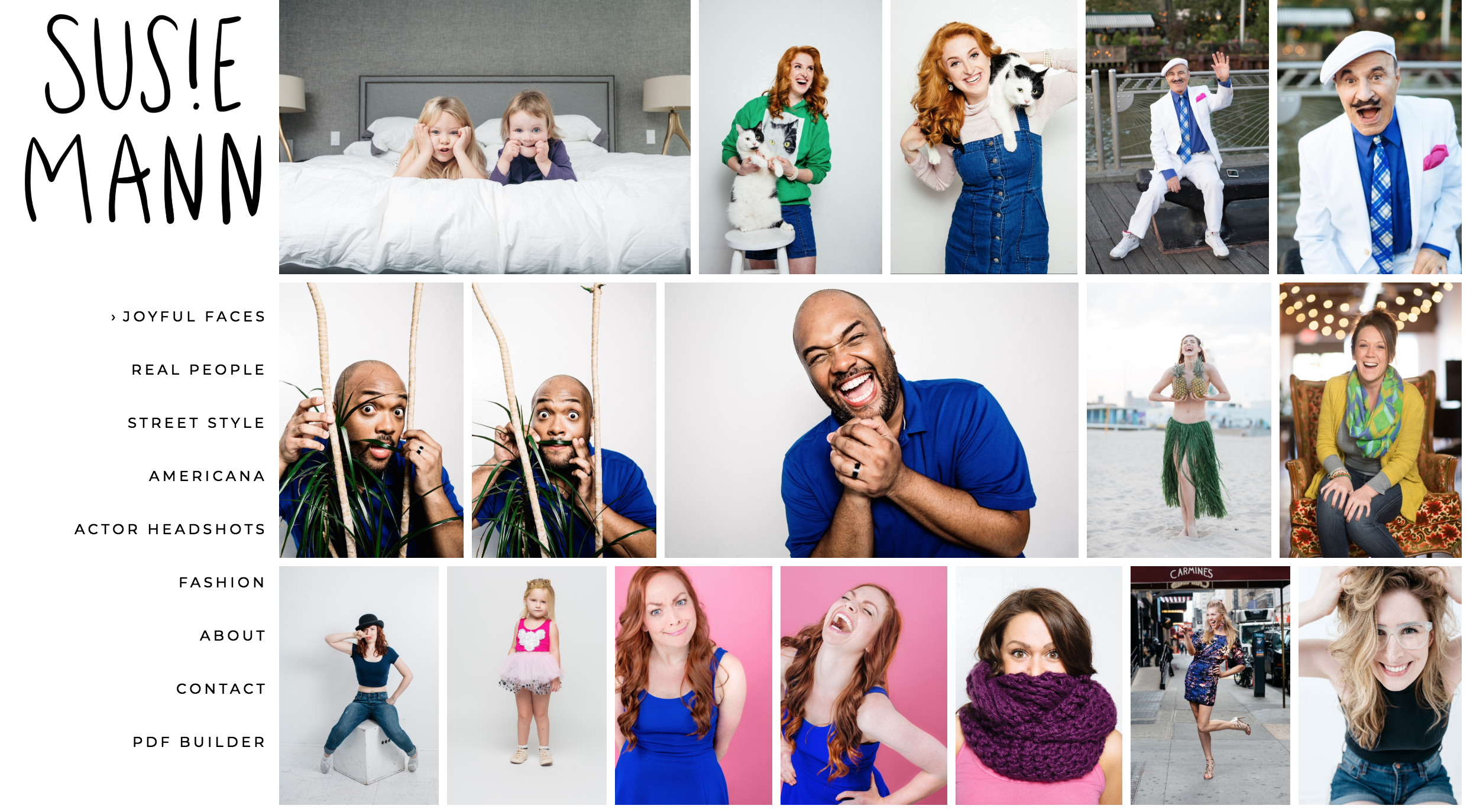
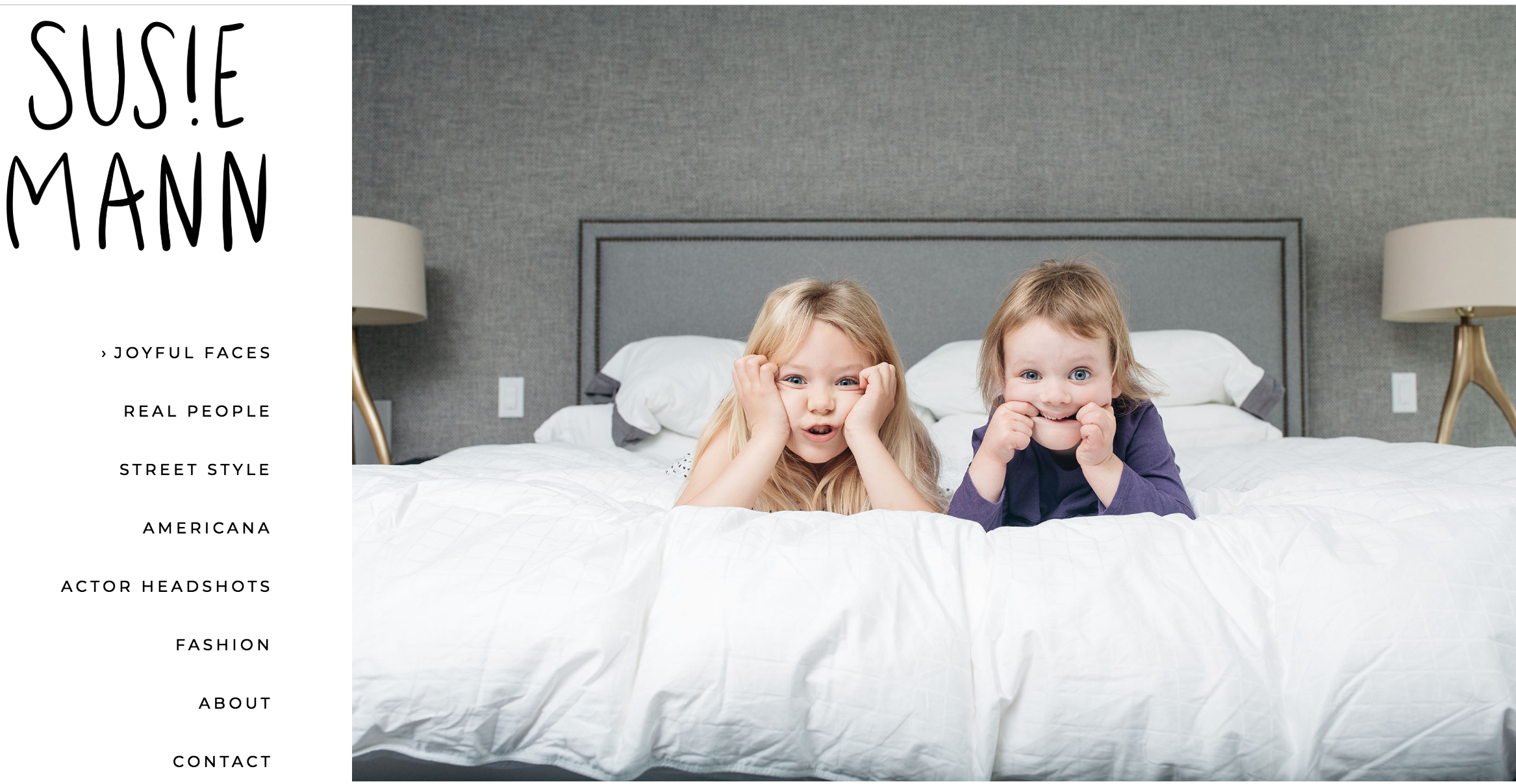
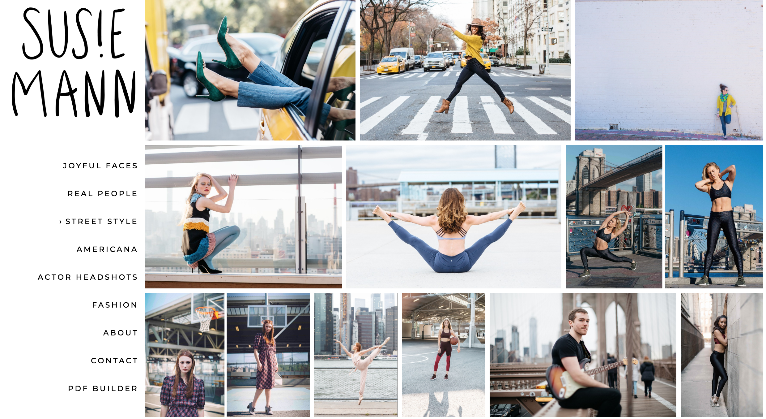
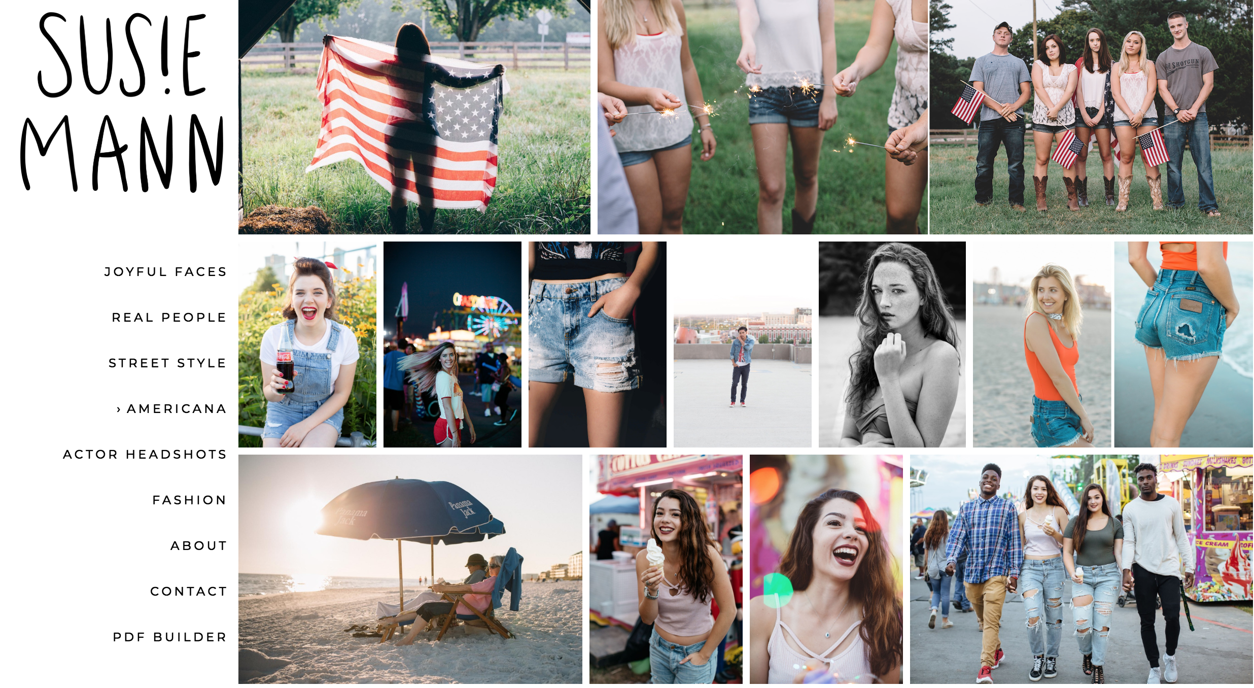
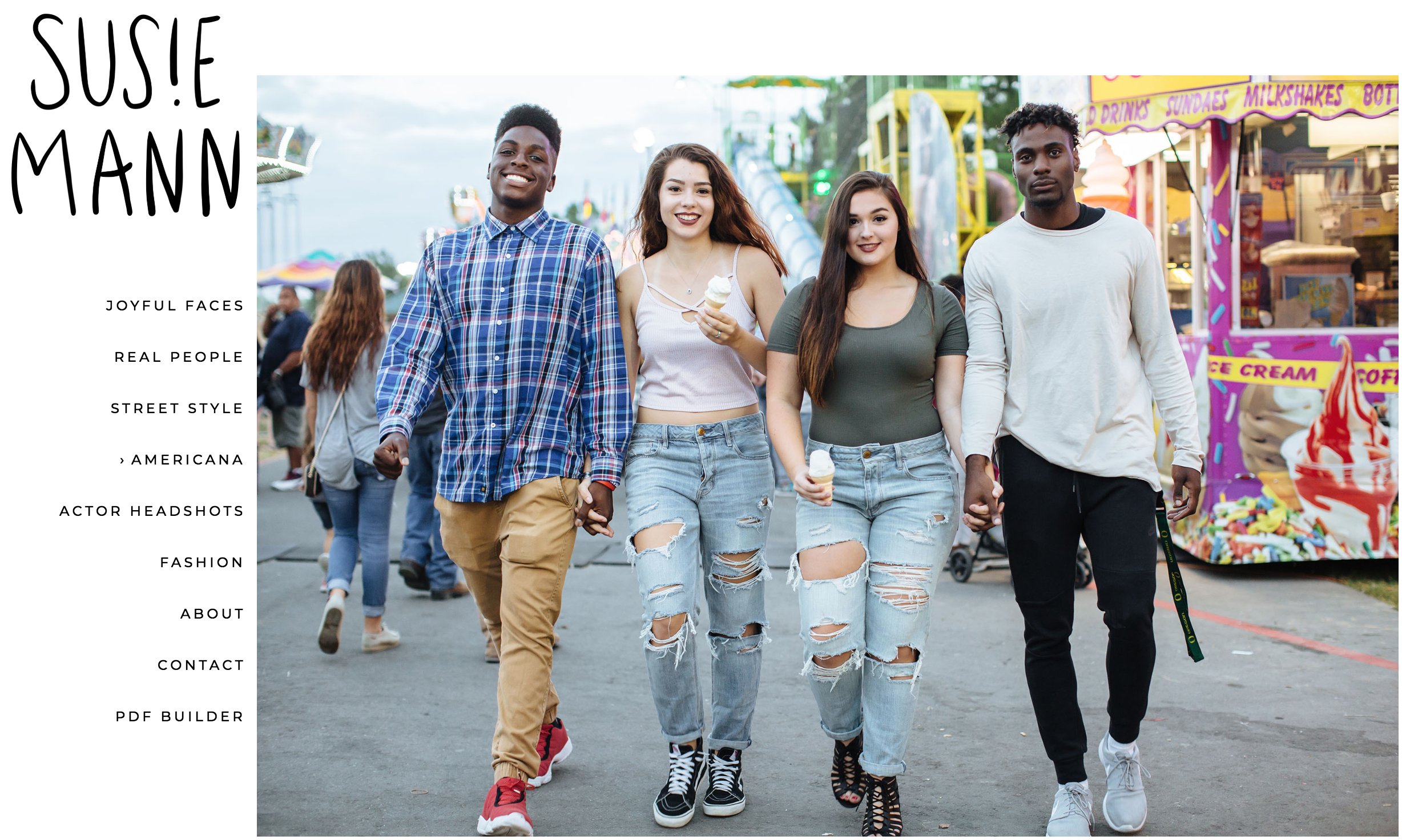
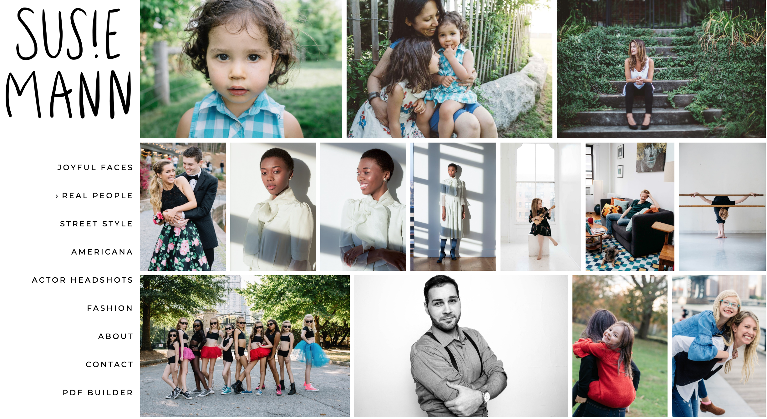
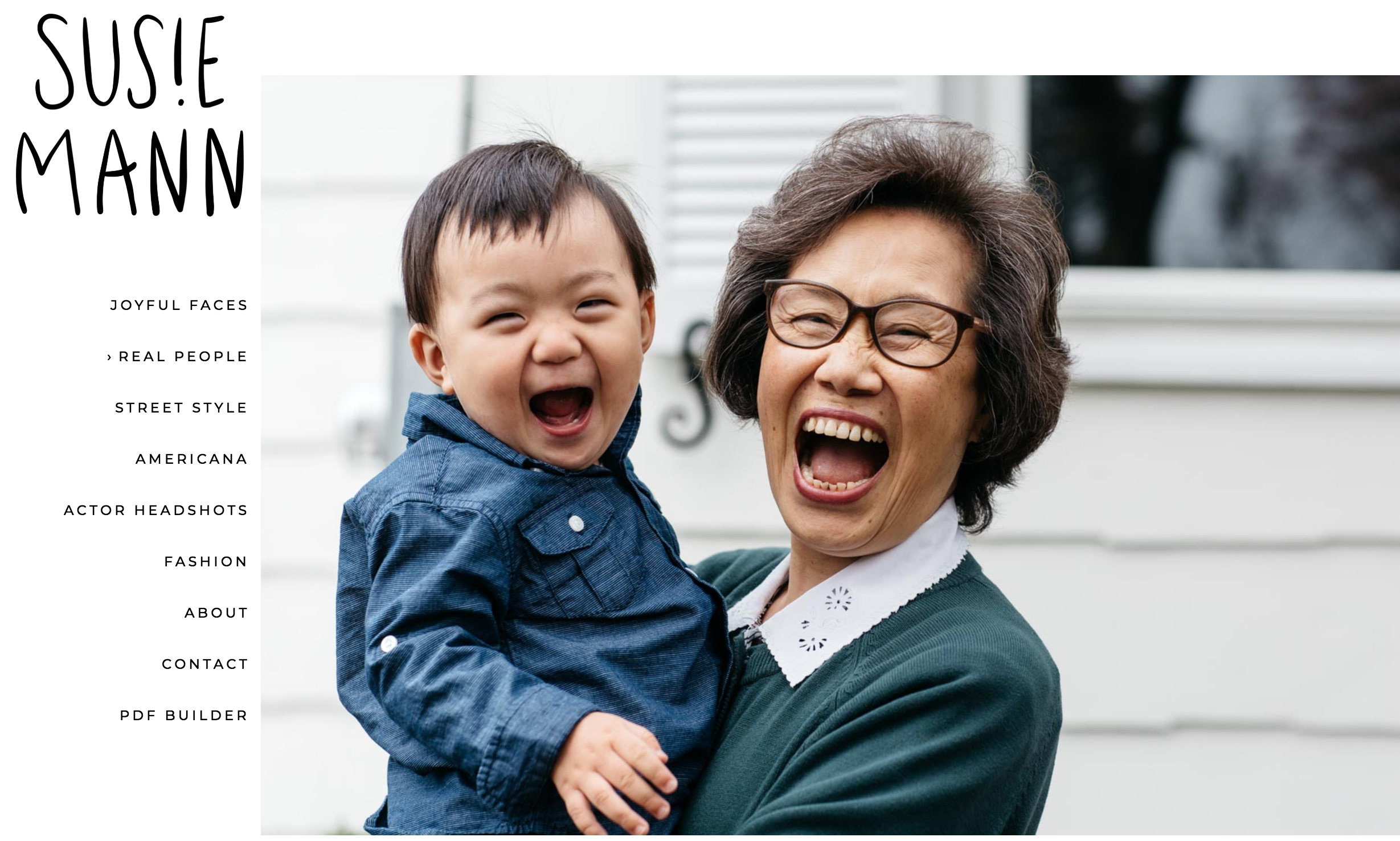
I’m so happy to share the website I created with NYC-based lifestyle and portrait photographer Susie Mann (@susiemcreative). Susie brings a fabulous energy to her work, creating images where people exude confidence and joy.

Susie came to me looking to freshen up her portfolio and marketing.

Here’s what we did together:

✅ Talked about her goals, what inspires her, and what kind of work she enjoys doing the most.

✅ Updated her website with a totally new edit

✅ Fine-tuned her @aphotofolio website template (love the new look!)

✅ Marketed her website update with an email blast to relevant clients

These are a few of my favorite photos from her site. Check out the full galleries here.

NashCo

Screen Shot 2019-01-27 at 10.31.22 PM.png

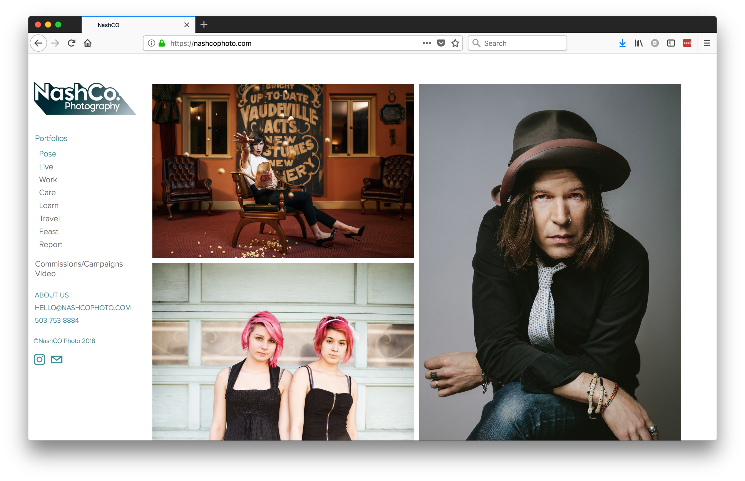
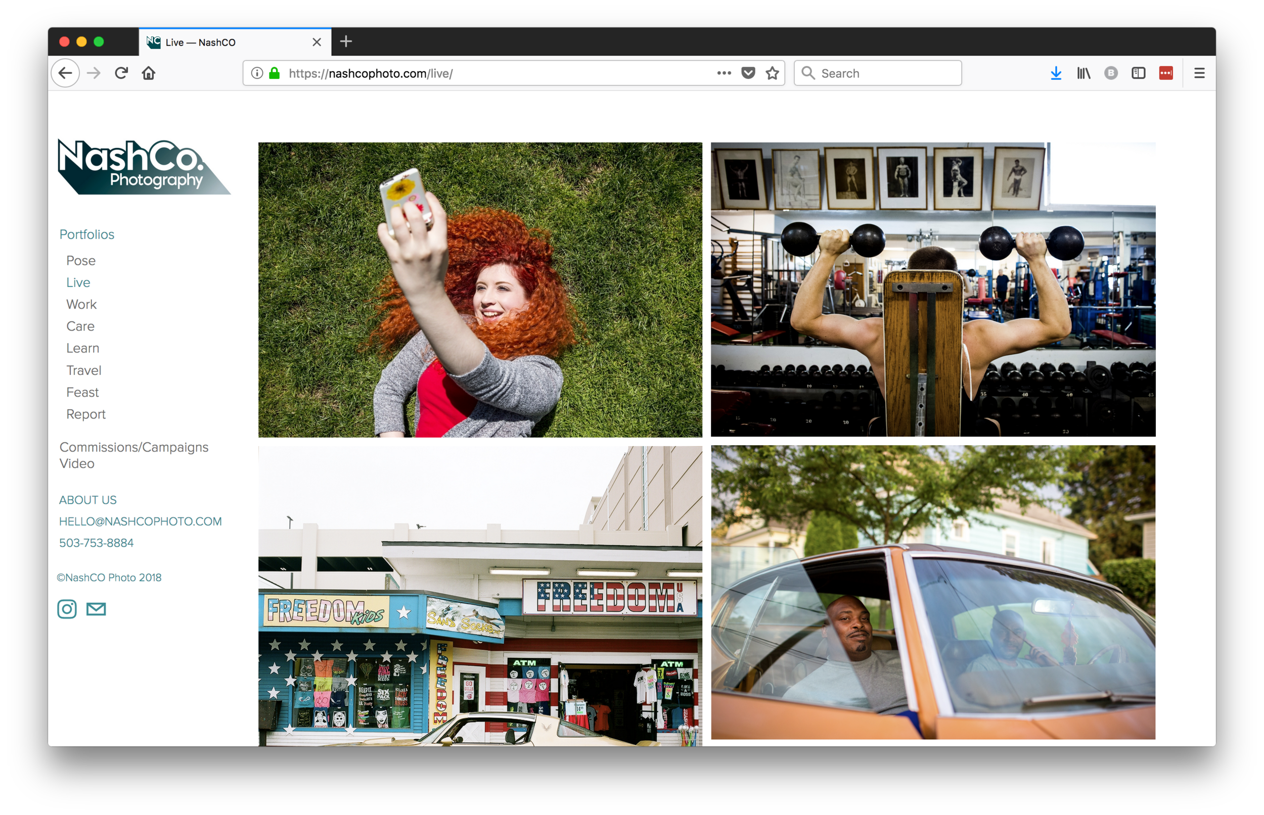
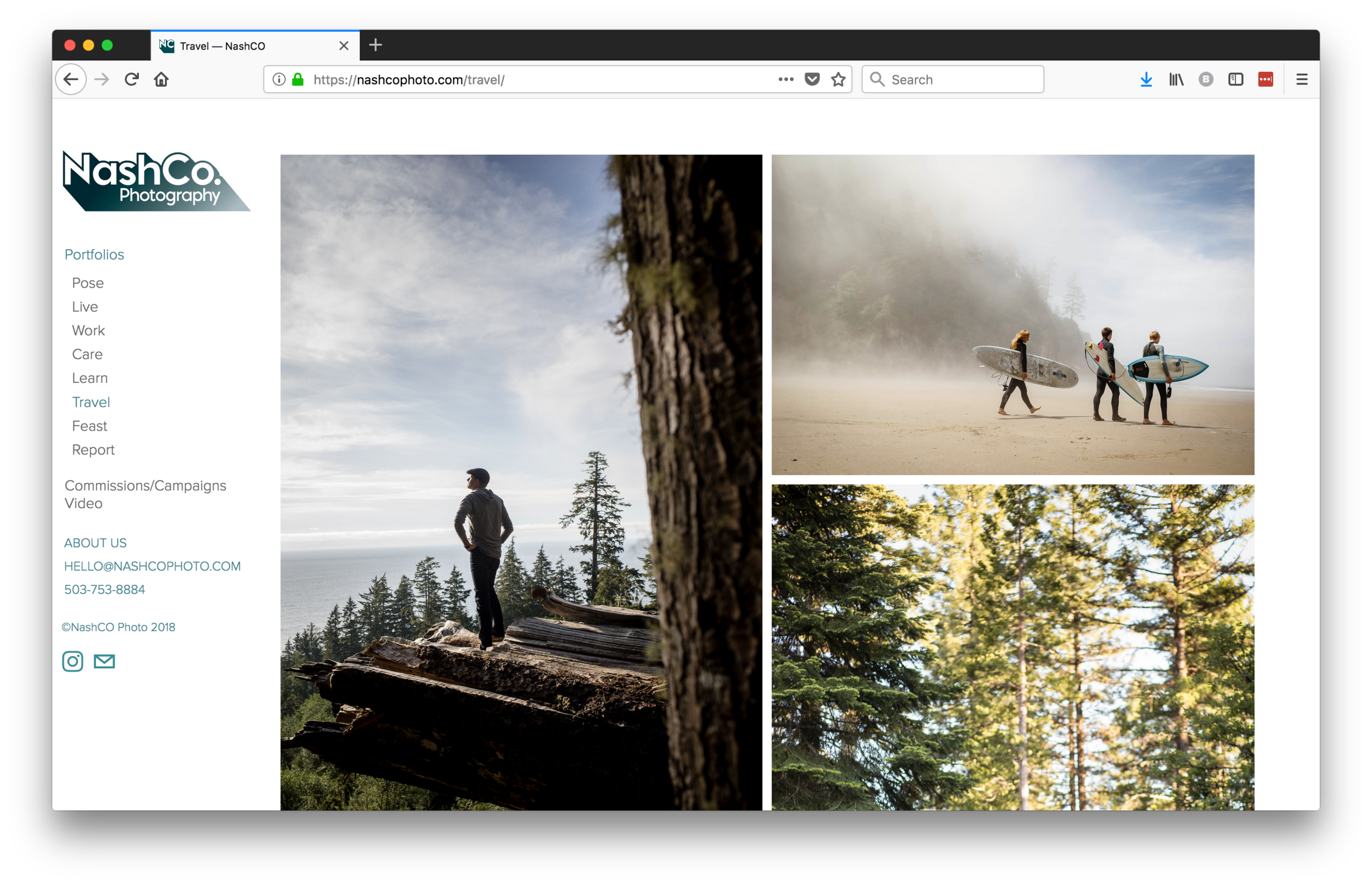
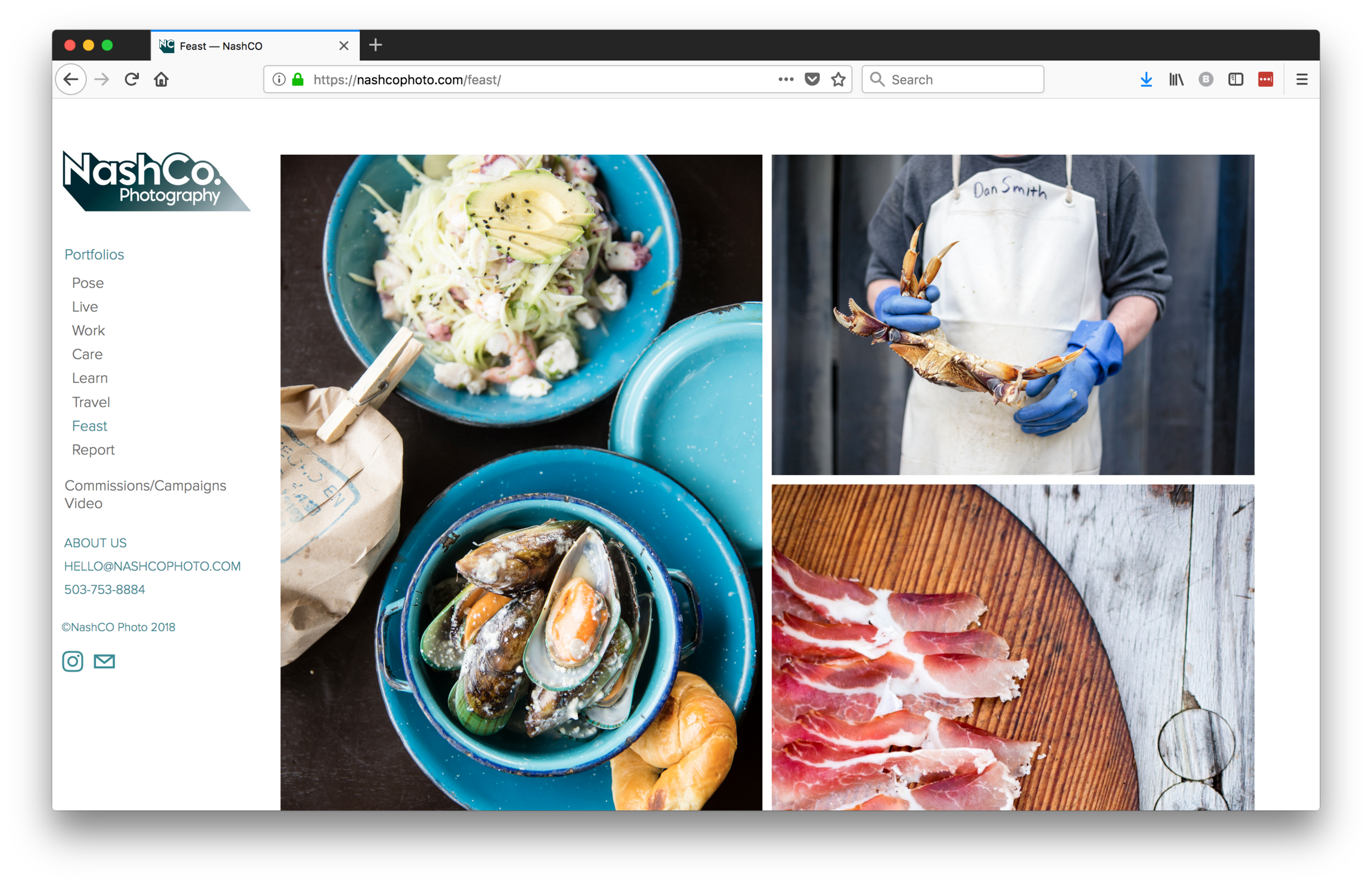
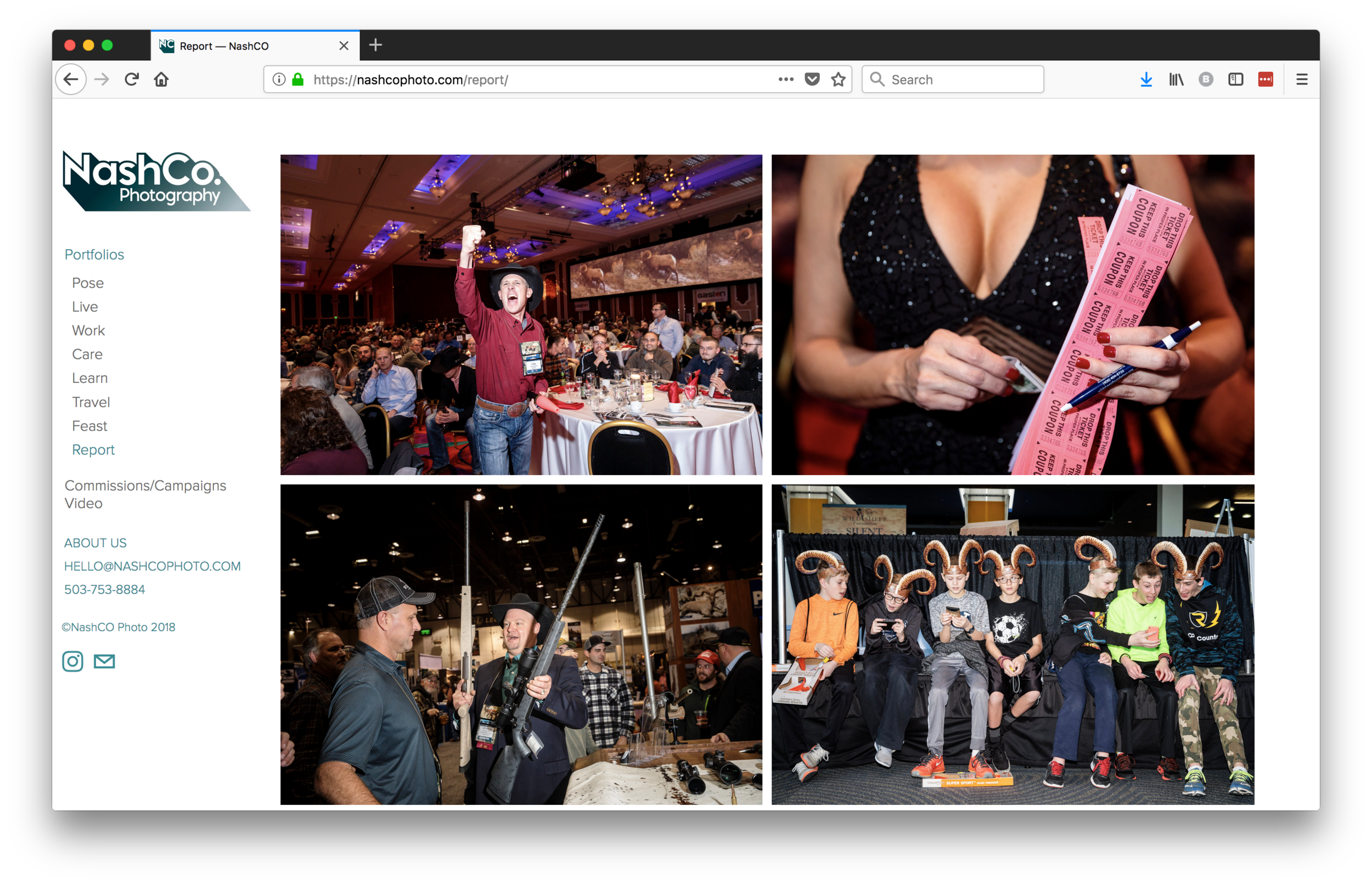
I’m so happy to share the updated website I edited for Portland, Oregon based @nashcophoto. I love their tagline, “We make real people look cool”!

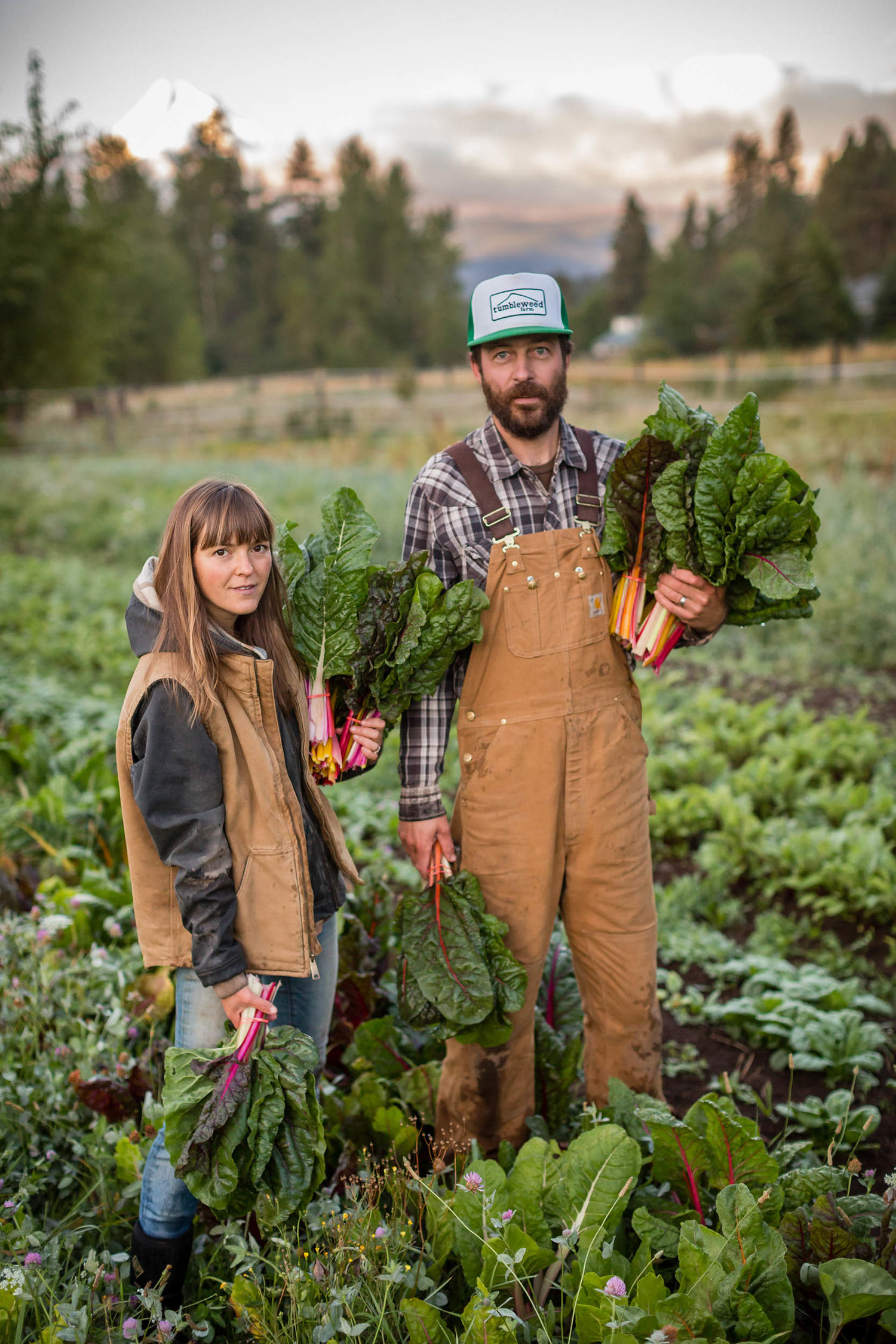
From celebrities and students to doctors and farmers, they capture people in an effortless way.

Their portraiture is beautifully complimented by their storytelling.

You can see more of NashCo’s work here.

Texas Tribune Festival

Screen Shot 2019-01-21 at 1.32.14 PM.png

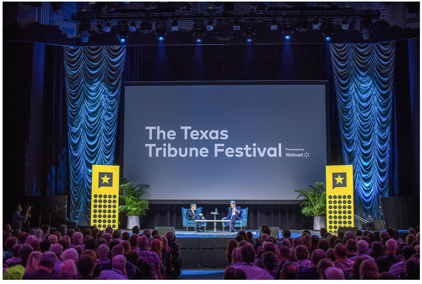
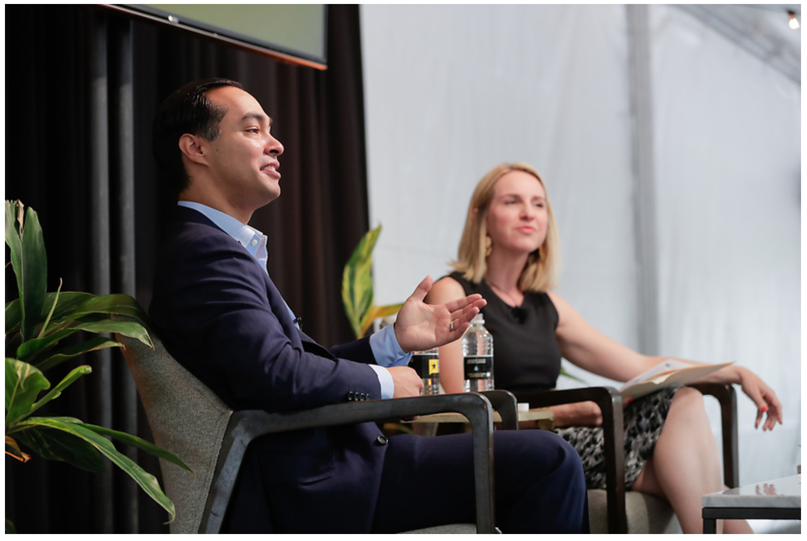
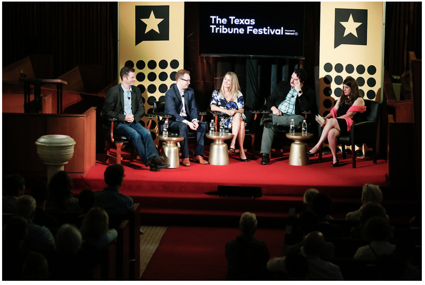
This fall, I had the pleasure of working with the media team for one of my favorite events, the Texas Tribune Festival. Working this event is a fun whirlwind of scheduling, editing, captioning, funneling images to social media teams, and of course, breakfast tacos and coffee. Lots, and lots of coffee.

Austin is lucky to have some incredibly talented, hard-working photojournalists covering this event. The Tribune Festival photography team included Bob Daemmrich, Callie Richmond, Chris Carrasquillo, Erich Schlegel, Erika Rich, Marjorie Kamys Cotera, Rachel Zein, Rudolfo Gonzalez, Stephen Spillman, Steve Moakley, Thomas Meredith and fellow photo editor Leslie Baldwin.

Thanks to Tribune Creative Director Jacob Villanueva for putting together a rock-star team! If you are in need of solid event or editorial coverage, these photographers should be on your list!!

If you're in need of an editor to produce photo and video coverage, give me a shout!

You can see more photos from the event here, and read more about the Texas Tribune Festival here.

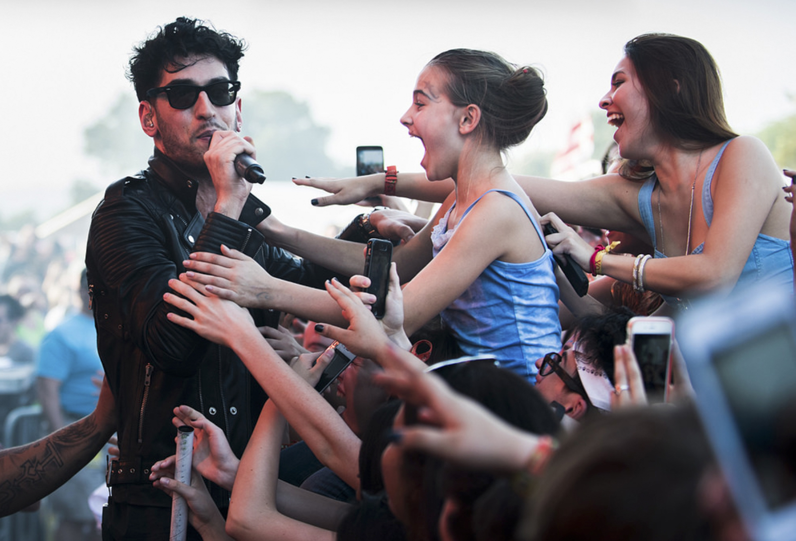
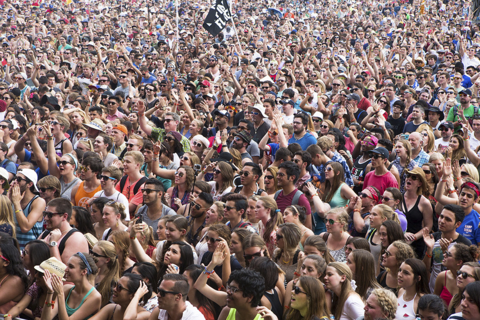
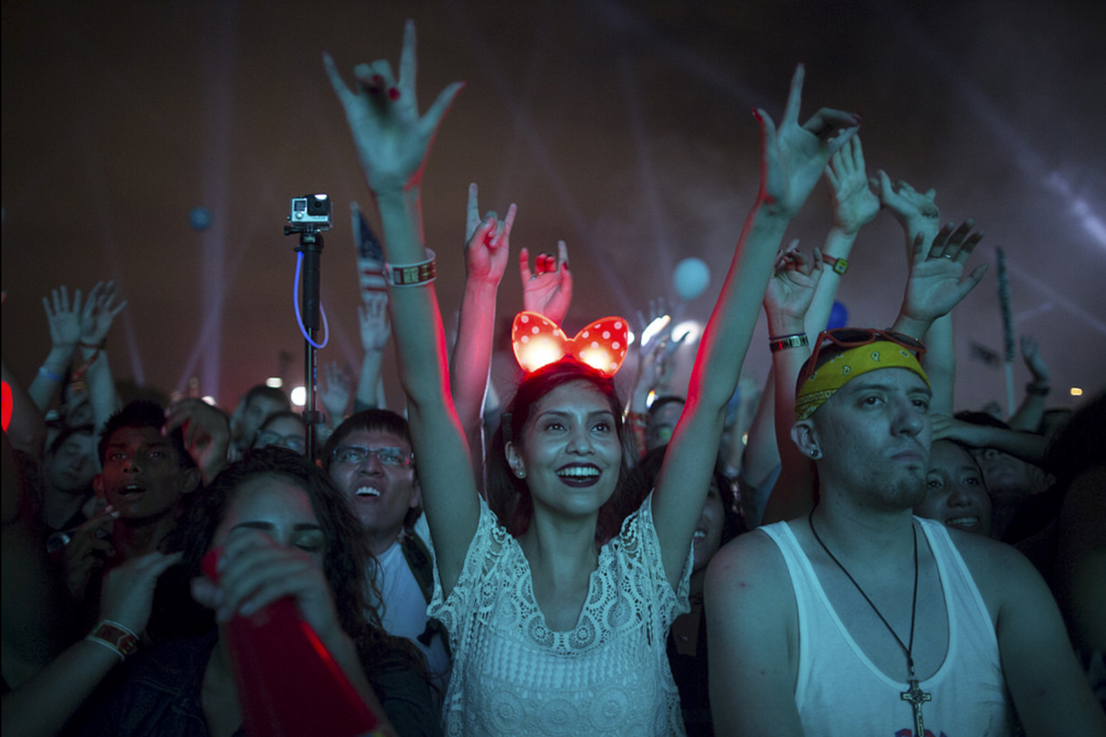
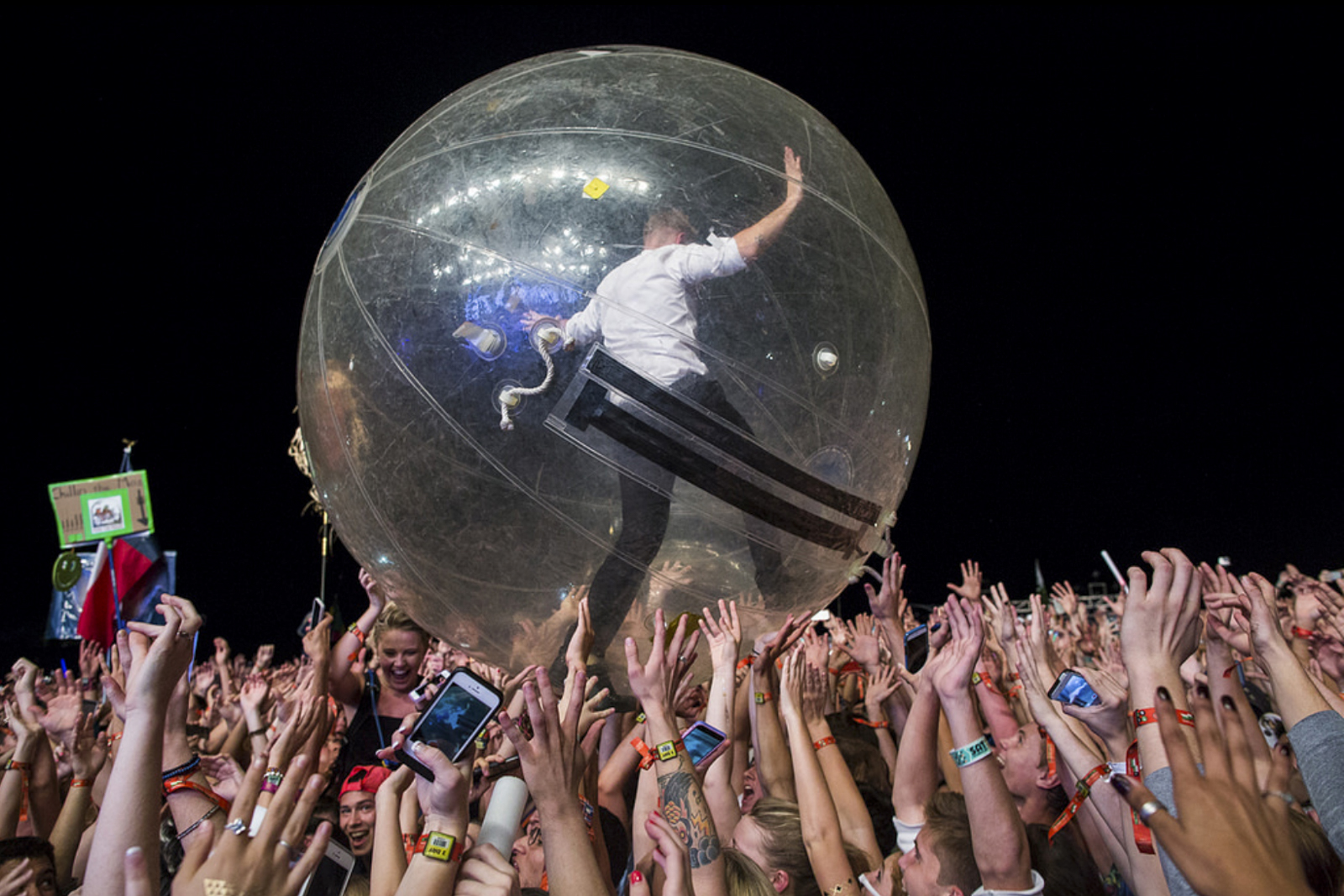
Austin City Limits Festival

31286582_10155468151608030_7493717680881401856_o.png

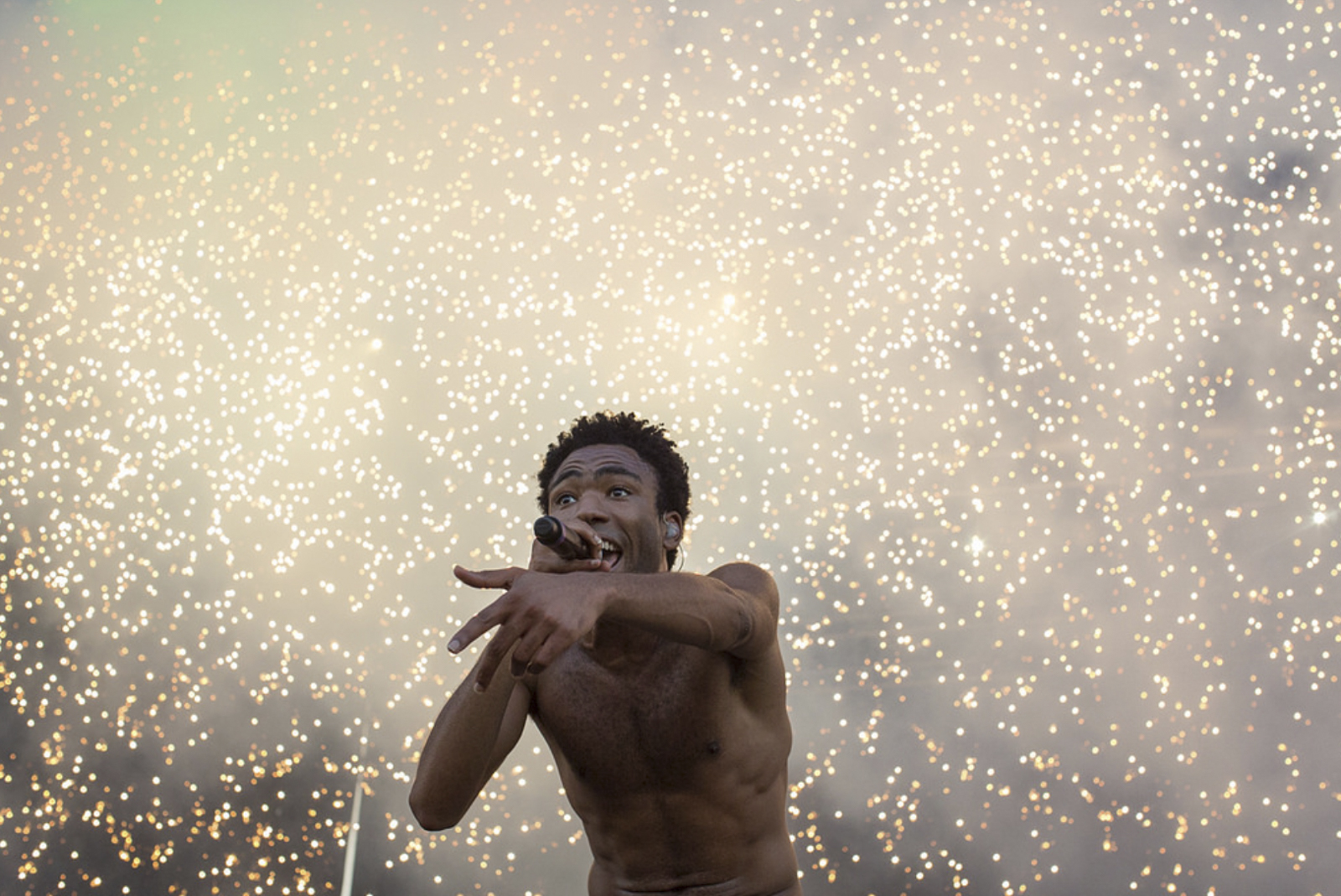
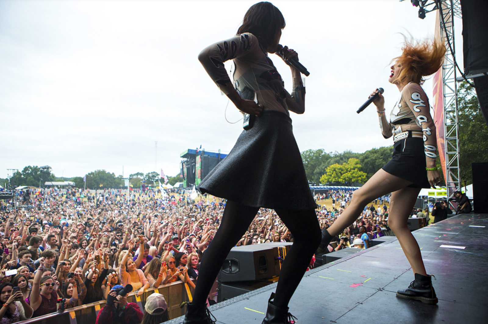
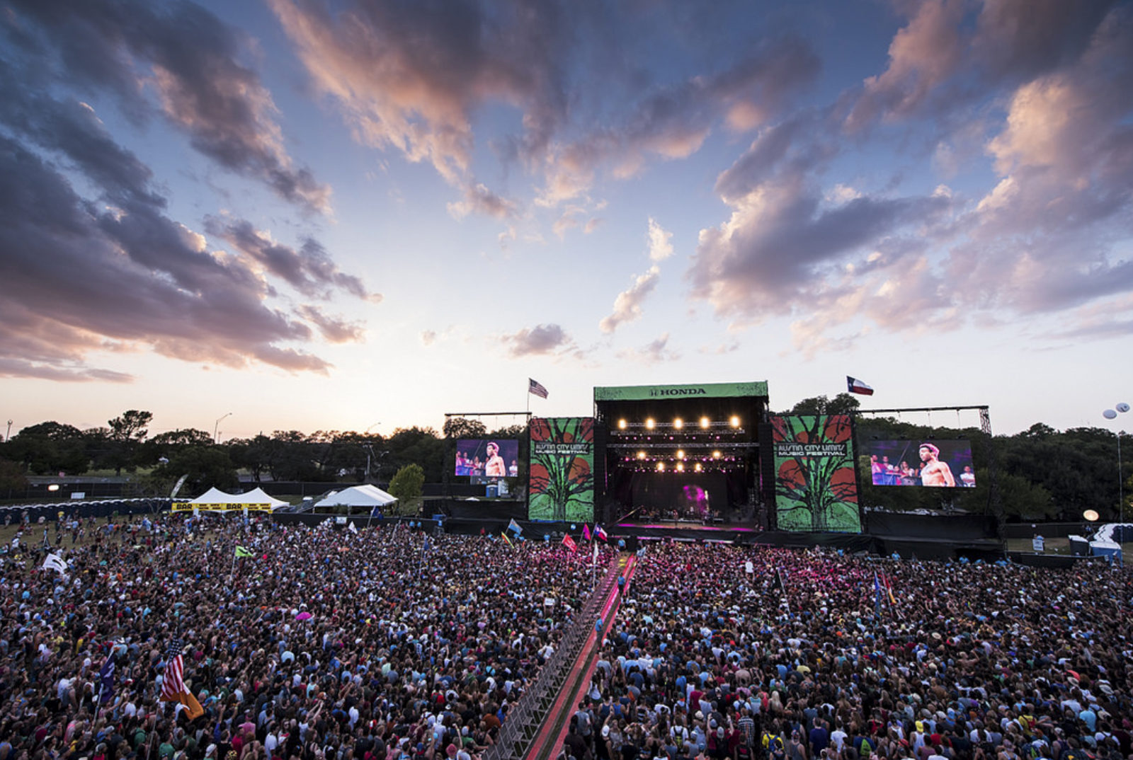
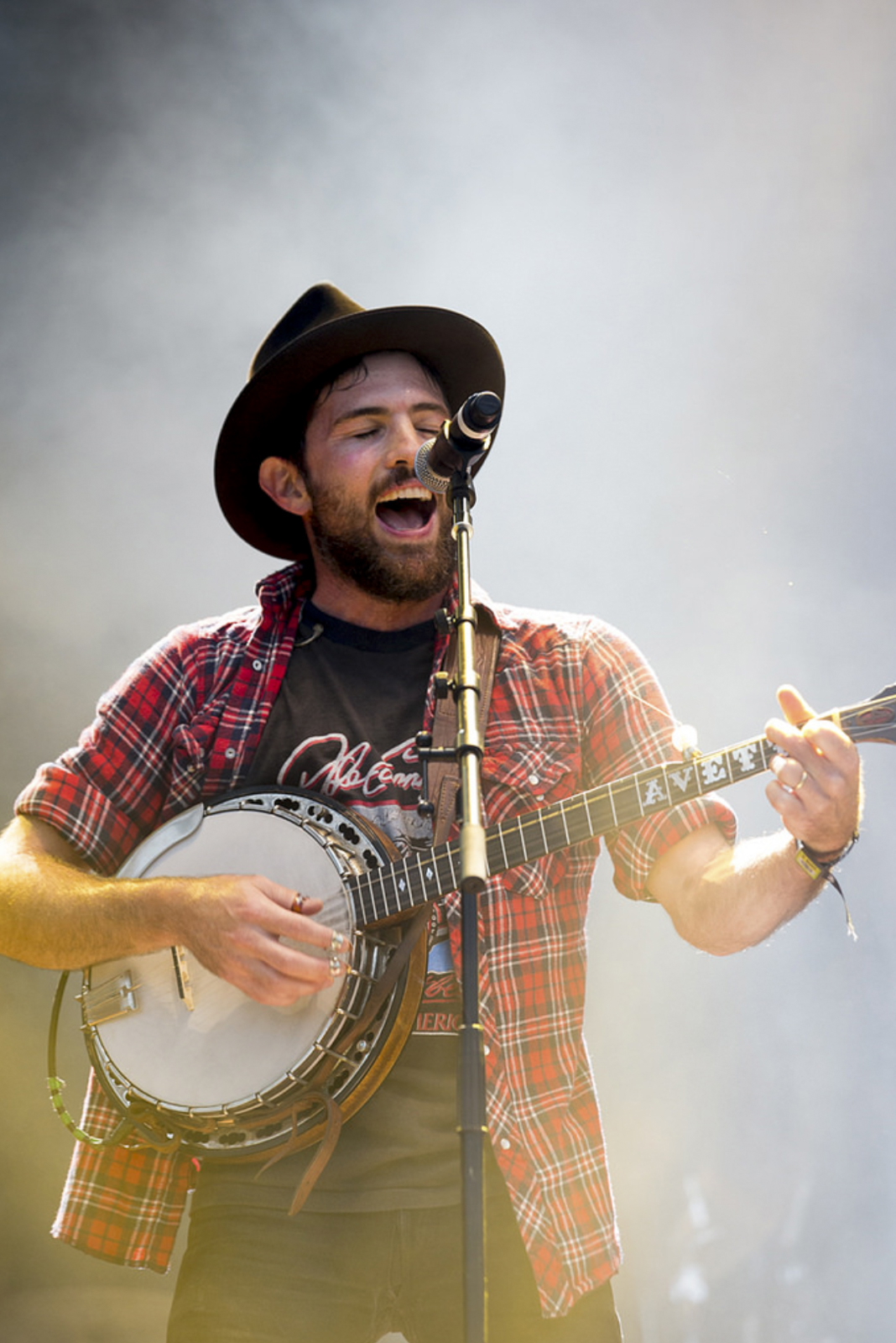
Being an on-site photo editor for large events is one of the best things about my job! Working with the photographers, PR folks, and social media team in a fast-paced environment is always an inspiring way to spend a work day.

ACL Fest is a special level of high energy, since your office is in the middle of the largest music festival in Texas!

Together with fellow editors Alyssa Coppelman and Molly Winters, we reviewed tens of thousands of photos, selecting, editing, and distributing images in as close to real time as possible.

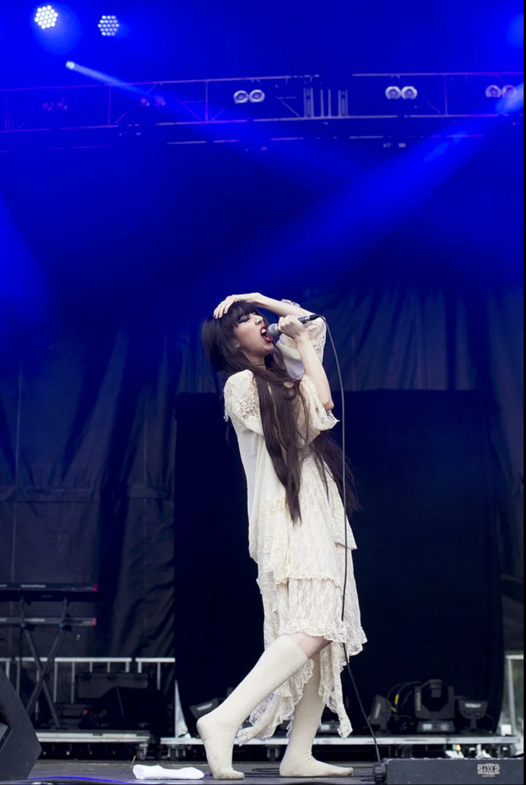
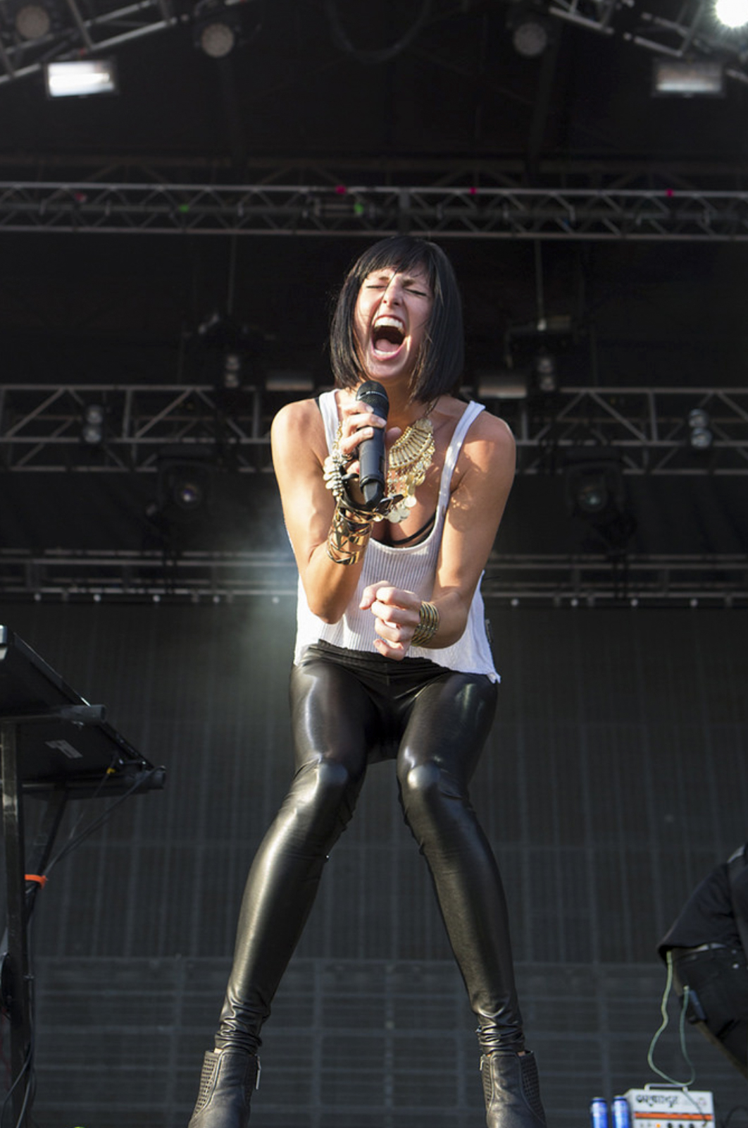
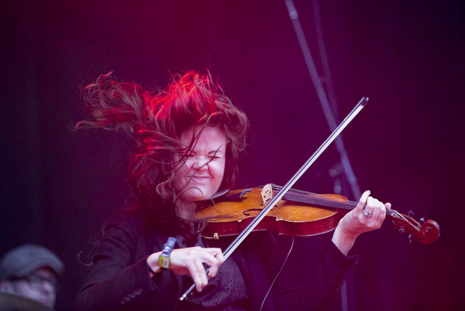
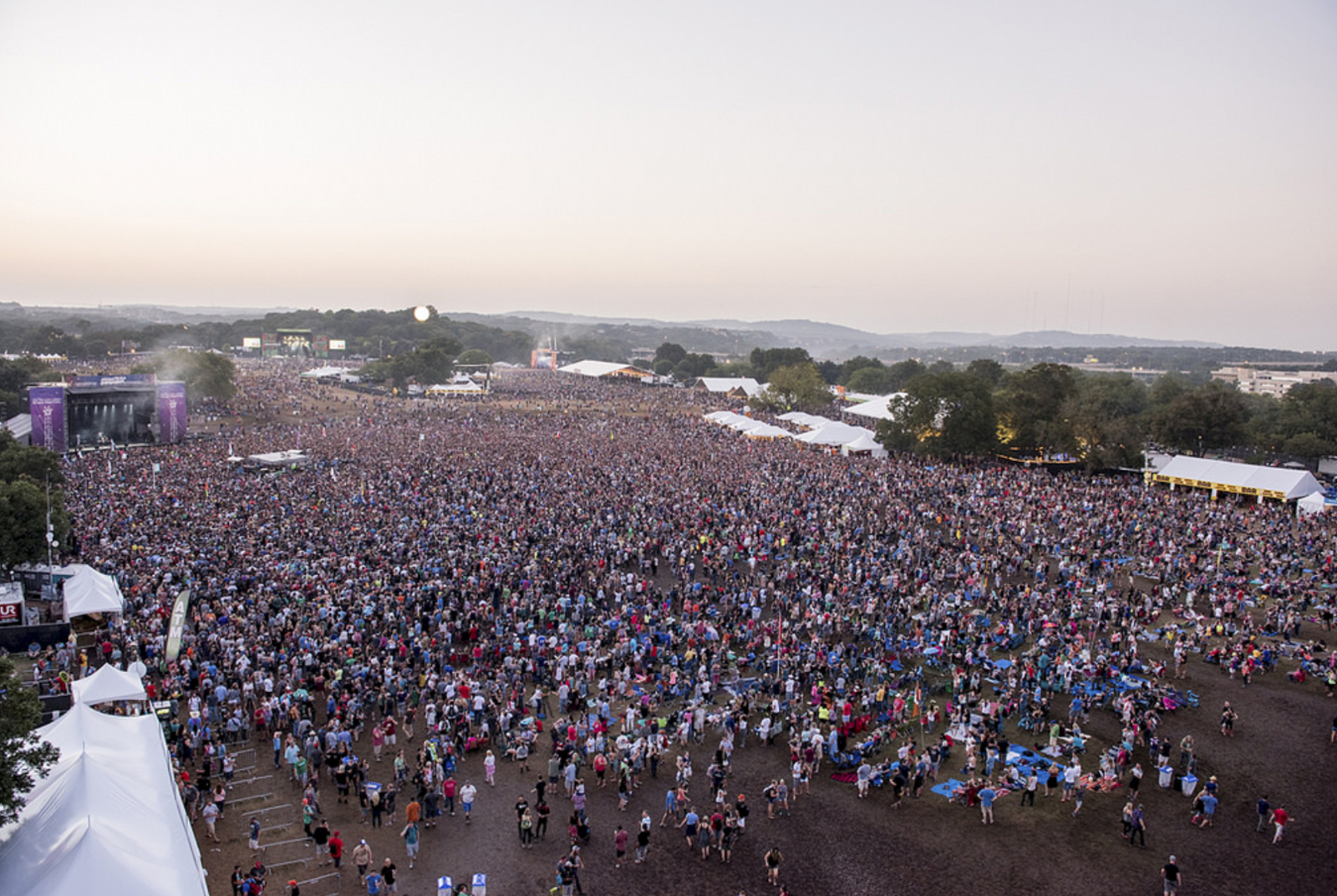
We curated galleries of the best images from the weekend, highlighting marketing activations, crowd shots, aerials, and of course, EPIC stage shots of the bands performing.

The unsung heroes of the production were the runners, who literally ran -- to and from golf carts -- to shuttle cards from the photographers in the photo pit to the A/V trailer.

The photographers were Callie Richmond, Cambria Harkey, Greg Noire, Nick Simonite, and Reagan Hackleman.

Here are a few of my favorite images!

Guardian Picture Editor on Finding and Hiring Photographers in the US

John-Oliver2.jpg

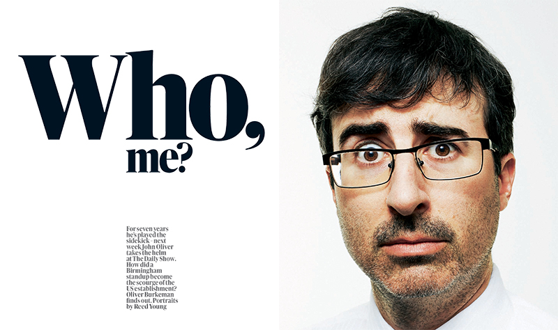
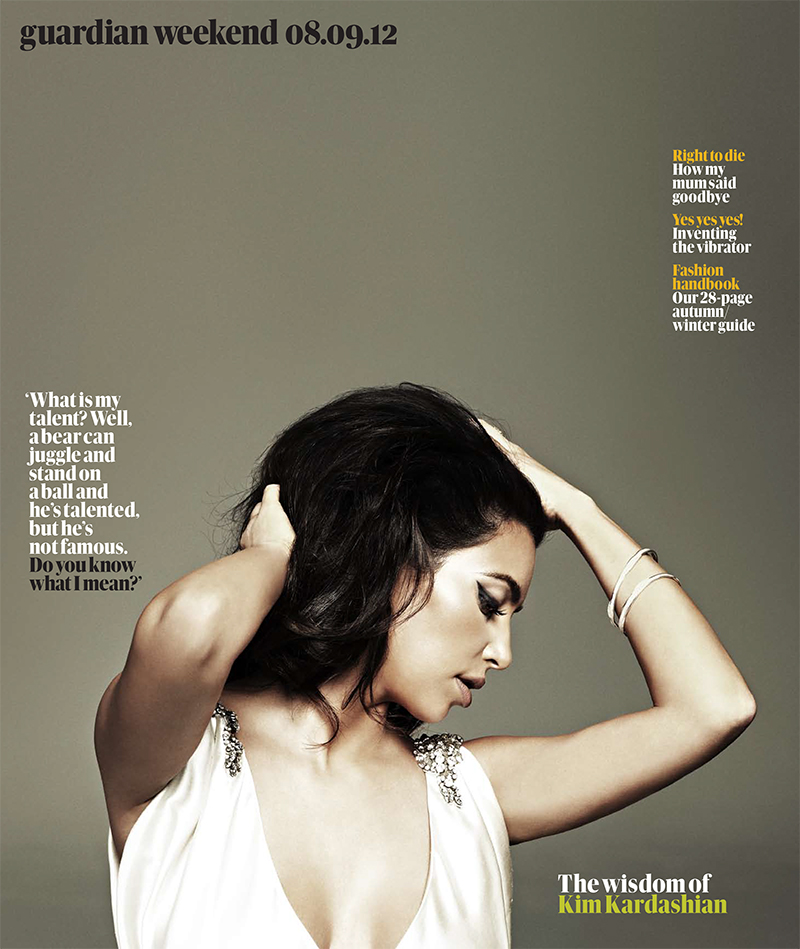
Caroline Hunter is Deputy Picture Editor of The Guardian's Weekend Magazine which features gorgeous photography. I recently spoke with Caroline about the process of finding and hiring American photographers from her vantage in the U.K. How often are you hiring U.S.-based photographers? We hire U.S. photographers every week. I work on a busy picture desk and we often feature contributors and celebrities who are based in the US. Sometimes it feels as though we commission more photography in that part of the world than anywhere else!

Are you more likely to look for someone who is located in the city you have an assignment in, or to fly someone in who has the perfect style for the story? Does that depend on if it’s a big feature or a smaller front of the book story? Yes, basically if it's a big feature or a cover shoot or a very important subject, we'll almost always use someone that we've used before. If the flights aren't too expensive or the distance too great, we'll often fly someone to a particular location - it's just safer and more reassuring to use someone whose work you know very well. If on the other hand, it's for a smaller feature or a a fairly straightforward shoot/job, we'll always prefer to use a local person. This saves massively on budgets - although the end result can be unpredictable !

Walk us through a typical shoot. You get the story from the editorial team. What comes next? If you don’t have someone in mind, where do you begin your search? What are some of your favorite resources for finding people? How much do you rely on recommendations from colleagues? A typical shoot can work in many different ways. Sometimes we'll have the written copy/feature already. This is the best way to commission as you know exactly what the story is about. Quite often though, I might not know much about the feature as it hasn't been written yet. On other occasions, I might commission a shoot that is part of a much bigger and ongoing feature - which will often change as time goes on. Sometimes it will be a celebrity shoot that will require styling, hair and make-up and location scouting.

I'll discuss the shoot with one of the commissioning editors as well as the Art Director and then will have a think about ideas and photographers. I might do some research on the internet for visual ideas as well as looking at online portfolios. If I don't have someone in mind, I might look at the Wonderful Machine website or recent editorial shoots for other magazines that I like. I'll also have a look through the sites of photographers who have contacted me recently - just to refresh my memory. I like looking at websites like Nowness, which is great for visual ideas. I don't rely too much on recommendations - sometimes it's nicer to discover fresh talent.

How can a US photographer get on the radar of an editor in Europe? Obviously they can’t network with you at parties, and planning trips to show their portfolio can be time and cost prohibitive. With all the noise online, how can they get through to you in a memorable way? I think it's quite hard. The most effective way is a meeting - but I know that this is very tricky and expensive to set up. Photo-festivals are a good way of potentially seeing/contacting many editors/agents in a short space of time - but these too can be expensive. Being located in a city where there isn't much competition and you're a 'big fish' in a small pond is quite a good way to get stand out.

Most of the photographers we use are based in NY and LA - two of the most competitive cities for creatives on the planet ! Having an interesting and consistently high standard of work will ensure your work always stands out - and a well-designed, easy to navigate website is essential. Being well-connected and getting known in certain circles is important too. I often get recommendations from other photographers and editors.

Do you have favorite blogs that you follow to stay up to date on what is happening in the US photo scene? I like looking at the NYT lens blog as well the New Yorker Photo booth, Time magazine and blogs like Flak photo and Lens Culture.

Do you make trips to photo festivals or portfolio review events to meet new photographers? I know in the past a lot of European editors went to Visa pour l’Image and Arles, but it seems like travel budgets aren’t what they used to be.  Yes, I regularly attend photo festivals. I find them really energizing. I like doing portfolio reviews as it gives me a chance to meet and spend time with new and existing photographers.

What are some of the trends that you’re seeing when it comes to the kinds of photographers that are getting assigned? Any trends in promos you receive? I get a lot of monthly newsletters (always emailed) from photographers who have just done a shoot or e-zines where they're telling me what they've been up to in the last few weeks. I think the trend for highly retouched, digitally remastered images will be with us for some time. This seems to have replaced the very natural-looking painterly style imagery that was fashionable around a decade ago.

Can you share some pet peeves when it comes to photographers courting you? For a photographer, I think that it's important to know the market that you're pitching to. If you're ringing up a photo editor, agent or art buyer - don't expect them to give you a page-by-page description of their product. You should already know which sections you'd like to contribute to and be able to ask questions and comment on recent work that was featured. It's really no point pitching a lifestyle or travel feature to a magazine that only deals with current affairs. It might sound like commonsense but you'd be amazed at how many times this happens.


Caroline Hunter is a magazine photo editor and Deputy Picture Editor of The Guardian's Weekend Magazine. She has over fifteen years experience of commissioning and art-directing portraits, photo-journalism, celebrity shoots, still-life, interiors, beauty and conceptual photography. Previous to the Guardian, she worked for Time Out London, Emap publications and The Saturday Telegraph magazine.

 She has degrees in Fashion Journalism and English Literature from the London College of Fashion and the University of London respectively. She is a regular portfolio reviewer and judge at international photo-festivals. She lives and works in London.

Video interview with KLRU Collective

klru.org/collective Turning your love of photography into more than a hobby is not an easy task. With the rise in popularity of apps like Instagram, everyone has the ability to be a photographer, but it takes more than just having the right equipment. We’ve got some tips from Austin professionals at the Texas Photo Roundup on how to "develop" your photography. Music: "You Belong Here" by LEAGUES

KLRU Collective filmed photographer Kimberly Finkel Davis and me at the Texas Photo Roundup!

I talk about what it takes to be a working professional, and Kimberly visits AgavePrint and Cloverleaf Studio for help with her beautiful print portfolio.

Awesome Things about Look3, in No Particular Order

250636_3883600884348_2135636882_n.jpg

I just returned from three (was meant to be four... thanks a lot American Airlines) days in quaint, charming and lush Charlottesville, Virginia and the fabulous Look3 Festival of the Photograph. Look3's motto is "Peace. Love. Photography." and they do a great job at celebrating all three. Here's a list of some highlights, in no particular order:

- Lynsey Addario's heart-wrenching and inspiring presentation of the work she has done on women's issues over the last 15 years.

- Robin Schwartz's presentation of "Amelia's World": Portraits of her daughter with various animals. Her daughter has a magical gift for connecting with animals.

- Camille Seaman's wonderful telling of venturing into the world of Arctic and Antarctic photography, and how we are all connected in this world. So inspiring!

- Sitting under the stars, drinking a miniature boxed wine (think grown up juice box) with David Laidler, Alyssa Coppelman, Timothy Archibald, Andrew Hetherington, Jennifer Whitney and others.

- Piling into a bus with 19 other people to go from the Razon party to the Luceo Images party.

- Burgers and meeting the rest of the Prime Collective members

- Timothy Archibald's fantastic "Echolilia" project, in which he and his autistic son embark on a photographic journey together

- Simon Norfolk's Astra3B series

- Swimming in the river on our last day, while a bunch of baptisms were performed right behind us.

'Til next year everyone!

Texas Photo Roundup:Marketing Strategies Seminar + Portfolio Reviews

12/1/11 Update: Currently the portfolio reviews are sold out, if you would like to be added to the waiting list, please email info@texasphotoroundup.com. There are still spots available for the morning marketing seminar. Austin Center for Photography (which I'm a board member of) and ASMP Austin/San Antonio have teamed up to produce a day of events geared towards professional and semi-pro editorial and commercial photographers. We're dubbing it the Texas Photo Roundup and if you live in Texas, you don't want to miss it!

February 3, 2012

One Day, Two Great Events

Marketing Strategies + Portfolio Reviews

Save the date for this one! Registration opens soon.

Morning Event:

Real World Marketing Strategies for Photographers

ASMP Austin/San Antonio and Austin Center for Photography invite you to join commercial and editorial photography industry experts for a three hour interactive morning seminar and panel discussion. This event is geared to both emerging and professional editorial and commercial photographers who are looking to kick their business into high gear. Topics that will be covered by our experts include:

  • Defining your target market
  • Creating a marketing plan
  • Making the most of your marketing dollars
  • Choosing the strongest images for your marketing
  • Strategies for print and email marketing
  • Social media marketing

You will also have a chance to share your current promotional materials, home page or social media strategy with the group and have them critiqued by the panelists. Follow us on twitter for details!

Please come prepared with specific questions for the included Q&A session with the panel of experts.

Panelists include:

  • Jennifer Kilberg, Creative Consultant
  • Matthew Mahon, Commercial and Editorial Photographer
  • Shannon McMillan, Senior Art Producer, GSD&M
  • Allen Murabayashi, co-founder of Photoshelter
  • Amanda Sosa Stone, Creative Consultant
  • Zana Woods, Director of Photography, Wired Magazine
  • Alison Zavos, founder of FeatureShoot.com and Social Media Consultant

(Read more about the panelists)

Afternoon Event: Portfolio Reviews

Join us for an amazing opportunity to get your work in front of potential clients. This event will give you 20-minute one-on-one meetings with prominent art buyers, photo editors, artist reps, and industry experts.

This event is geared towards professional and semi-professional commercial and editorial photographers.

Confirmed reviewers from a variety of top notch companies will be reviewing work, including:

  • Texas Monthly Magazine
  • GSD&M
  • Door Number 3
  • Men's Health Magazine
  • Renee Rhyner
  • TracyLocke
  • EmDash
  • T3
  • Wired Magazine

(read complete list and bios)

Registration opens October 18, 2011.

Produced by

Questions? Email us at jasmine (at) jasminedefoore (dot) com.

Call for Submissions - Palm Springs Photo Stories

I'm looking for photo essays on Palm Springs and the surrounding areas (Salton Sea, Slab City, etc). Especially interested in images that show people doing things (not so interested in landscapes). I know there are a lot of quirky characters in those areas, and am open to seeing photos of them, but also want to see some luxury and relaxation. This is for a soon-to-be-launched tablet travel magazine. The magazine skews higher end/luxury, but we are dedicated to showing authentic experiences, so embrace photojournalism as well as lifestyle and travel photography.

I will be sending out other photo needs via my mailing list. Please sign up (sign up form is on the home page, bottom right) if you would like to receive these. And please share this post with any colleagues who may have work to share.

To submit your work for consideration, please email me a link (no attachments please). I need captions in order to know what it is I'm looking at. Thanks!

I will post all future calls for submissions to my twitter and my facebook professional page, so please follow me there too to get the latest requests.

(photo by me)


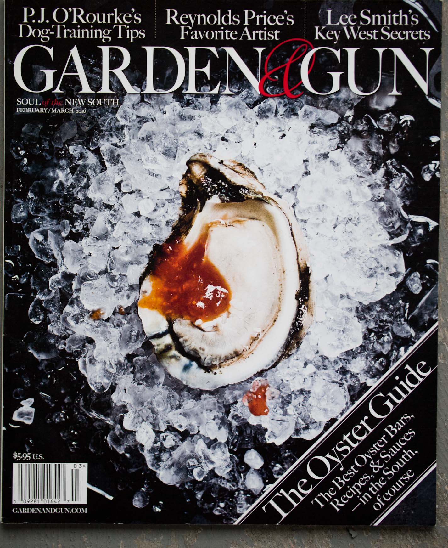
Q&A with Garden & Gun's Maggie Brett Kennedy

Why do you think Garden & Gun is at the top of so many people’s “dream clients” lists.

That’s amazing. We’re fortunate that photography is a focus of the magazine’s design. A lot of full page images and great paper stock to ensure high quality reproduction. Our readers let us know how much they relate to the photography each issue. We’ve always been a photo friendly publication.

You have hired Peter Frank Edwards for many stories, and one of those recently won a James Beard Award. Can you describe what it is in Frank’s work that keeps you coming back? How do you two work together? Is it a collaborative process?

I’ve had the pleasure of working with Peter Frank Edwards since the very first issue of Garden & Gun (Spring 2007). He’s from the South, spent his life in the outdoors, and previously was a fisherman and sous chef. Peter Frank Edwards IS Garden & Gun! He’s covered everything from hole-in-the-wall barbecue joints to traditional foxhunting and continues to get excited by every assignment. He lives the pages of the magazine so really gets what we’re all about.

It is very much a collaborative process. There is a level of trust after working together for many years. I know he is going to find the creative angle with each assignment and bring back the unexpected. I always look forward to his tales from the road. (Read more about their collaboration in my Q&A with Peter Frank Edwards).

You use such an amazing variety of types of photographers, that it is hard to pigeonhole Garden & Gun as having a particular style. How do you describe the visual aesthetic to people?

I like to work with a mix of national photographers and Southern-based talent in each issue and try to deliver the unexpected whether it’s for the front or back of the magazine or a feature.

It’s a balance between seasoned well-known shooters and up-and-coming photographers. We always strive for images that communicate a sense of place. Images that make you want to be there, in that moment. We like lots of natural light and rarely incorporate conceptual photography.

Walk us through a “typical” day at work.

Garden & Gun has a small staff so each component of photography and the overall process is very hands on. The magazine contains a wide variety of content so each day is filled with assignments ranging from Southern food and chefs, hunting and fishing, architecture and interiors, portraiture, music, you name it.

The magazine covers a wide editorial range and incorporates a high/low mix of content. For example, a profile of actress Anna Camp or a new modern architectural project verses gritty and soulful juke joints or frogging in Louisiana. Every day is exciting and keeps me on my toes. I also like to set aside time each week to respond to inquiries, research photographer’s new work, etc.

How many print and email promotions do you receive in an average week? Have any stood out to you lately, enough to where you actually contacted the photographer?

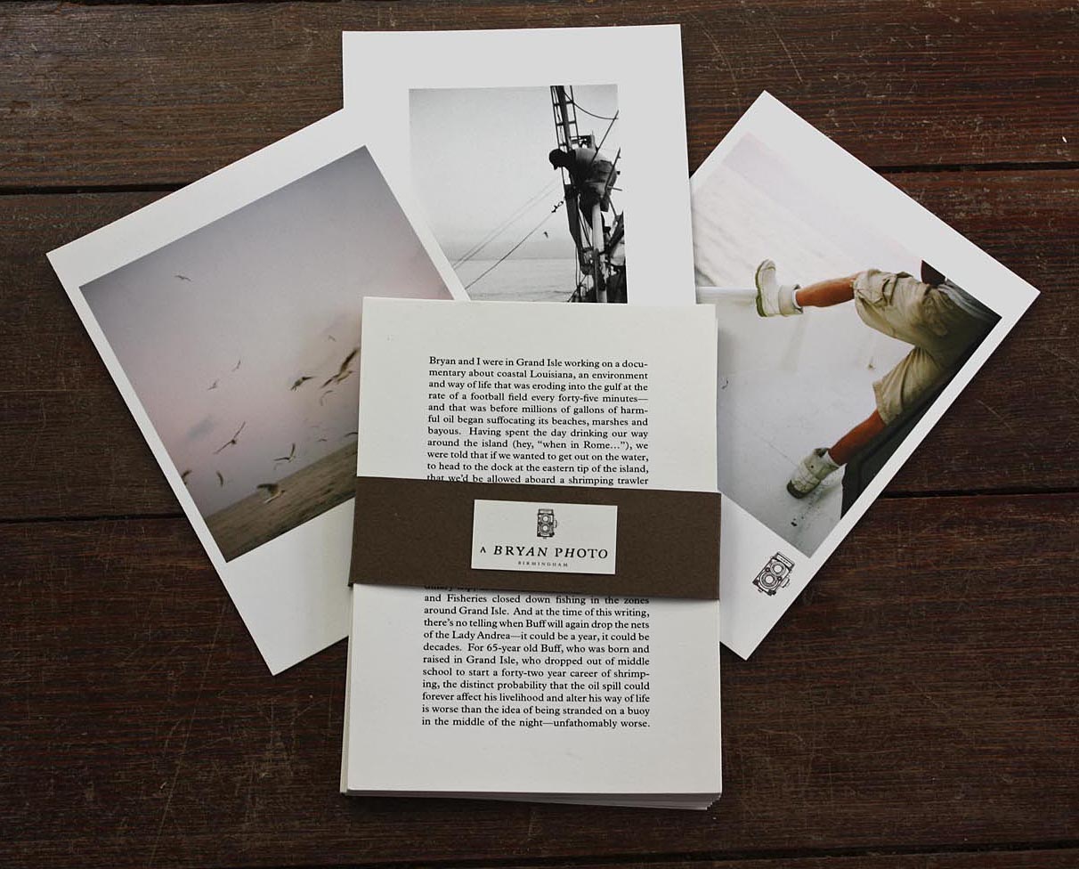
I receive about 30 promos a week. Bryan Johnson sent me a promo that turned into an online photo essay for G&G. The content was perfect for us: http://gardenandgun.com/newsletter/spill-one-year-later.

When being promoted to, do you prefer print or email?

Both are great, so however the photographer is most comfortable showcasing their work. I’m old school and still love print. I continue to hold onto those real standout print promos. Witty design on quality paper with gorgeous photographs always excites me.

Do you have any pet peeves when it comes to the marketing materials photographers send you?

Do not send emails with large file attachments. Be familiar with the magazine’s content and visual style and send an appropriate selection of photos. I prefer a tighter, well-constructed edit rather than a large quantity of work. Websites should be easy to navigate and show me images immediately.

What are some of your favorite ways to discover new photographers?

All types of blogs (photo, galleries, designers, magazines, etc.), chatting with people in the industry, those standout promos I receive, and an occasional portfolio review.

Questions from photographers

1. Is it OK to call Photo Editors to follow up after sending a promo?

Email follow up is great and always easier than phone calls.

2. When I send an email, should it be in a email newsletter format or will a simple note saying what I've been up to suffice?

Either is fine. Be sure your work is easy to view.

3. Do you take a chance on photographers just starting out fresh out of school?

Yes.

4. What is the best way to get noticed by a photo editor and ultimately hired to shoot a job?

Develop your own style, have confidence in your work, and do your research on each publication you approach. Send quarterly updates about your projects, travels, etc. I just worked with a photographer for the first time I’ve been corresponding with for two years. Everything has to fall into place before that project can become a reality.

5. What are some of the qualities of an ideal photographer to work with?

Passionate about their work, down-to-earth, excited to tackle all kinds of challenges, professional, someone who thinks outside of the box and brings something new and fresh to the table visually.

6. Can you share some names of some photographers whose work you are inspired by?

I love to look at classic Southern icons (Jane Rule Burdine, William Christenberry, Sally Mann) as well as current shooters (Marcus Nilsson, Peggy Sirota, Andrea Fazzari, Ditte Isager, Trujillo- Paumier).

7. What is the most interesting shoot, photographically, so far?

The next one...

Peter Frank Edwards G&G Cover

Peter Frank Edwards G&G Cover

photos by (clockwise from top left): Joey and Jessica Seawell, Dan Winters, David McClister and Michael Turek

photos by (clockwise from top left): Joey and Jessica Seawell, Dan Winters, David McClister and Michael Turek

Bryan_promo

Bryan_promo

Miller Mobley Spread

Miller Mobley Spread

Maggie Kennedy is the photography director of Garden & Gun magazine. She previously worked as a creative director and producer of commercial photography in San Francisco and New York with an emphasis on food, still life, and interiors.
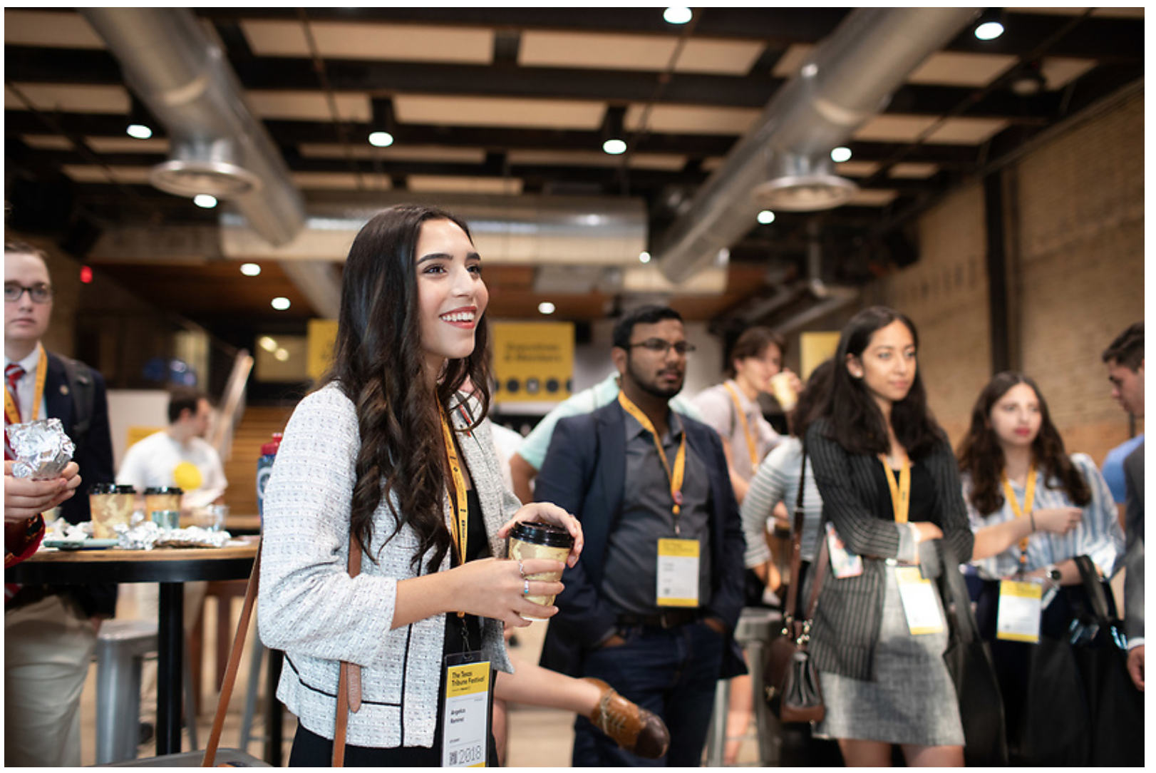
Photo Editor Maggie Soladay Critiques Unconventional Promos

Unconventional promos -- boxes full of toys, food, elaborate scavenger hunts, etc -- are getting a lot of attention these days. Despite the fact that a lot of art buyers and editors say they prefer simple promos, photographers are still churning out these pricey and attention-grabbing promos. Lately, it seems blogging about the promo sometimes gets more attention that the promo itself (Clint Davis and Casey Templeton come to mind). I like that people are documenting the process and sharing the promos in so many ways. Seeing a video of someone's promo go viral makes all the work, and often expense, more worth it.

When planning to do a promo like these, you need to really think about who your target market is and if it's worth the time and expense to reach them. You may be more effective doing something less expensive. Obviously the scale of these promos means they are not being sent to huge lists, so working on a really tight list of existing clients you love and dream clients you want to love you is key to making the most of your marketing dollar.

Below are Maggie's critiques of a few "out of the box" promos she has received recently.

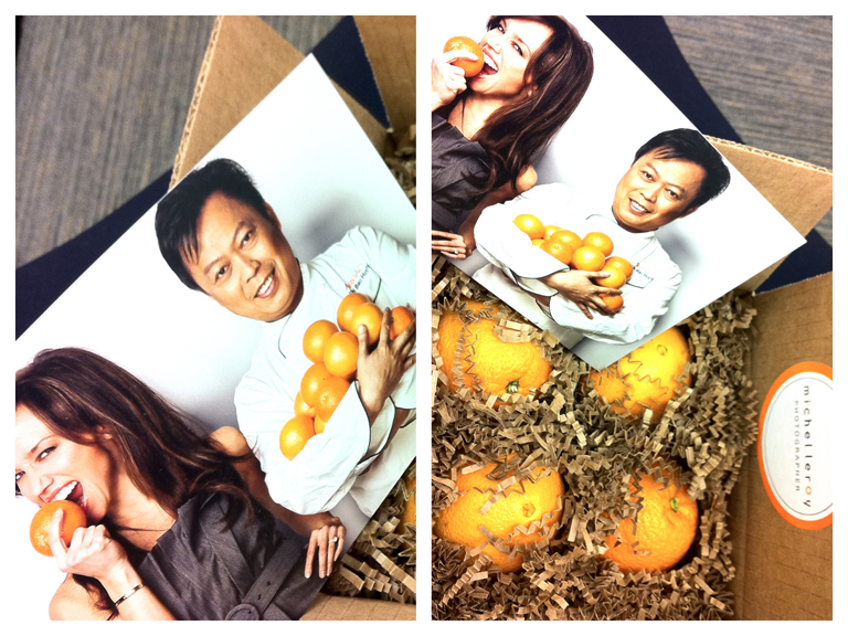
Michel Leroy http://www.michelleroyphoto.com/ New York, NY What: 4 oranges and a promo card. Oranges are a great gift and they were a good tie-in back to photo on the promo card.  The package colors, imagery, theme and design were all in-sync with each other.  The promo card is a commercial/editorial portrait that is professional and a little weird (who bites into an orange?). It is different enough to grab my attention but not so weird as to confuse me.


Eric Schwabel http://schwabelstudio.com/ Los Angeles, CA What: Create-A-Face game. Peal and stick (re-stickable) photo decals to place on the face of a dude and build different (slightly frightening) characters. This was designed to impress creative directors and art buyers and I bet it will! I can imagine it was quite pricey to produce. But Eric thinks big and different. And, I think this is an unforgettable promo for tough to impress art buyers and ad agency creatives. For editorial, I think this might work with major newsstand publications but is slightly wasted on a business magazine photo editor like me.


Tony Gale http://www.tonygale.com New York, NY What: Remote control monster truck, ransom note, and promo card. The ransom note said that; in order to get the controller for the car, I need to make an appointment to see Tony’s new book.  I have heard he is getting a great response.  He has an all new website and this is his best promo card so far.  My main complaint with this promo is that the red monster truck toy has nothing to do with his work, his subjects or the enclosed promo card and ransom note.


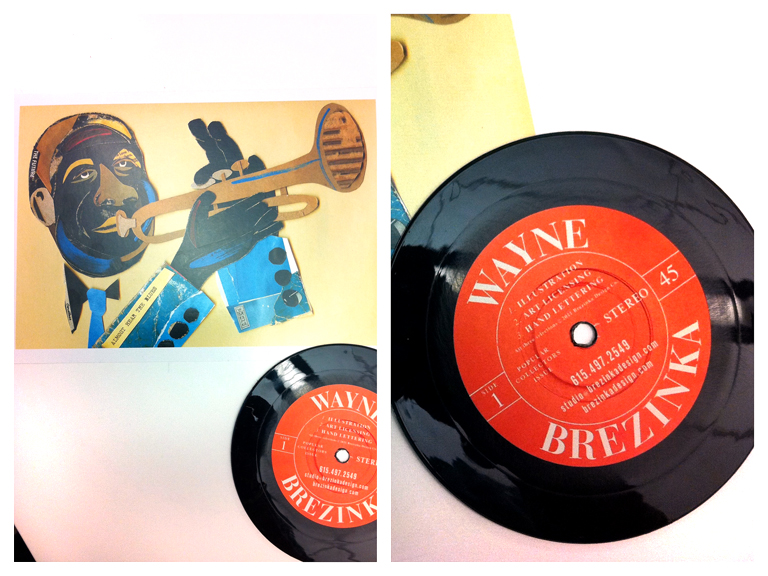
Wayne Brezinka (illustrator) http://www.brezinkadesign.com/ Nashville, TN What: 45 rpm coaster and a promo card. So cool I had to pick include an illustrator.  When you go to his site the postcard image is top of page.  Everything ties in beautifully. I really liked this promo, Wayne’s work, and his website.  It’s a total coincidence that one of our art directors commissioned him the same week the promos arrived on their desks. (editor's note: also check out Matt Barnes' vinyl record themed promo)


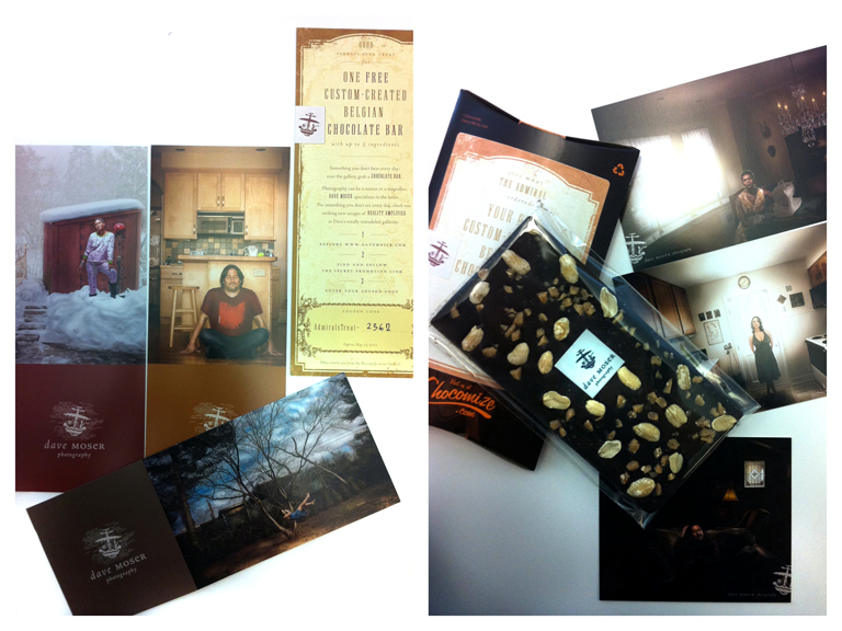
Dave Moser http://davemoser.com/ Philadelphia, PA What: Custom Chocomize chocolate bar and two sets of promos. The first part of this promo was series of long elaborately branded cards. I almost didn’t notice that one of the long cards was a coupon for a free custom designed chocolate bar. Score! I designed a dark chocolate bar with toffee, peanuts, and sea salt. It is incredibly good. This sweet promo cost him a decent amount at $10. I don’t know if it will pay off for him with me because his style and subjects don’t mesh with the styles I hire for at my magazines. What does totally work for Dave is that I spent quality time on his site and I won’t forget his name (certainly not while there is still some chocolate left in my drawer).


Jen Judge http://www.jenjudge.com/ Santa Fe, NM What: Newspaper This mini newspaper has images and stories from her work in post-earthquake Haiti.  All of the images are black & white, incredibly simple, and totally effective on the paper stock.  I emailed her immediately, or maybe I called.  (I do that sometimes).  She told me that she just got the idea to print the newspaper and send it out.  She hadn’t ever really promoted her work before but this was important to her.  I love the idea. It works too because all the portraits are from the same project.


***

Are you one of the photographers' mentioned in this post (or have you done a similarly unconventional self promo piece)? It'd be great to hear from you about the response you've been getting, how much you spent on the promo and how you decided who to send them to.


Photo Editor Maggie Soladay Critiques a Week of Promos

Maggie Soladay (@maggiesoladay) generously shares critiques of print promos she receives. Here’s what she has to say about this week's batch:

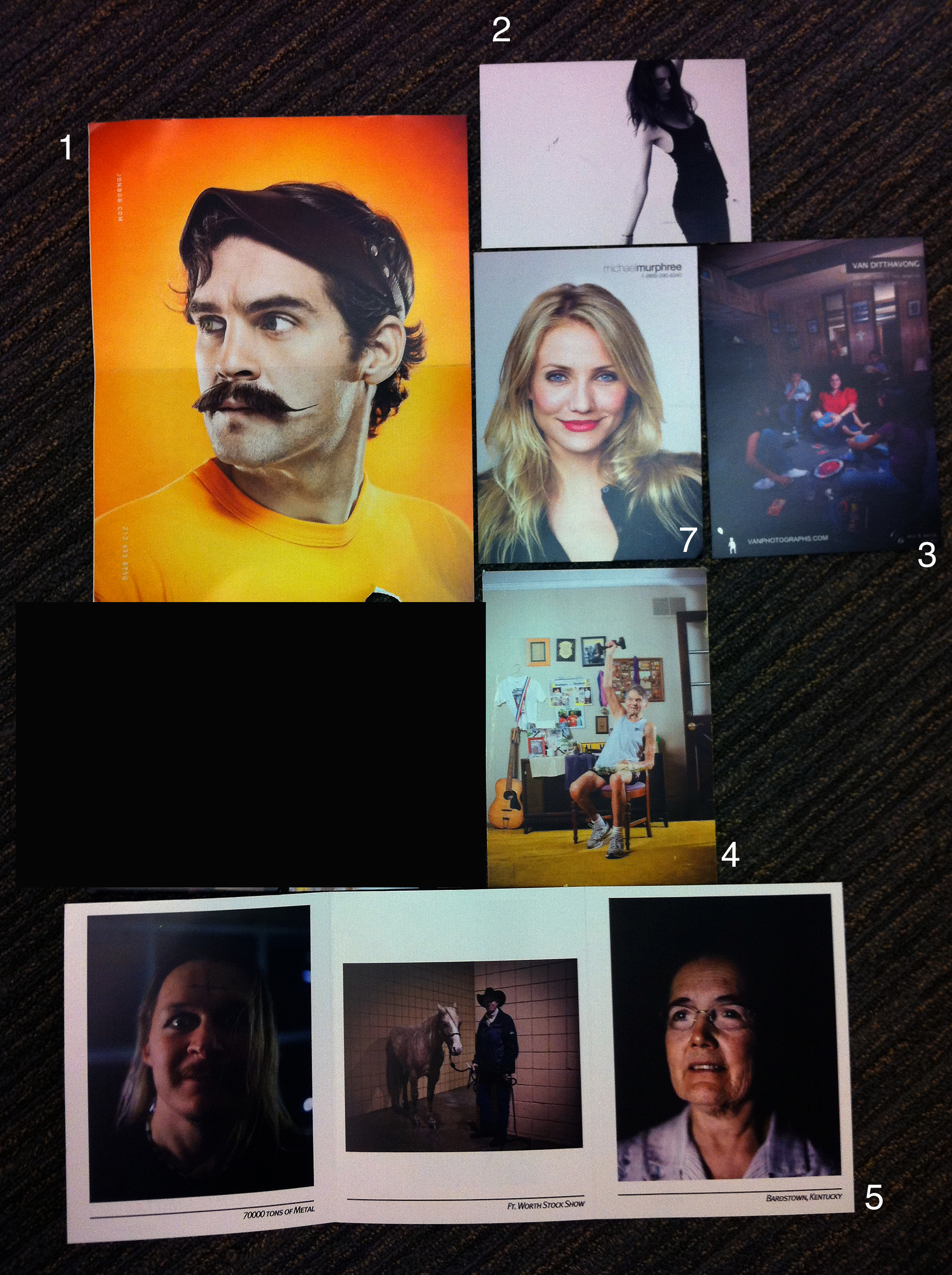
1. Jonathan Robert Willis lives in Bellvue, Kentucky. I have been working with him for years as my go-to for Midwest portrait and lifestyle assignments.  Luckily, I know that Bellvue, Kentucky is the Cincinnati metro area.  His website and card don’t make that clear.  In fact, his card lists a NYC number.  The card is terrific and wild and I am guessing it’s aimed at advertising clients, which it should be.  Though, for an editorial photo editor that doesn’t know him I think it would be tough to identify his region without digging.  For example, he just shot an assignment for me this past month in Indianapolis, Indiana, a 1.5hr. drive from Cincinnati.  In this batch of promos his really stood out.  http://jonbob.com/

2. Brooklyn based Daniel Glazer’s card was meant to direct me to a video vignette of a model.  Not my interest area or work area. Totally not the kind of photography we use.  But, what Daniel shoots and how he shoots reminds me of why and how I got into photography in the first place. http://www.danielglazer.com

3. I want to love Van Ditthavong.  He has been sending promos for a while.  The current one has a bluish/cyan cast to it.  Not great. Van has a great environmental portrait series called “Portrait of the American Dream” in which he photographed immigrants on the job wearing popular culture kids Halloween masks.  I know him as Dallas based but the postcard and the website say Los Angeles and Dallas.  That always irks me. Who lives in more than one place? http://vanphotographs.com

4. Milwaukee photographer Adam Ryan Morris has a good identity design that is simple, memorable and fun. Strikes me it represents him well. And his photography is good. Only one problem: his website has a commercial section and that makes no sense.  He seems to have been much published in a couple of magazines, namely Milwaukee Magazine and that’s great.  But I don’t see how the other work is or can be called commercial work? Confusing.  A fun charming image on the postcard totally caught my interest and I remember him from previous similarly fun promo cards in the past year.  http://adamryanmorris.com/

5. Knoxville, Tennessee’s Hollis Bennett is a great photographer with a sleepy promo card. The 3 images on his card are too dark and not very engaging.  The work on his website on the other hand is fantastic.  I could spend a lot more time there.  Few photographers have the ability to give a sense of place to a story like he does.  Hollis is the discovery of the week!  Great work, great subjects, and totally original eye.  If I wasn’t going to write about the promos I may not have ever visited the website due to the promo card alone.  I am glad I did. http://www.hollisbennett.com/

(editor's note: number 6 was removed per photographer's request)

7. Michael Murphree’s card has a very straight picture of Cameron Diaz on a grey background. He included an 866 number and his URL but nothing else- no location, email, greeting or photo caption. I need to know where someone is located because I am a magazine photo editor and, like many, I haven’t seen a travel budget in years.  I assumed Los Angeles and was correct. Where else would a picture of a celebrity be promotion enough?  Some great work in the “human interest” section and some shots on grey of all of our favorite comedians. http://www.michaelmurphree.com/

***

I think Maggie's feedback is spot on. Especially:

- Know who you are targeting to and try to send an image that is relevant to what they do (my exception to that rule is when you are sharing personal work. I think it's ok to share something that is not totally relevant when your goal is to give the editor a better sense of who you are and what you are passionate about).

- Make it easy for the editor to know where you are based. Although photographers do sometimes get sent to other locations for assignments, for the most part, photo editors are looking for great regional photographers.

- Be mindful of the quality of your paper and reproduction

***

Check back next week when Maggie highlights some of the quirkier promos she receives (think box of oranges, remote control car, etc). 


Photo Editor Maggie Soladay's Self-Promo Picks

Maggie Soladay takes photos of her favorite promos. Here's what she had to say about last Monday's batch:

The planets aligned Monday to deliver to me one of the tightest batches of photographer postcard promos in a while. I only received 6 postcards, but all 6 photographers made it onto my new photographer list. What I loved about the cards was the love the photographers showed for people and portraiture.

Every one of the photographers sent me postcards that alluded well to the work I was to see on their sites.  Most exceeded my expectations.  I laughed, entertained co-workers, and hung some of these on my wall (rather than send them right into the recycle bin). This batch of postcards were all beautiful, technically proficient, and showed originality.  I must say they look pretty good all together somehow too!

Maggie Soloday's Favorite Promos from Week of April 19, 2011

Maggie Soloday's Favorite Promos from Week of April 19, 2011

Jayne Wexler from NYC http://www.jaynewexler.com
Sara Rubenstein from Minneapolis, MN http://rubinsteinphoto.com/
Jeff Singer from San Francisco, CA http://www.jeffsingerphoto.com
Bryan Regan from Raliegh, NC http://bryanreganphotography.com
Jenn Ackerman + Tim Gruber from Minneapolis, MN  http://ackermangruber.com/
Joshua Paul from NYC http://joshuapaul.com/

Photo editor Maggie Soladay photographs the snail mail postcard promos that arrive each week (unedited) and posts them on Twitter @maggiesoladay.  She thinks photographers benefit by seeing what photo editors see and are hopefully inspired. She is the photography editor at ALM for The American Lawyer Magazine (the RollingStone of the legal world) and Corporate Counsel Magazine.