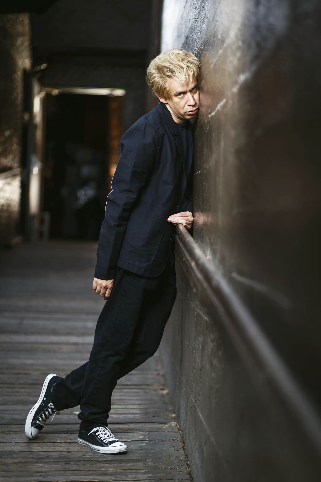
John Michael Fulton

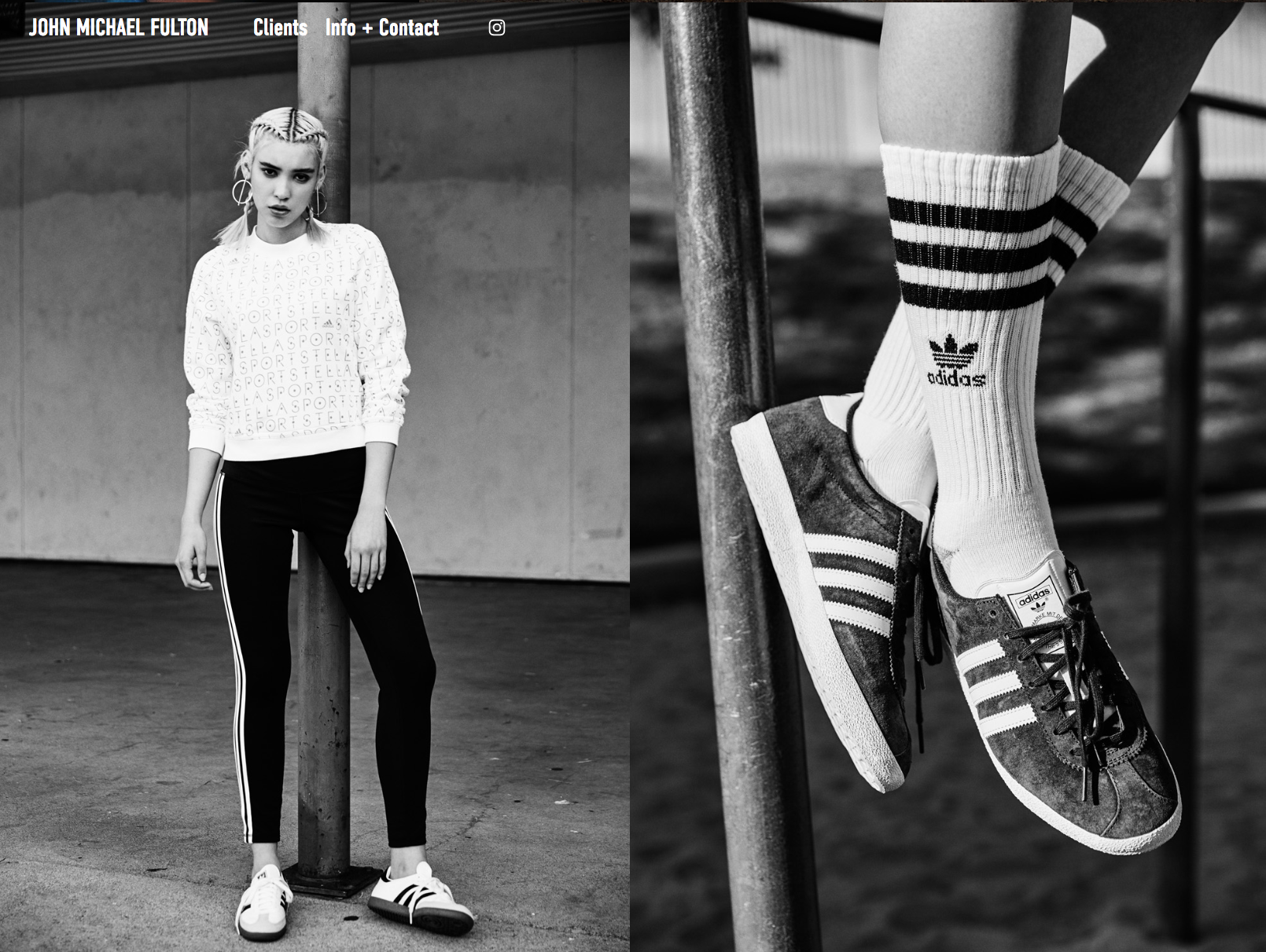
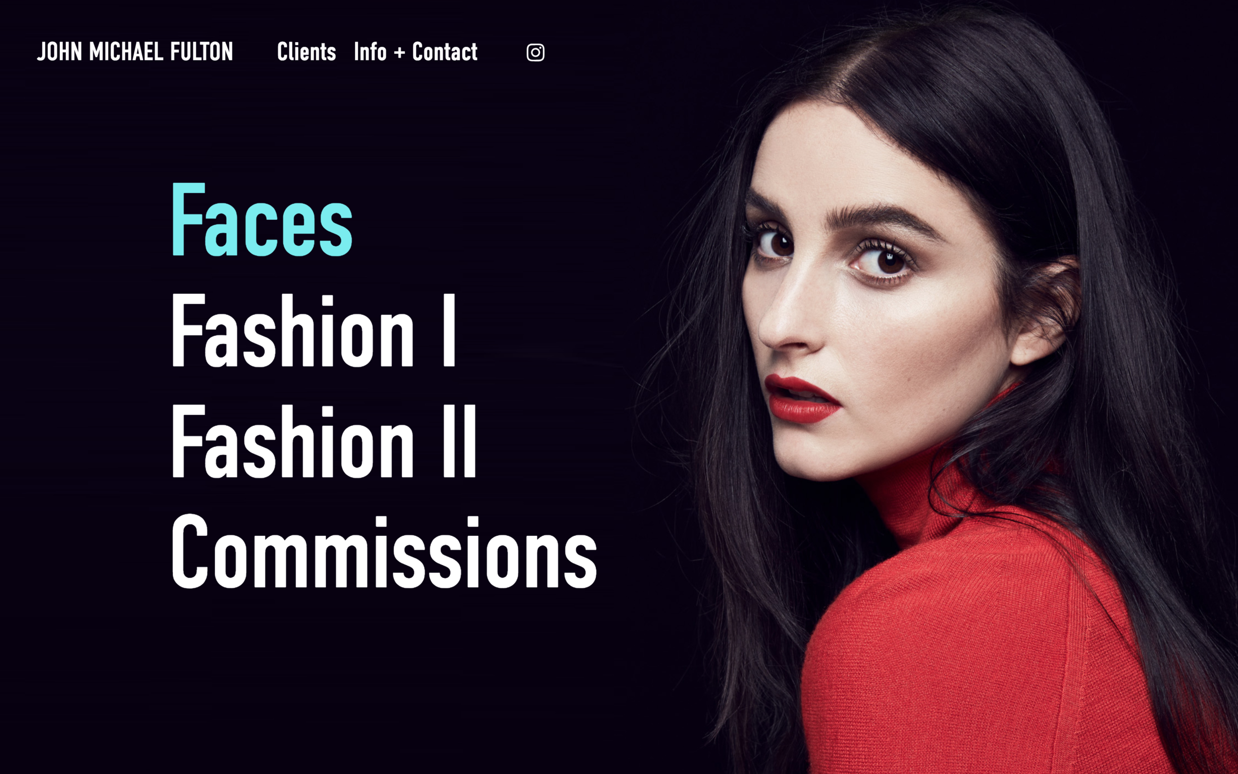
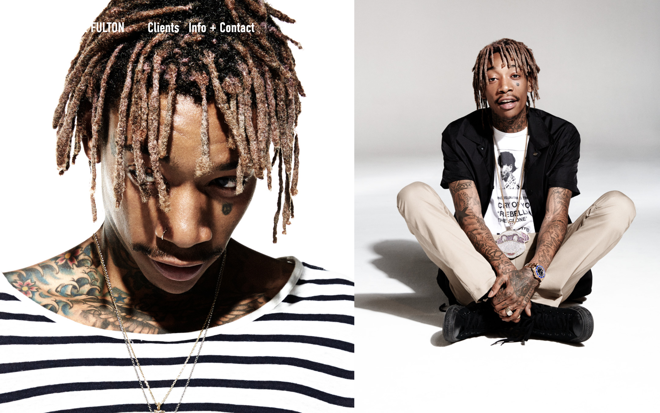
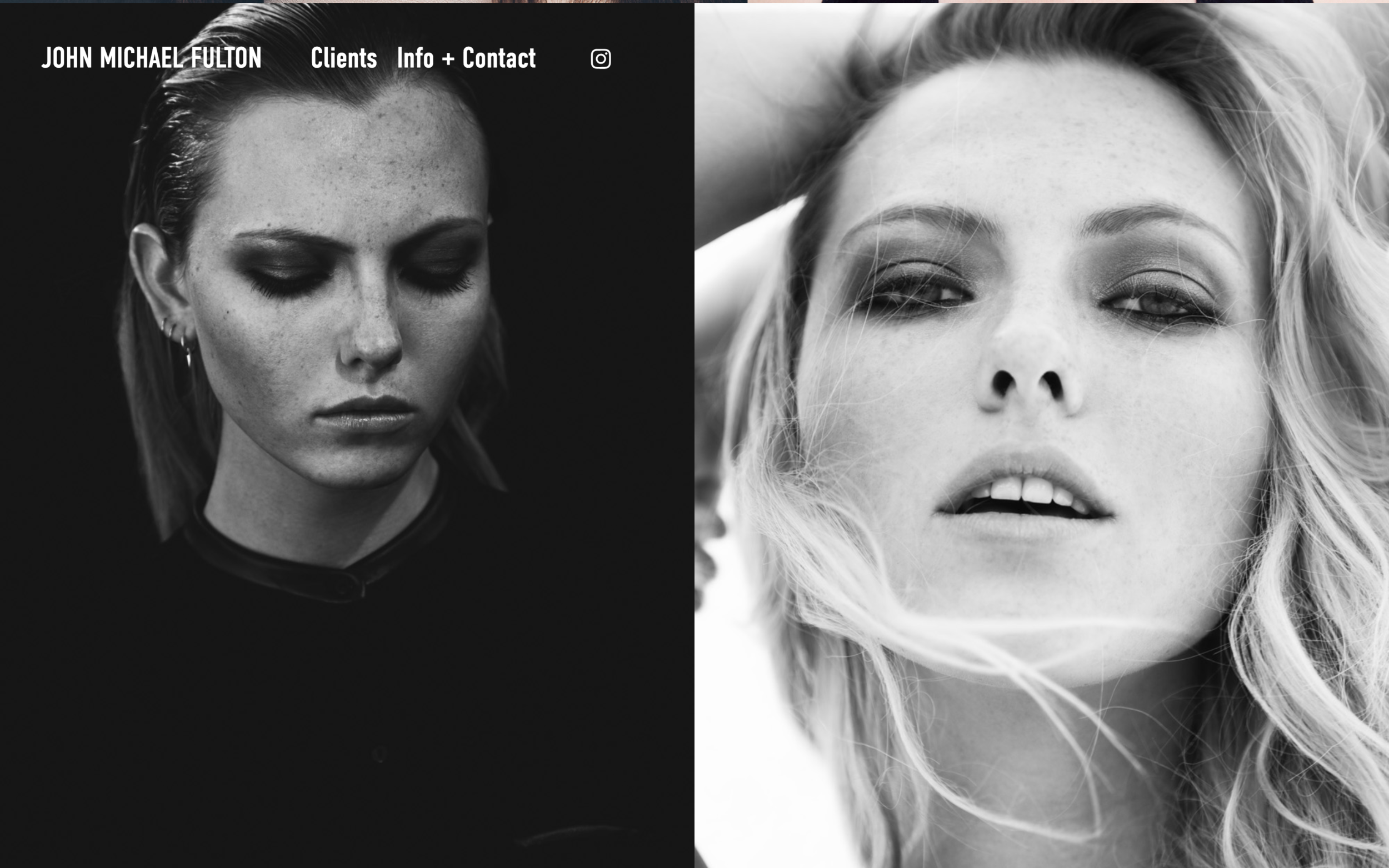
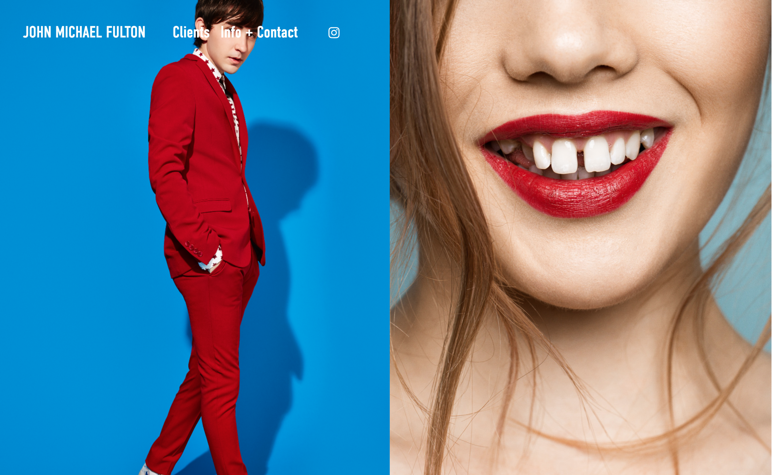
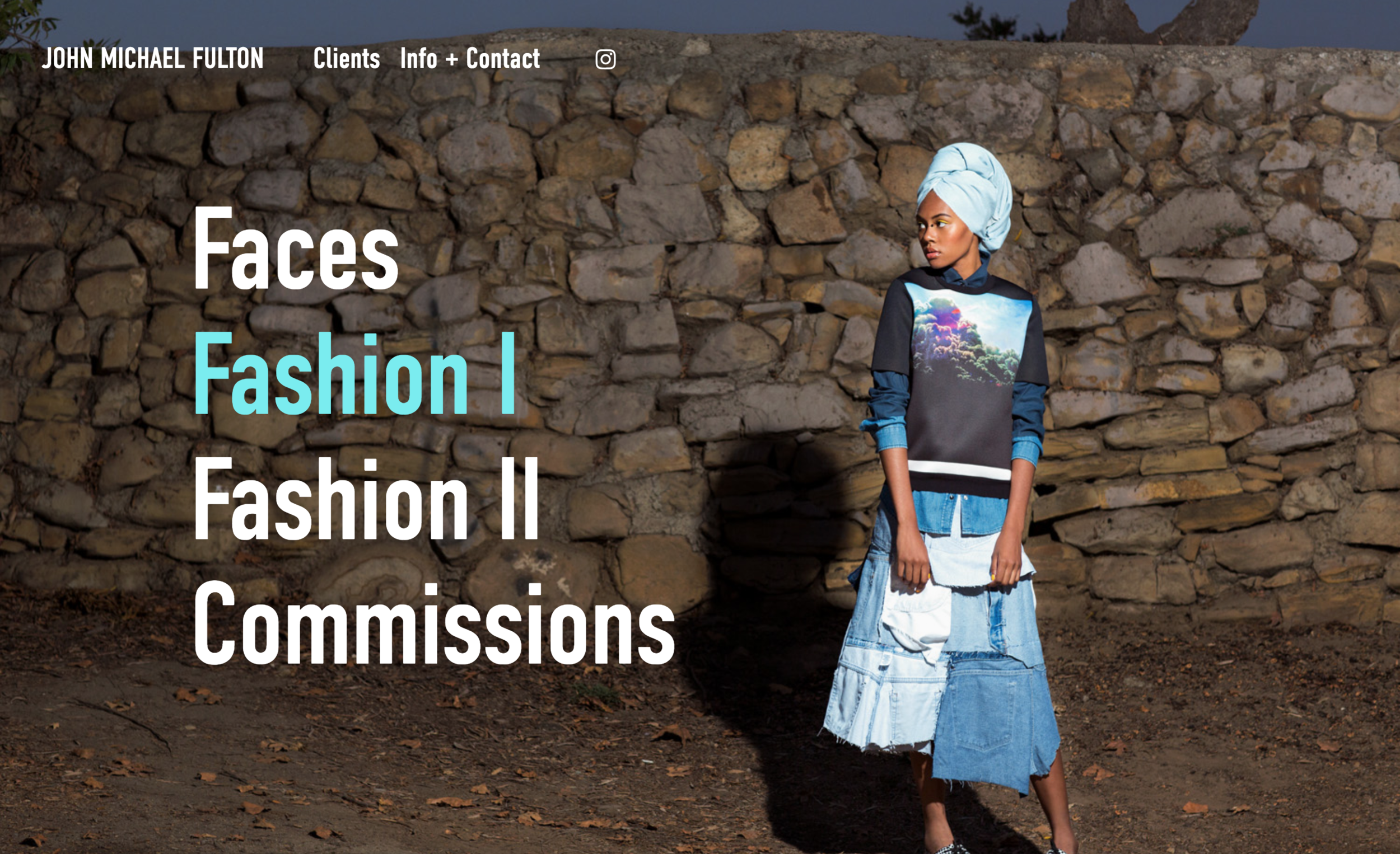
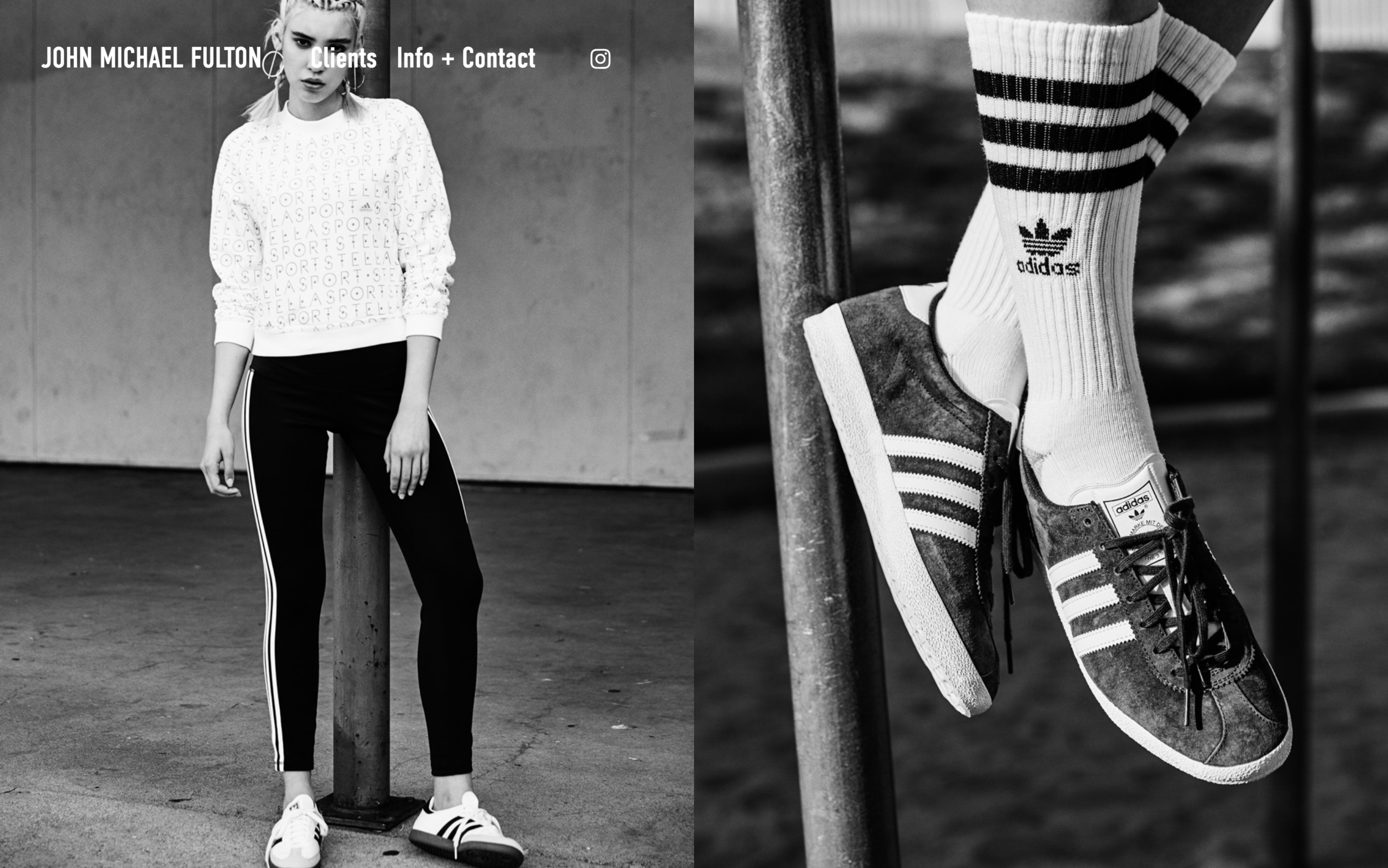
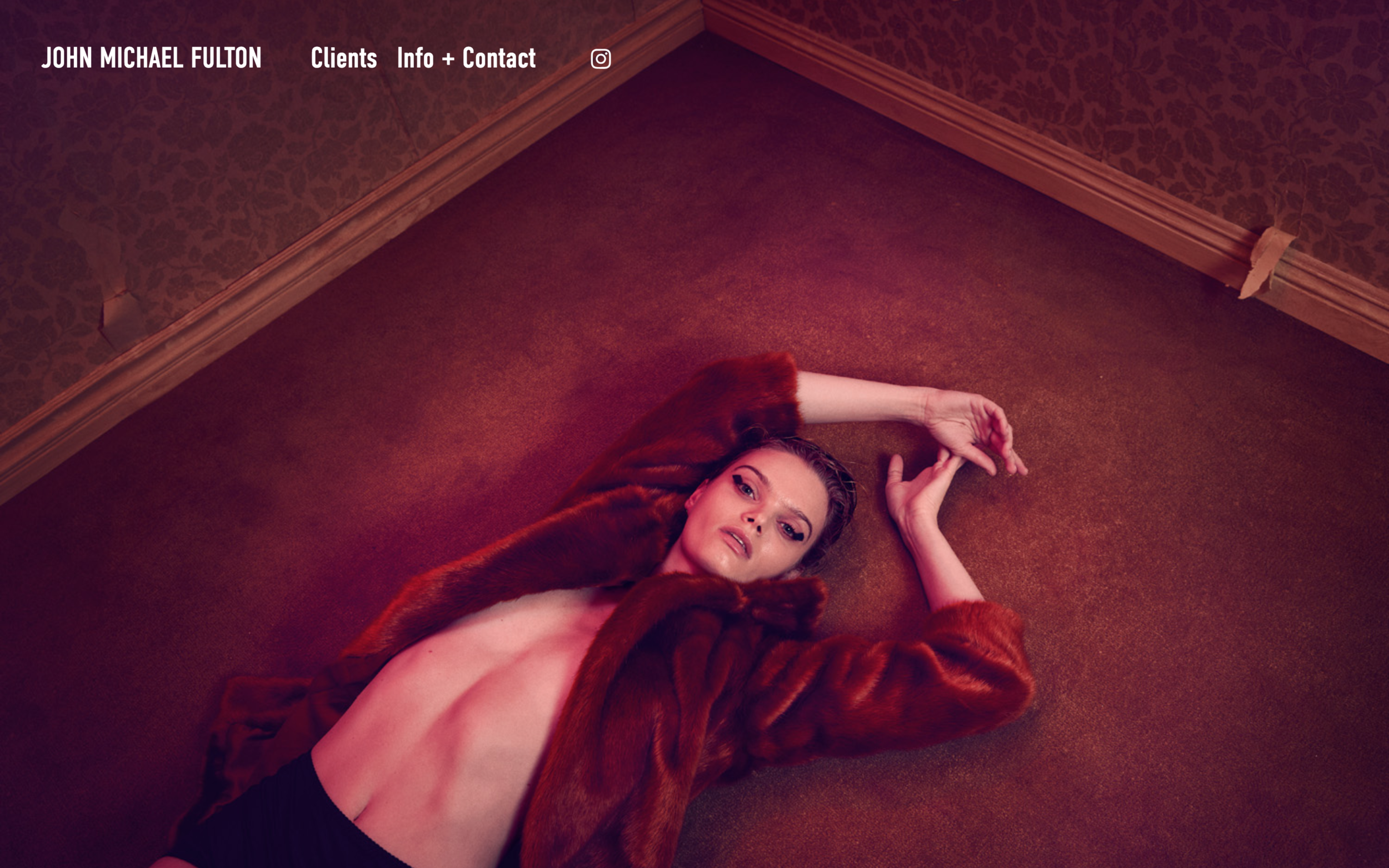
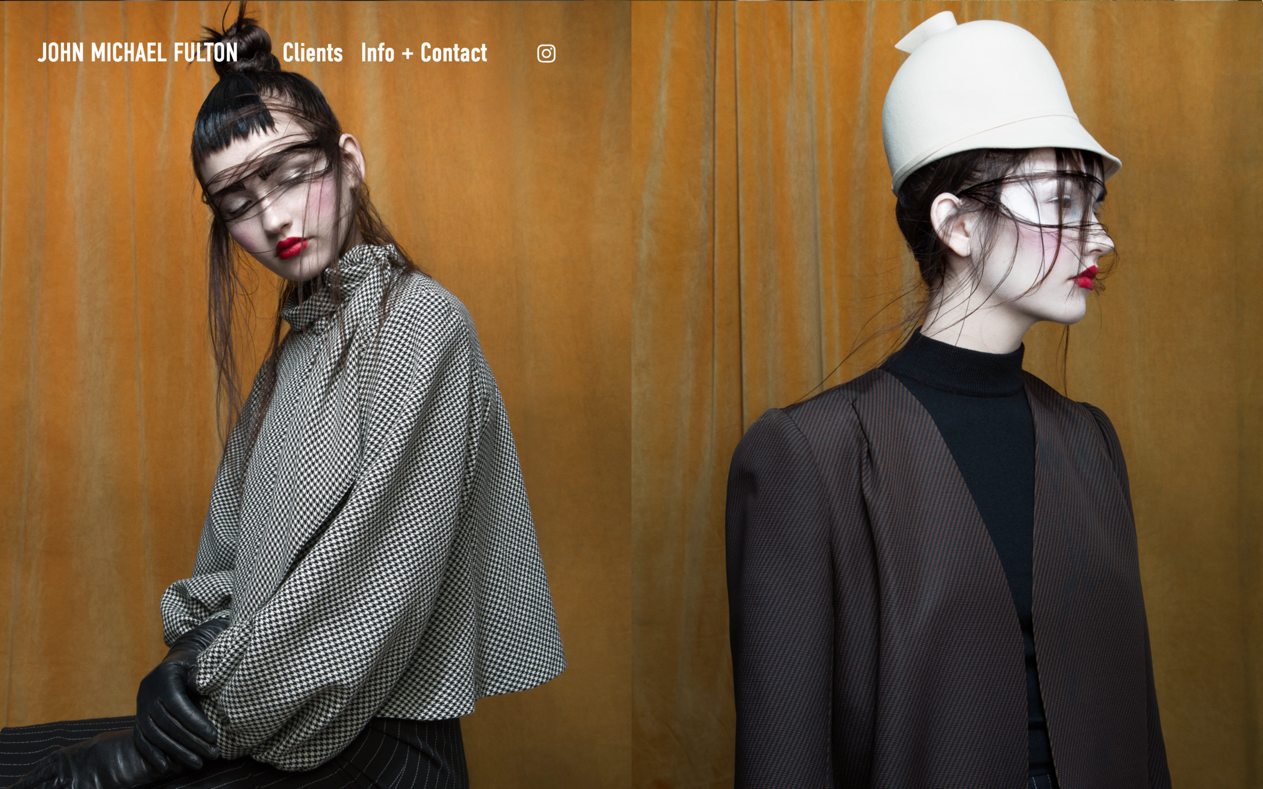
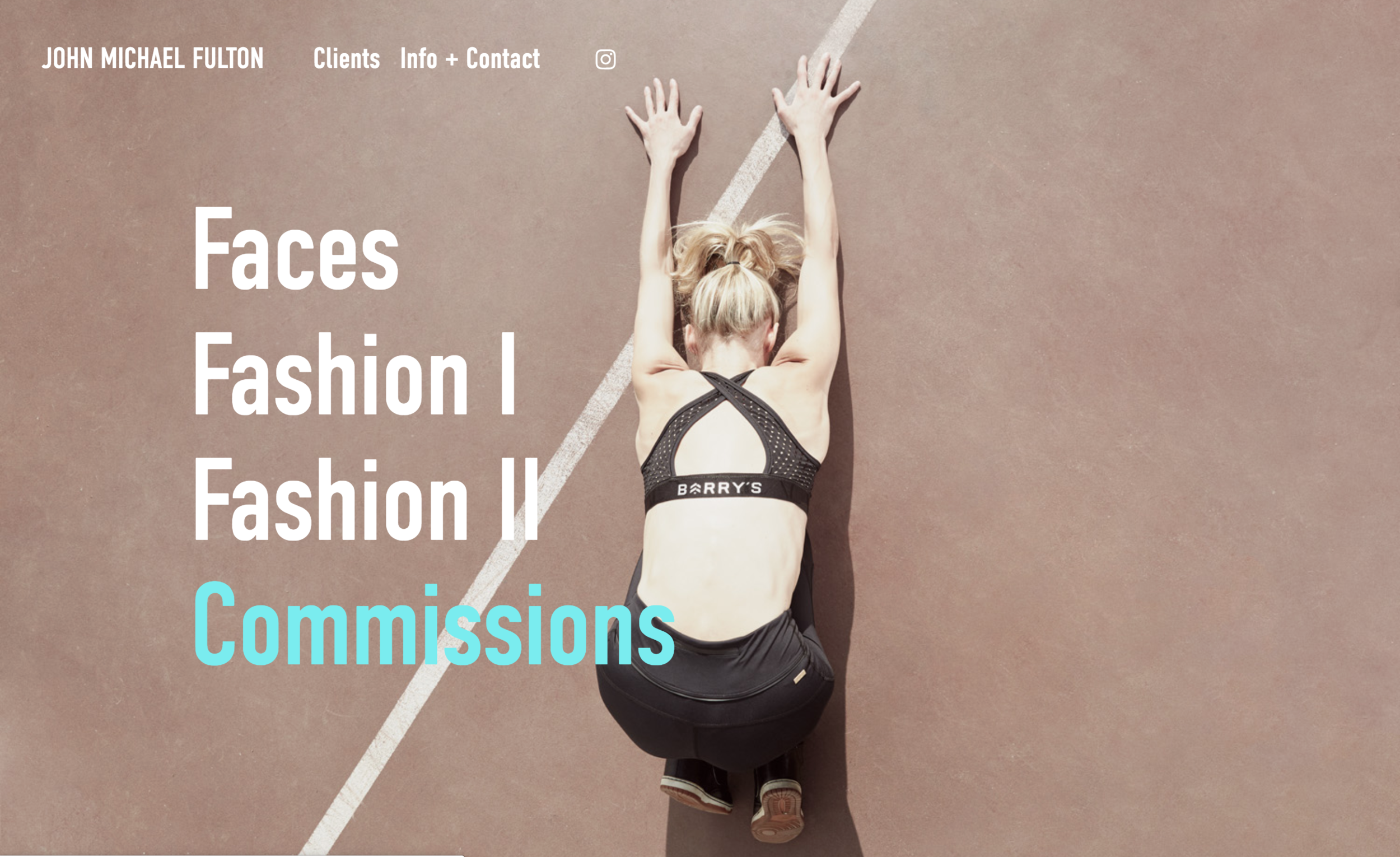
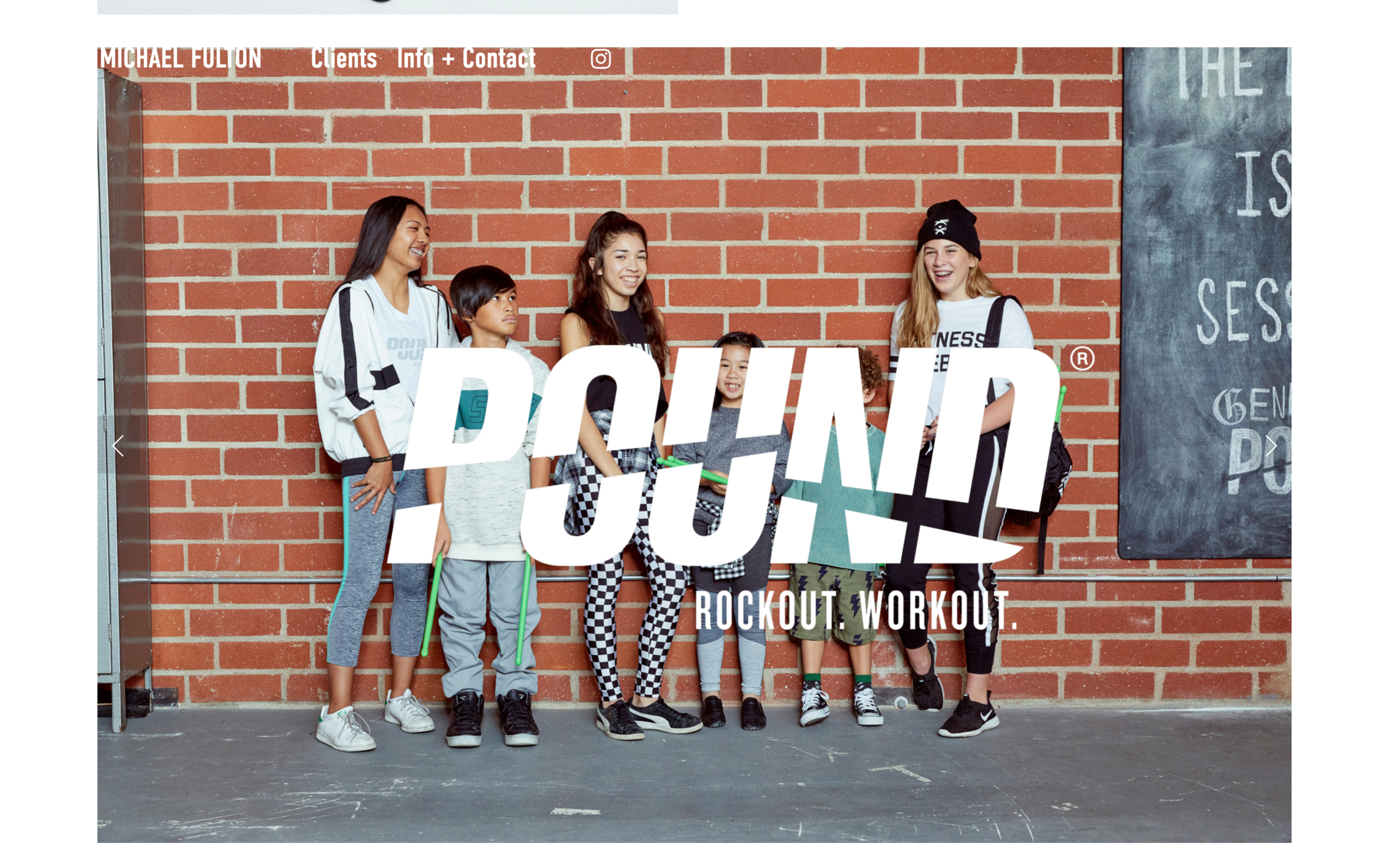
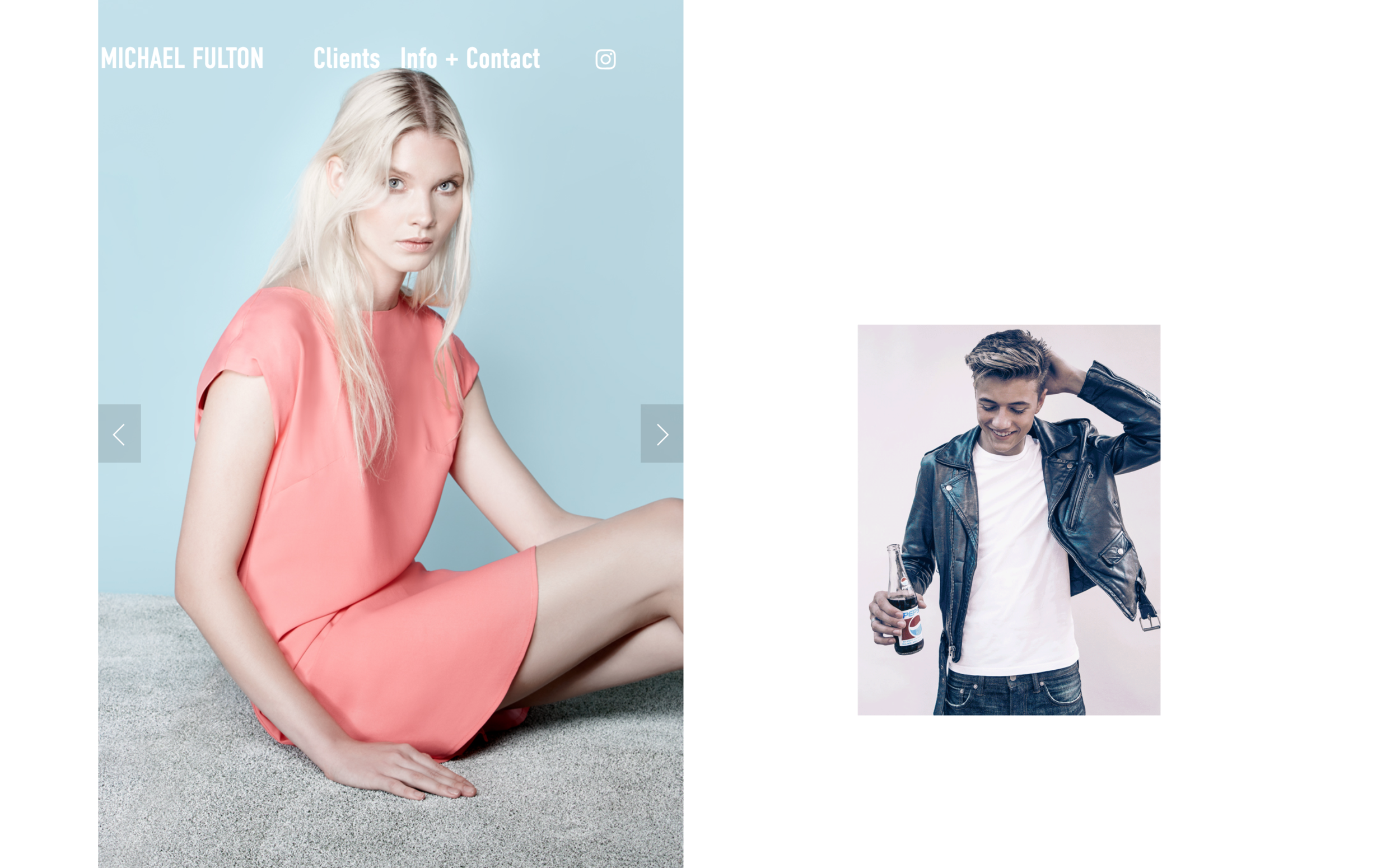
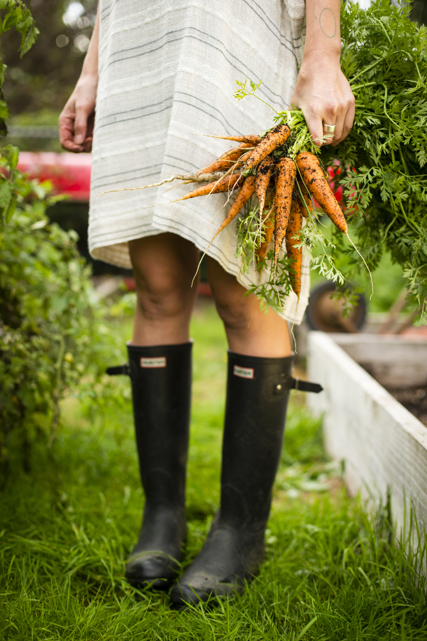
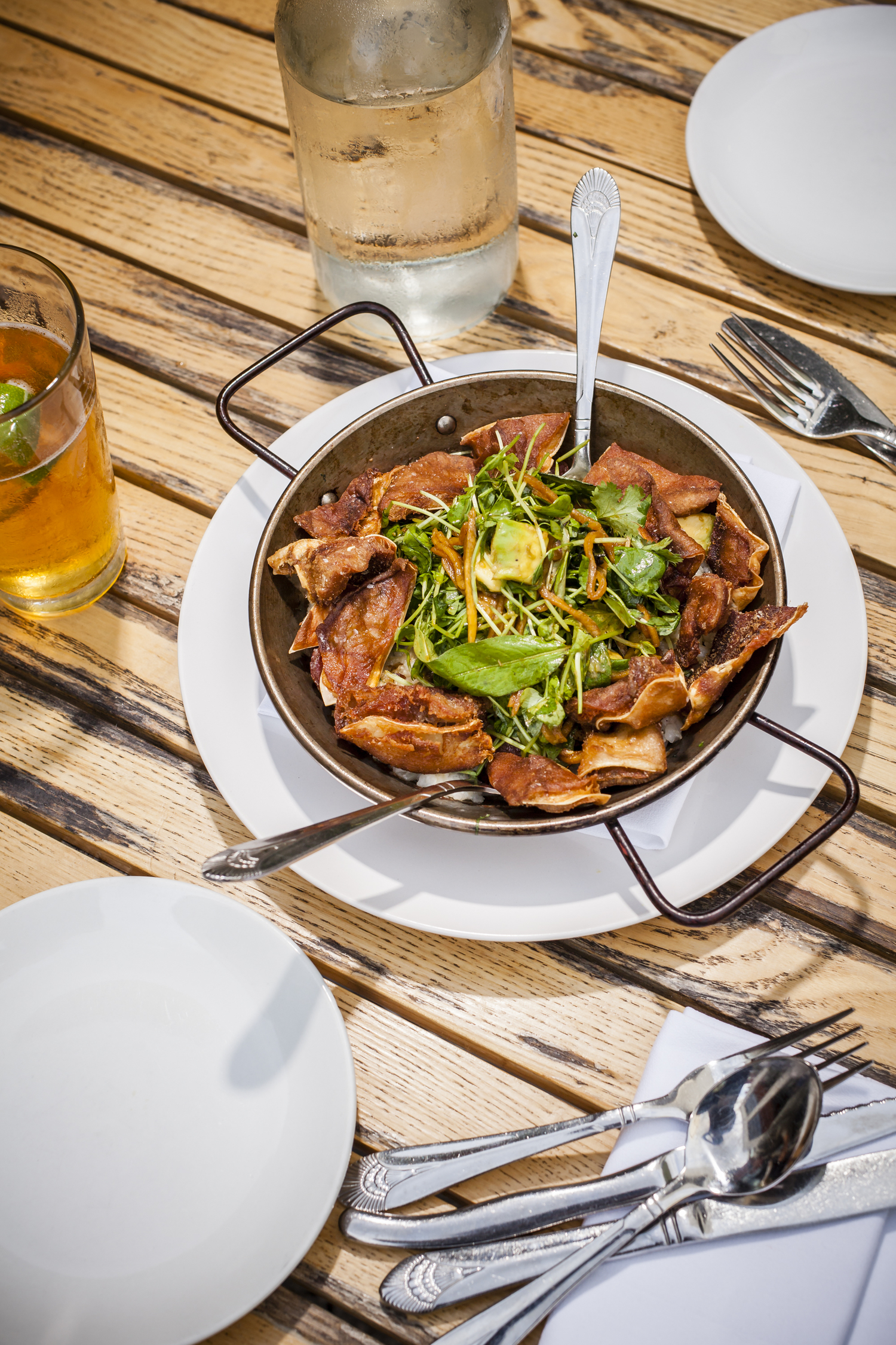
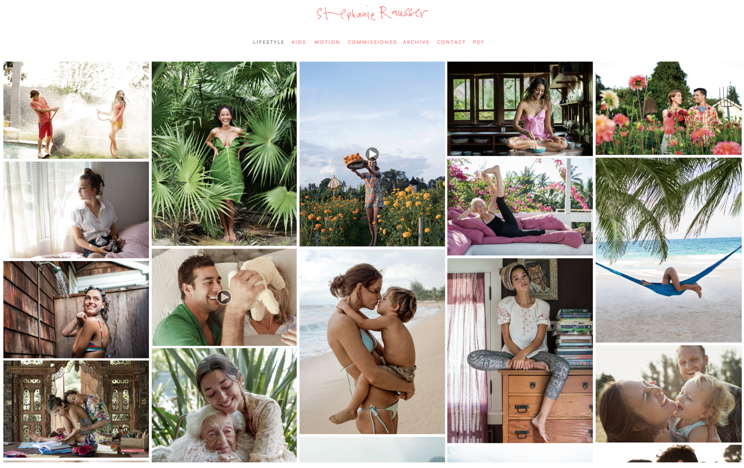
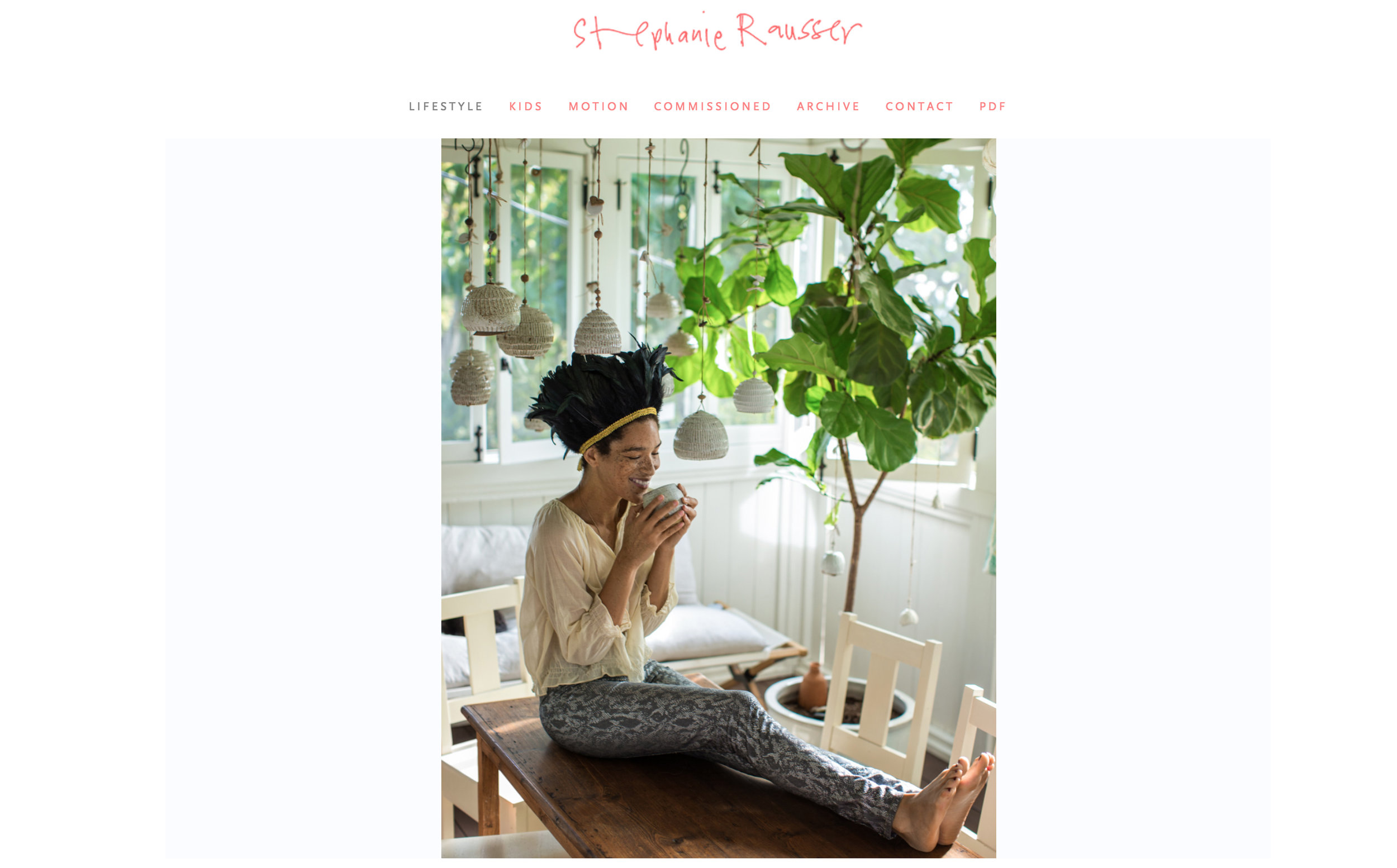
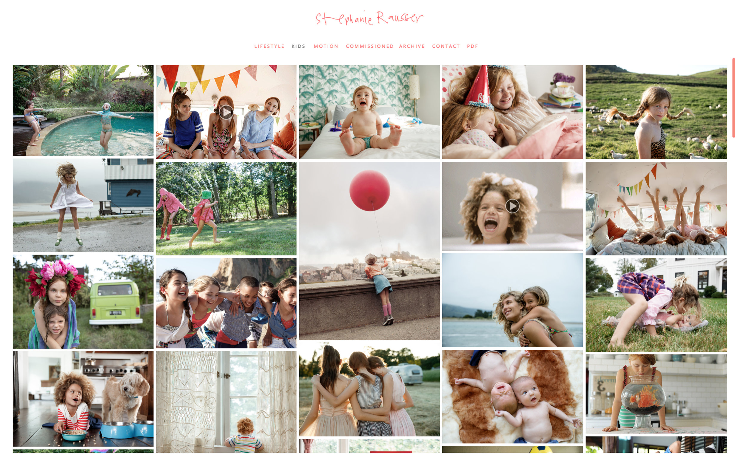
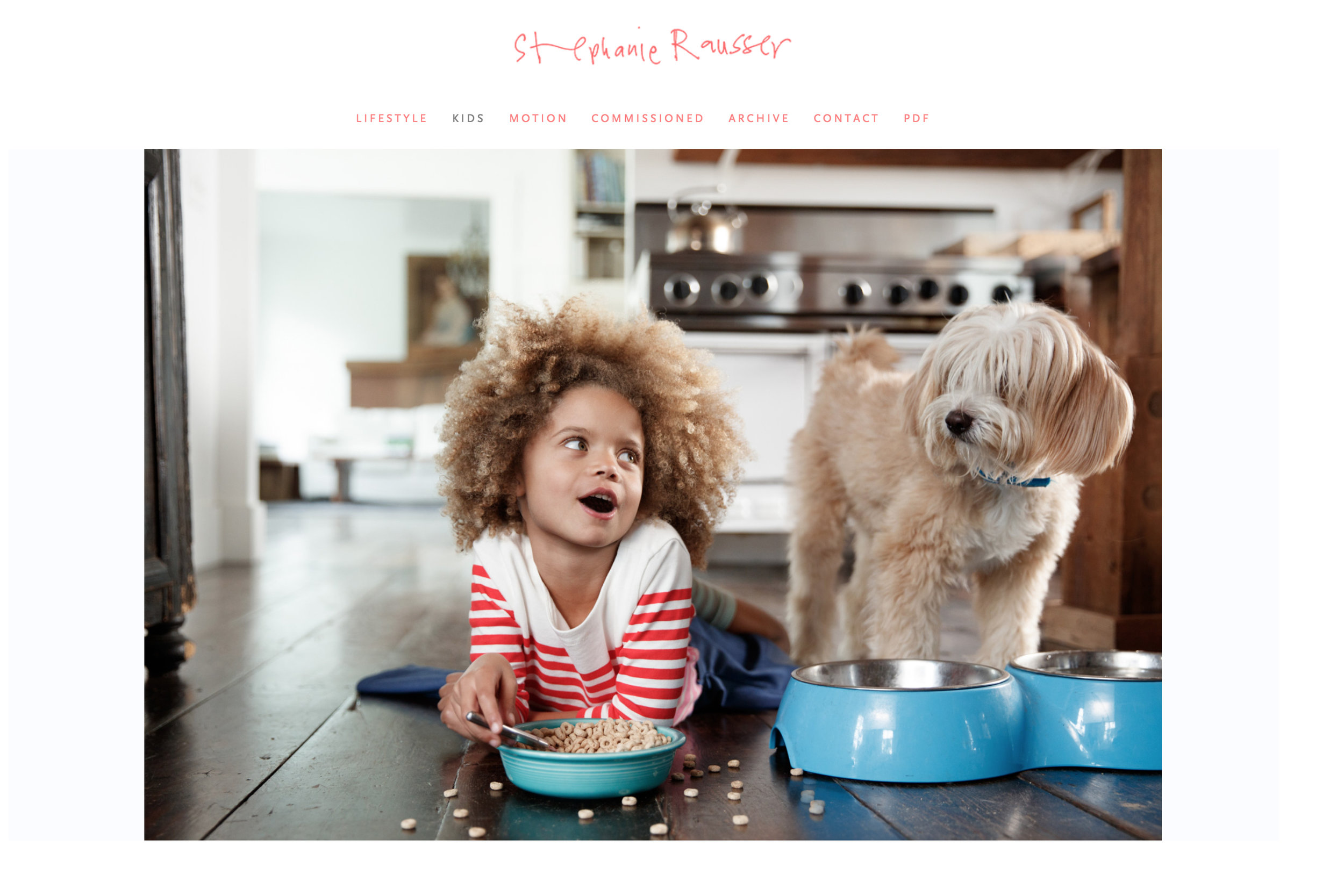
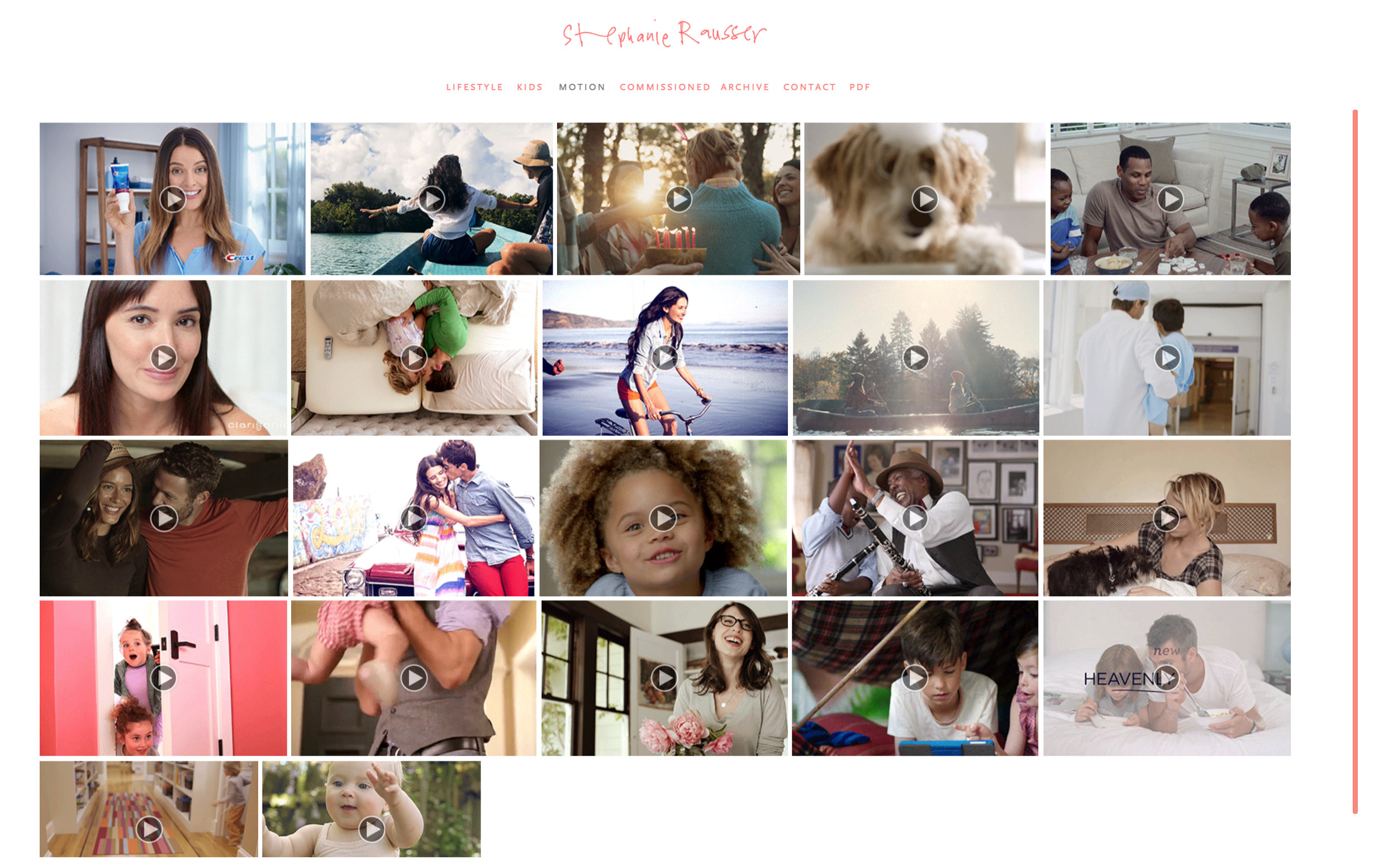
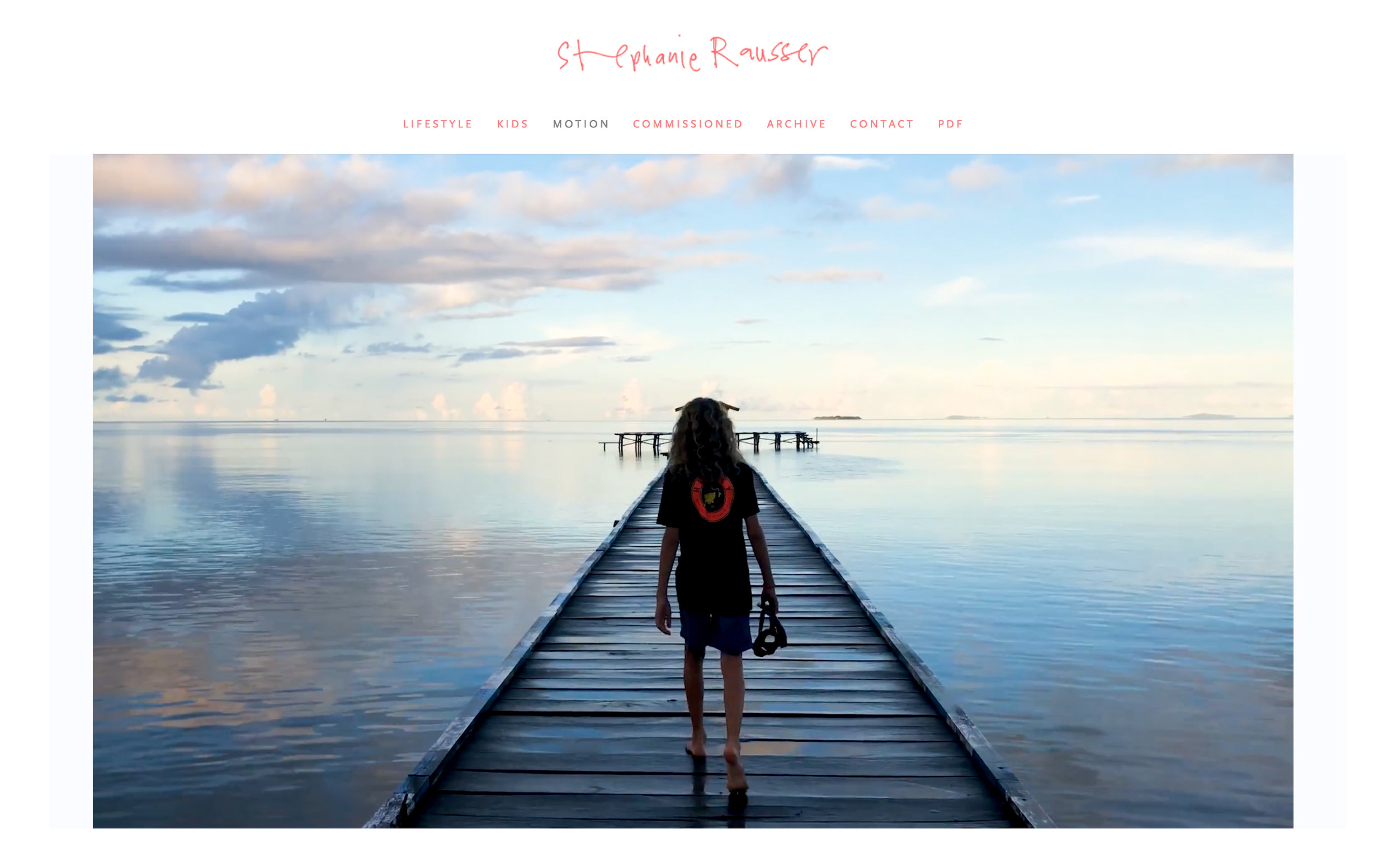
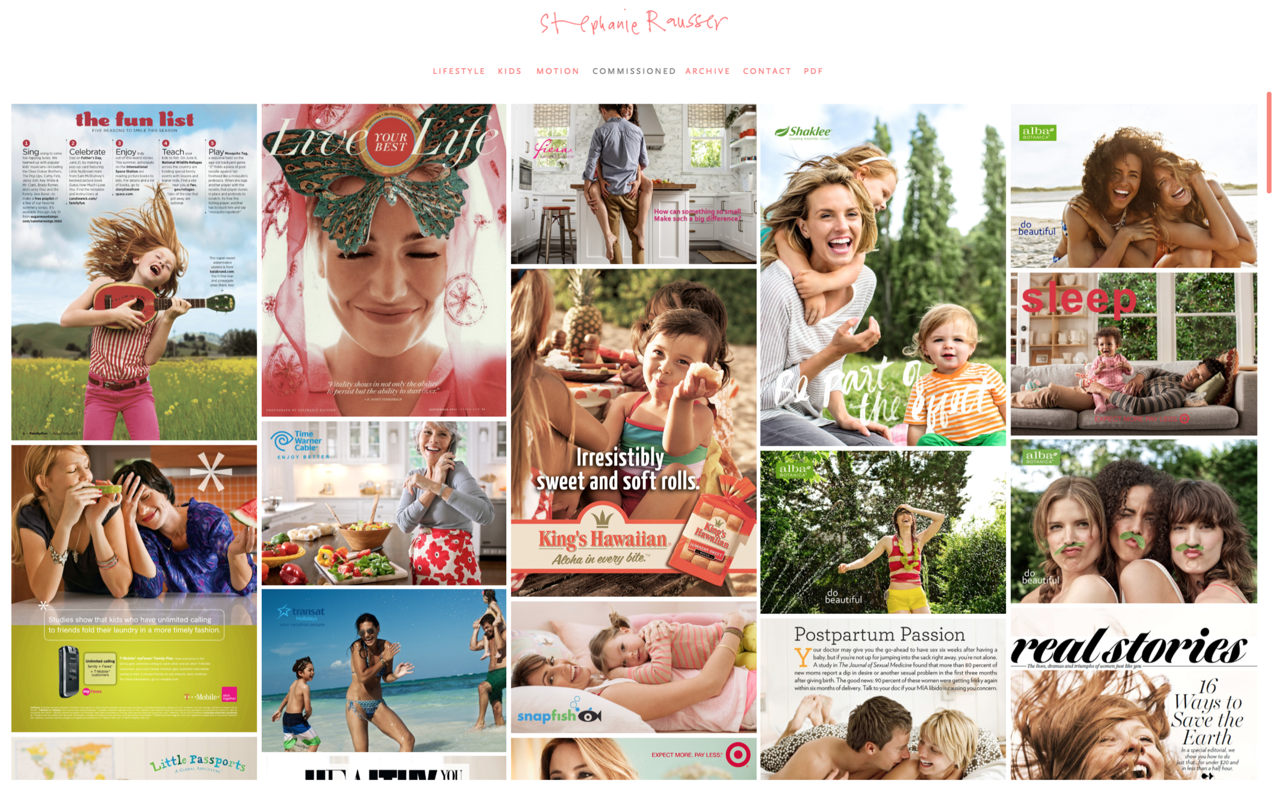
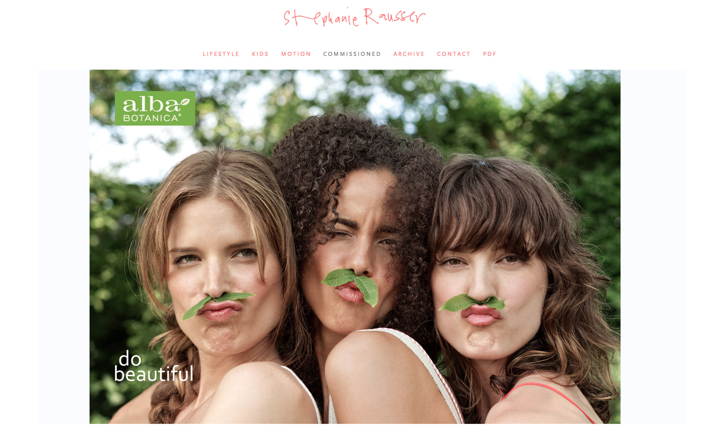
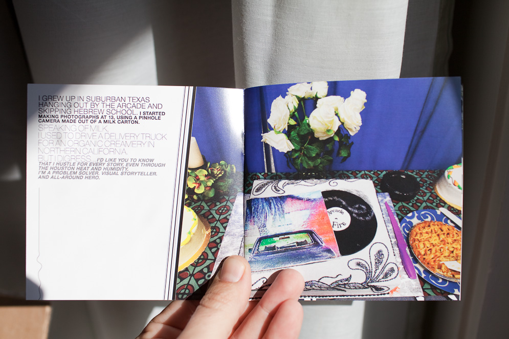
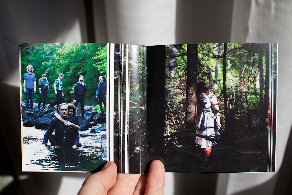
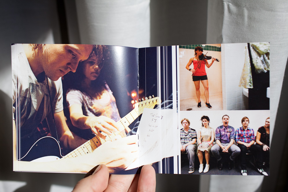
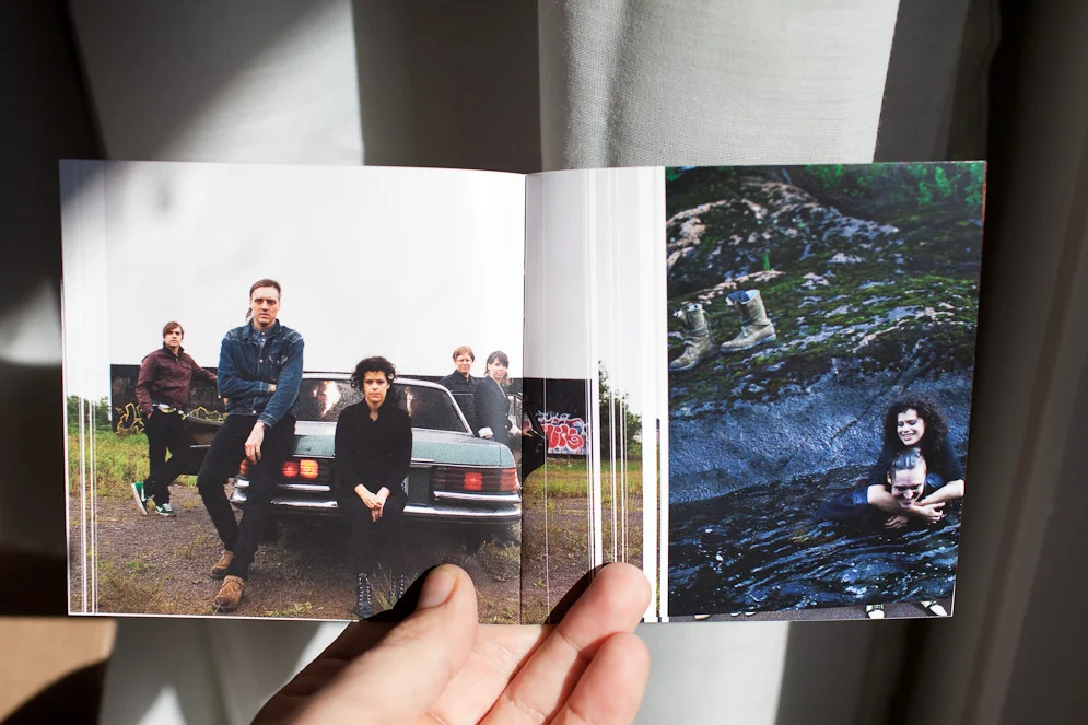
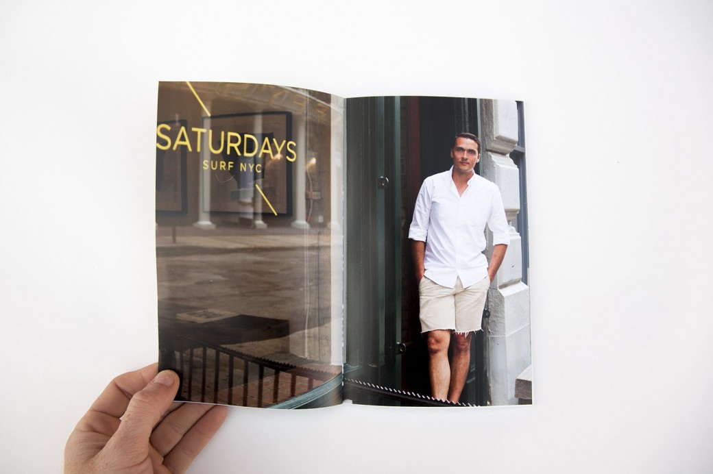
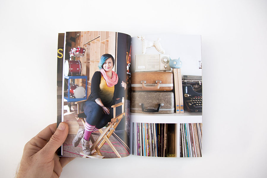
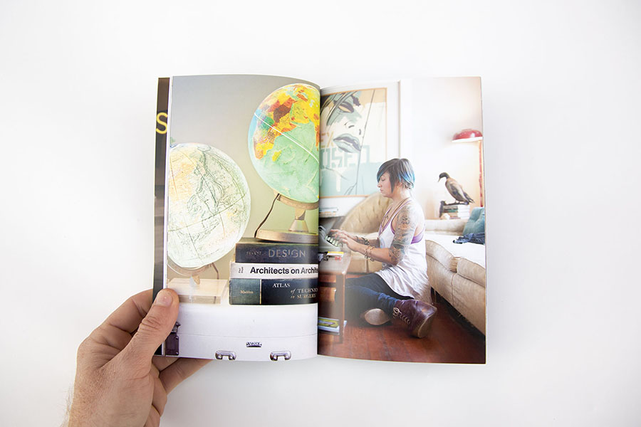
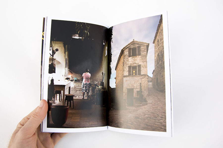
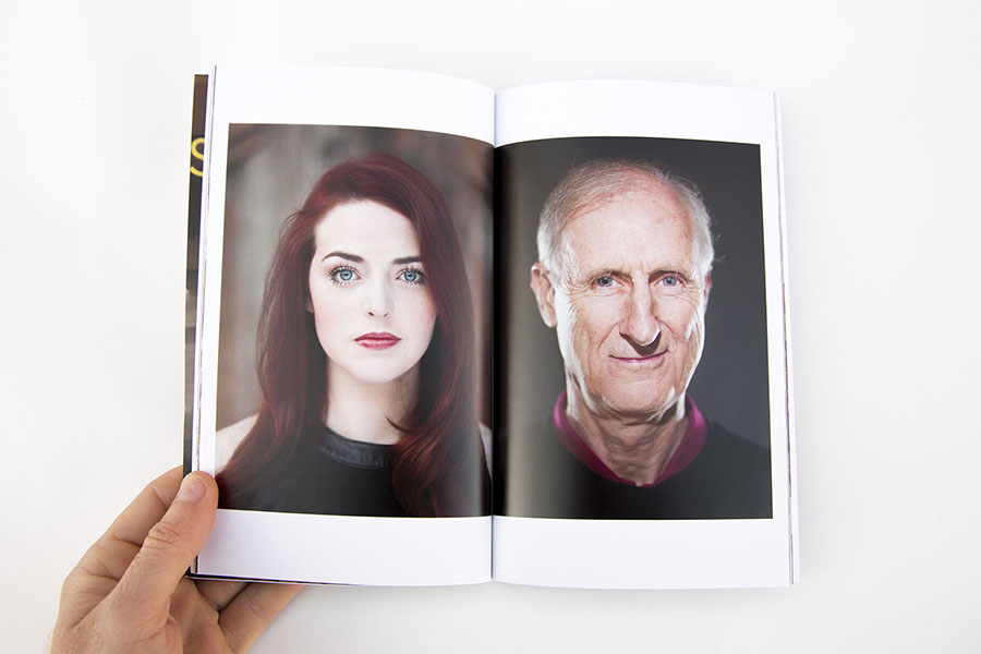
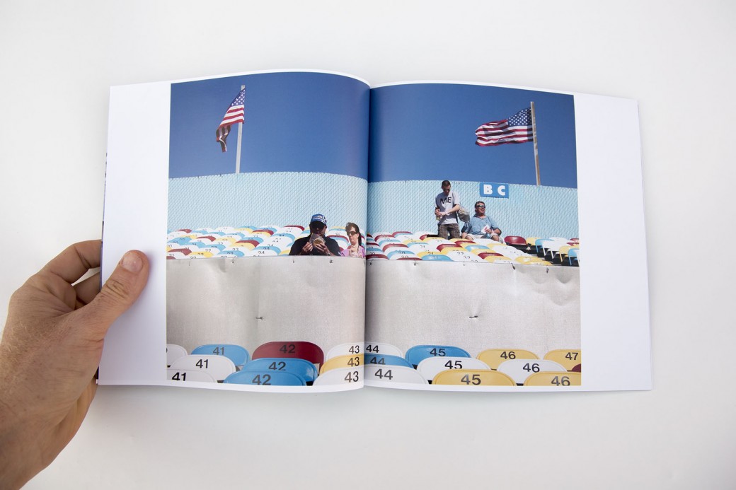
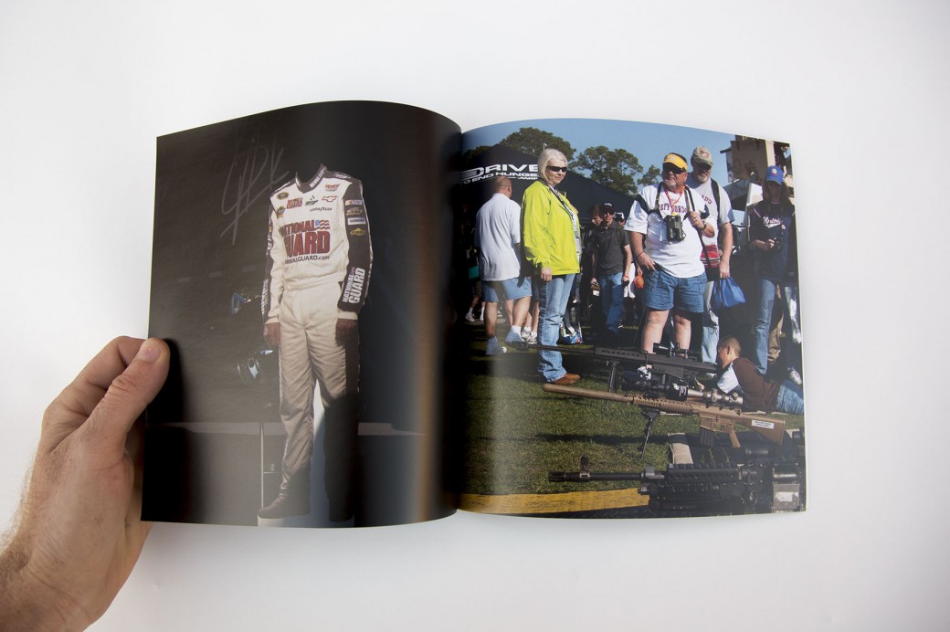
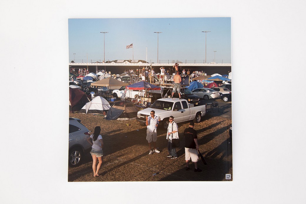
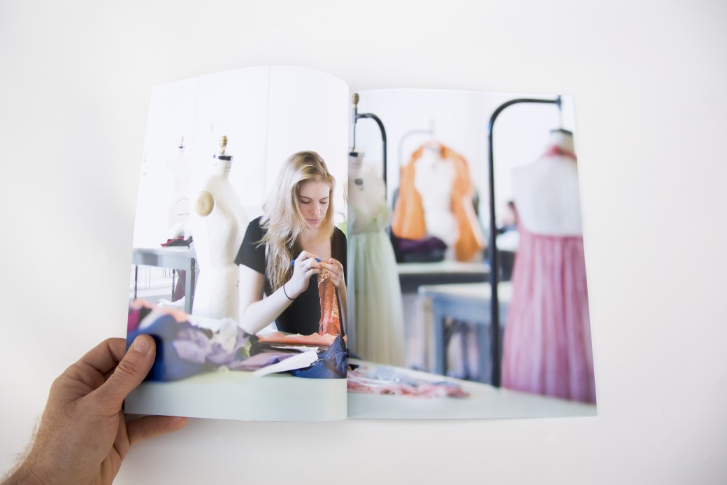
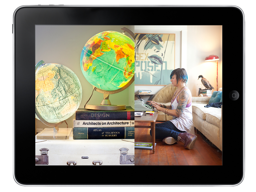
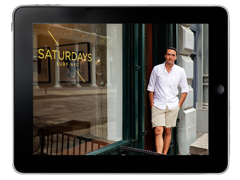
Last year I had the opportunity to work with John Michael Fulton. Together we created a brand new website that highlights his fashion, lifestyle and portrait photography.

JM works with editorial and commercial clients like 7 For All Mankind, Nylon Magazine, Mod Cloth, Rachel Zoe and many more.

I’m looking forward to following his work and seeing future projects. See more of his work at www.johnmichaelfulton.com.

Susie Mann

Screen Shot 2019-01-27 at 10.55.22 PM.png

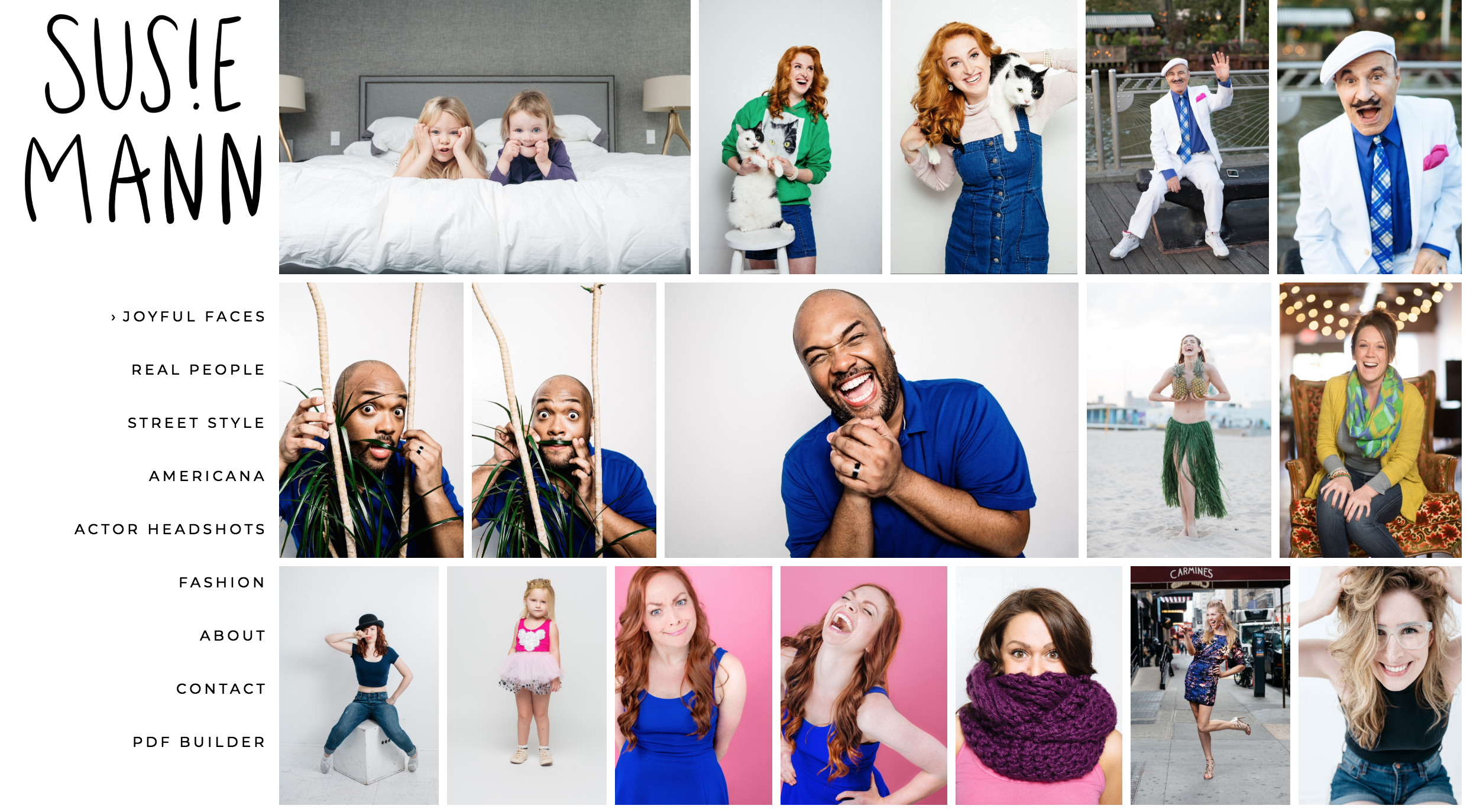
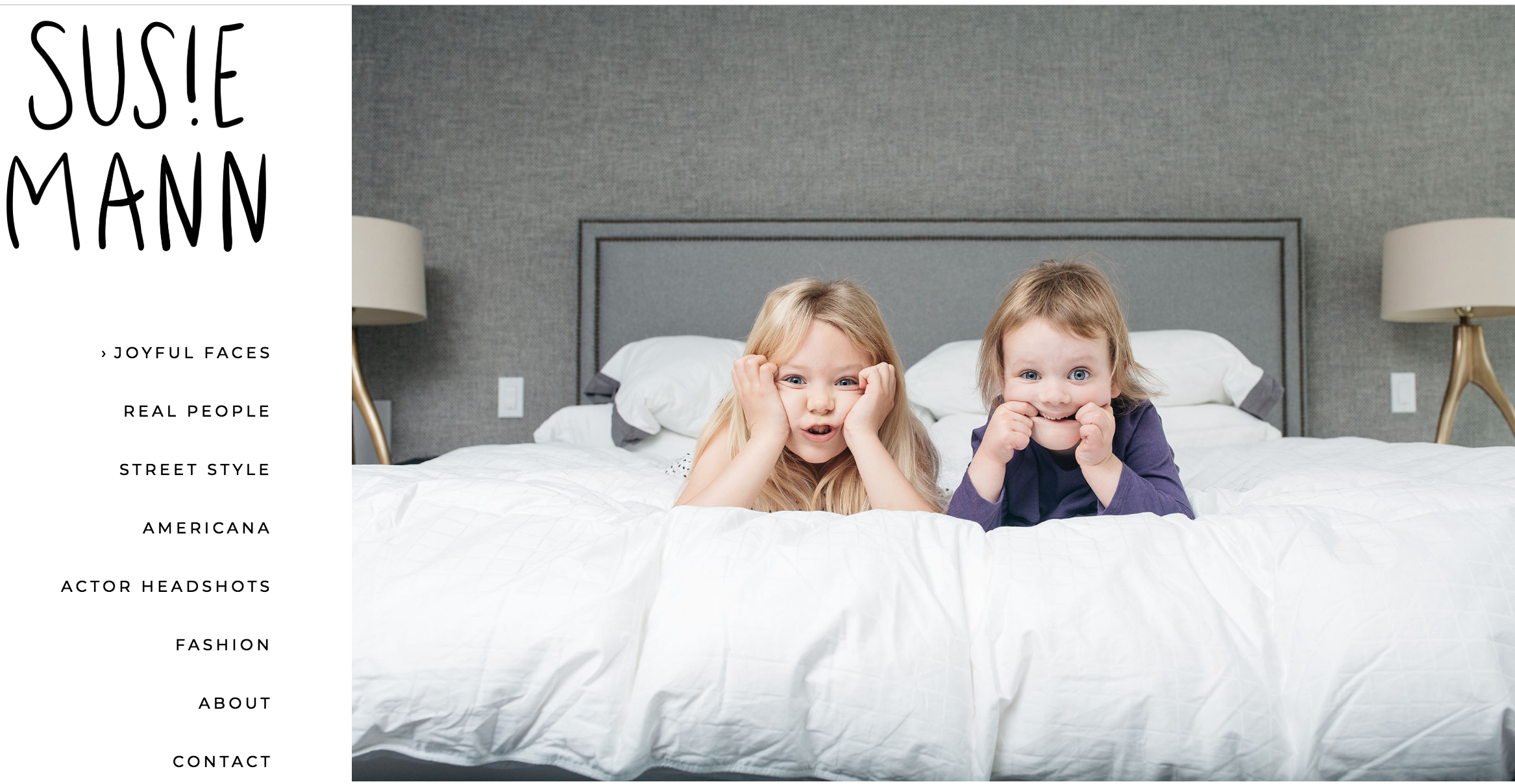
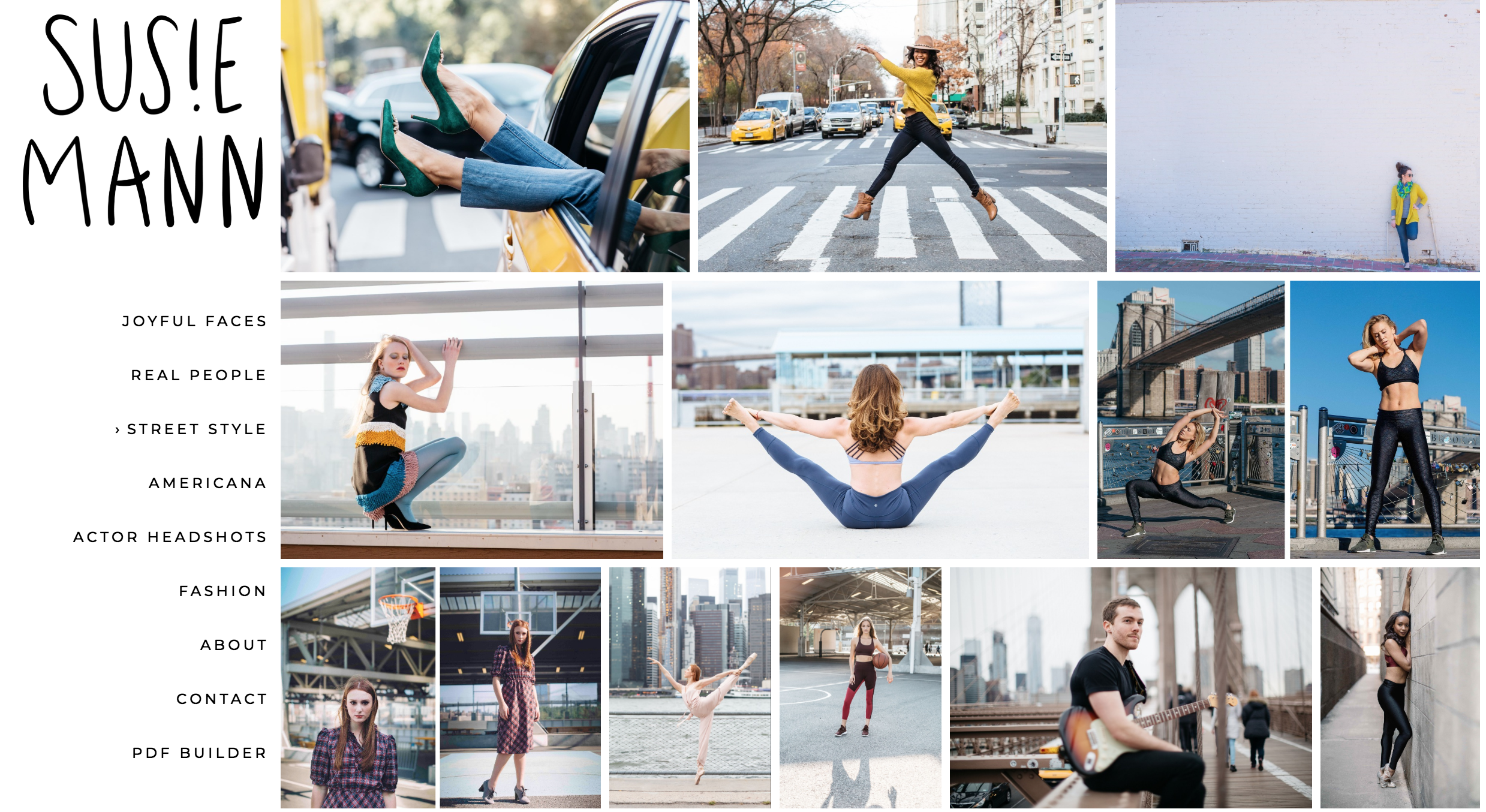
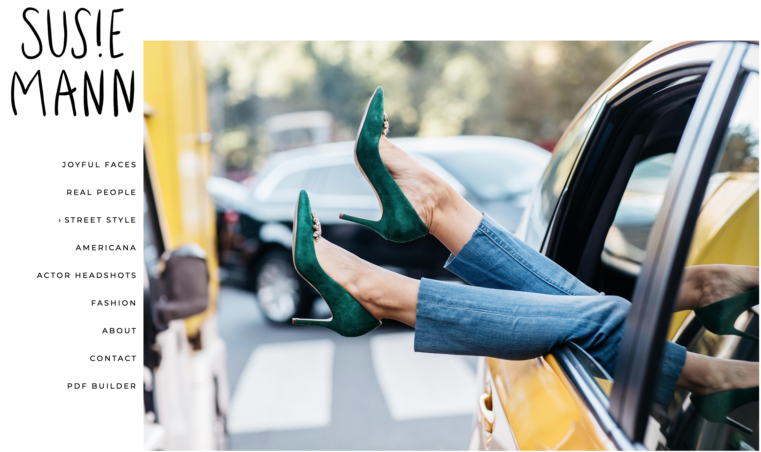
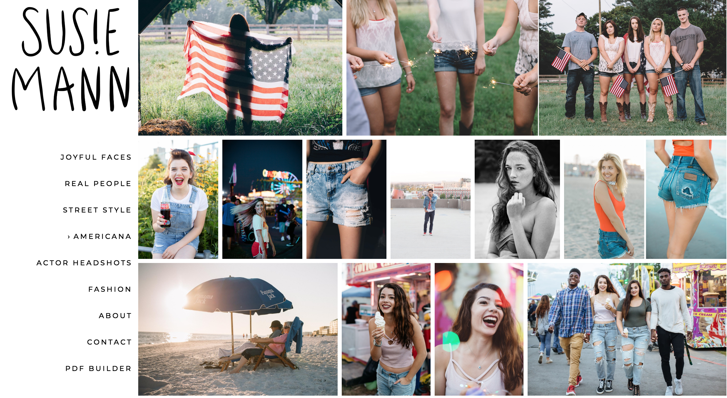
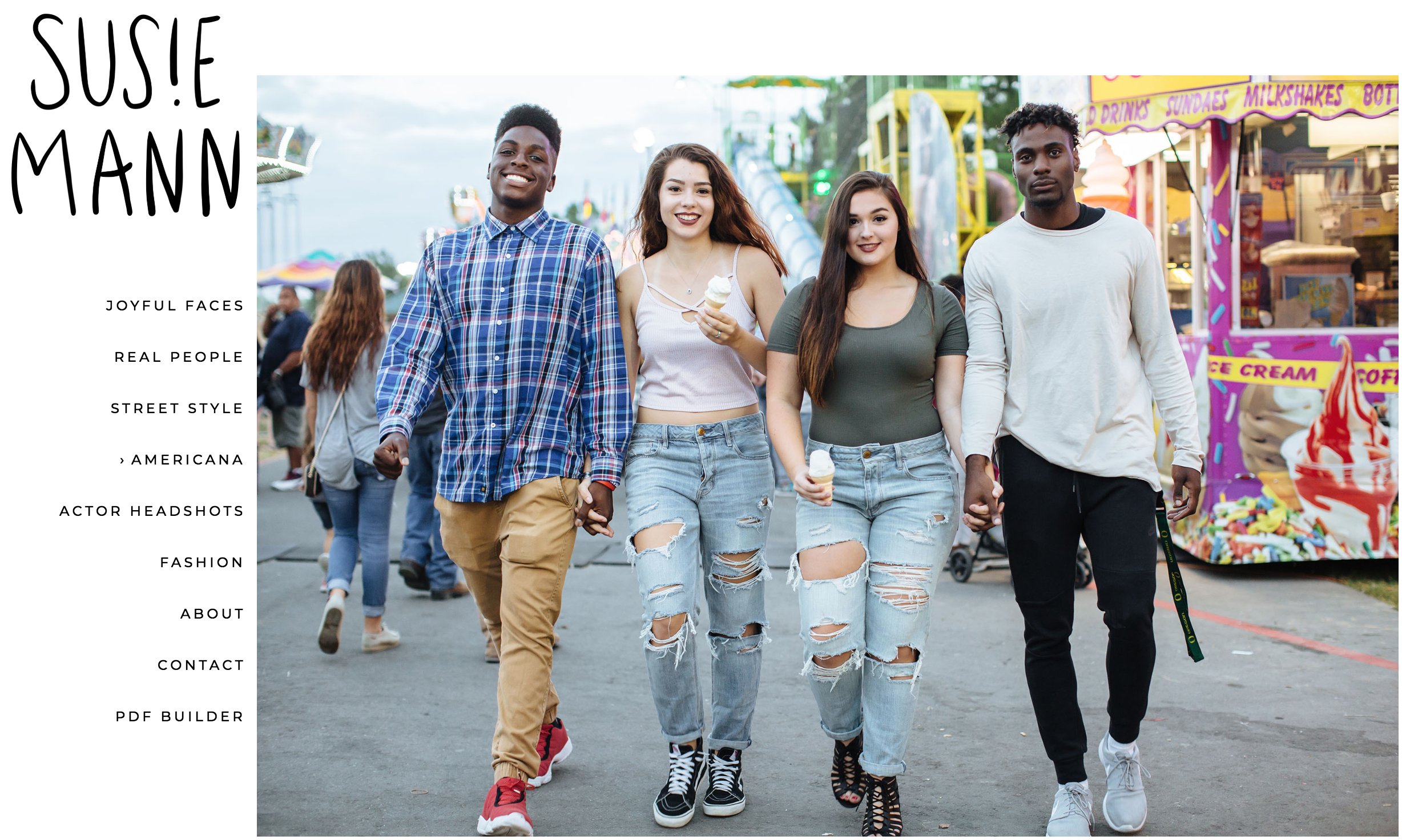
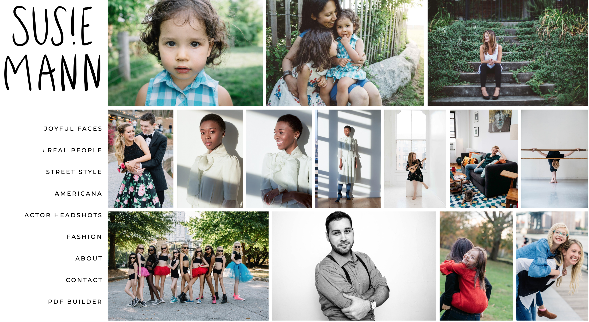
I’m so happy to share the website I created with NYC-based lifestyle and portrait photographer Susie Mann (@susiemcreative). Susie brings a fabulous energy to her work, creating images where people exude confidence and joy.

Susie came to me looking to freshen up her portfolio and marketing.

Here’s what we did together:

✅ Talked about her goals, what inspires her, and what kind of work she enjoys doing the most.

✅ Updated her website with a totally new edit

✅ Fine-tuned her @aphotofolio website template (love the new look!)

✅ Marketed her website update with an email blast to relevant clients

These are a few of my favorite photos from her site. Check out the full galleries here.

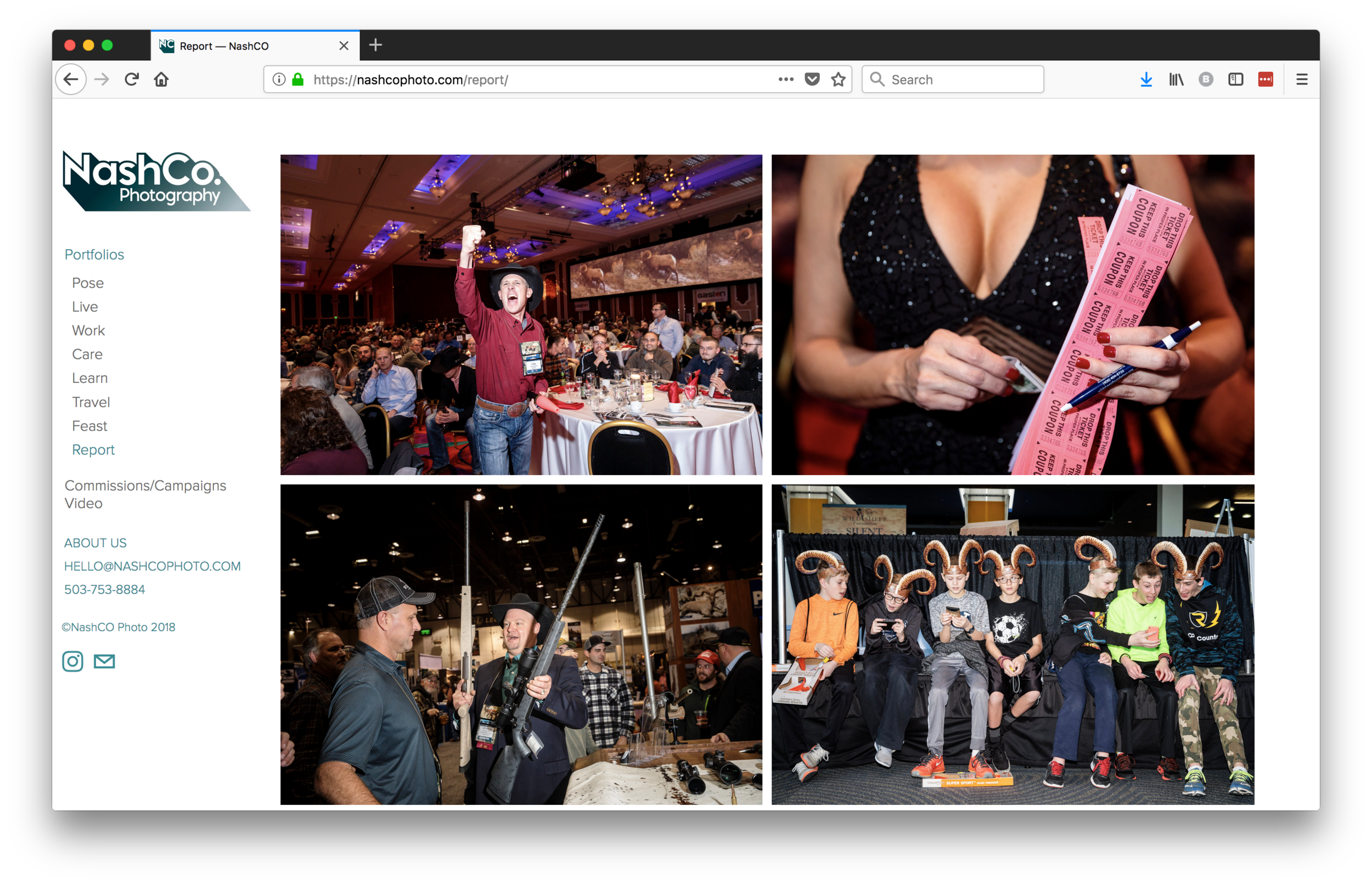
NashCo

Screen Shot 2019-01-27 at 10.31.22 PM.png

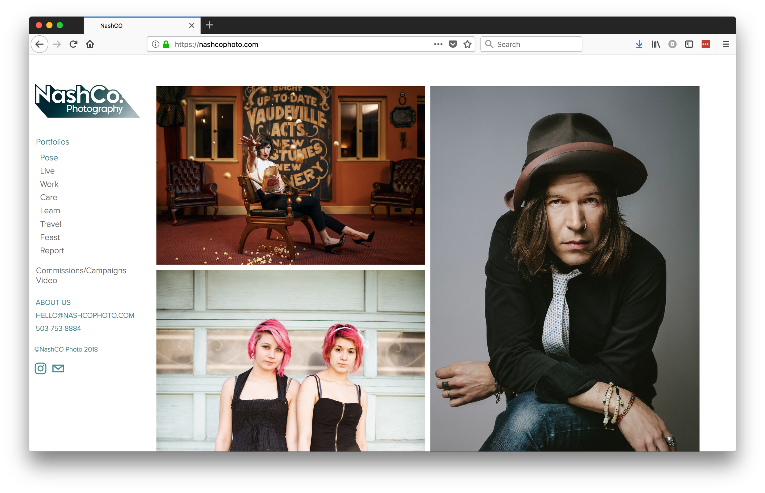
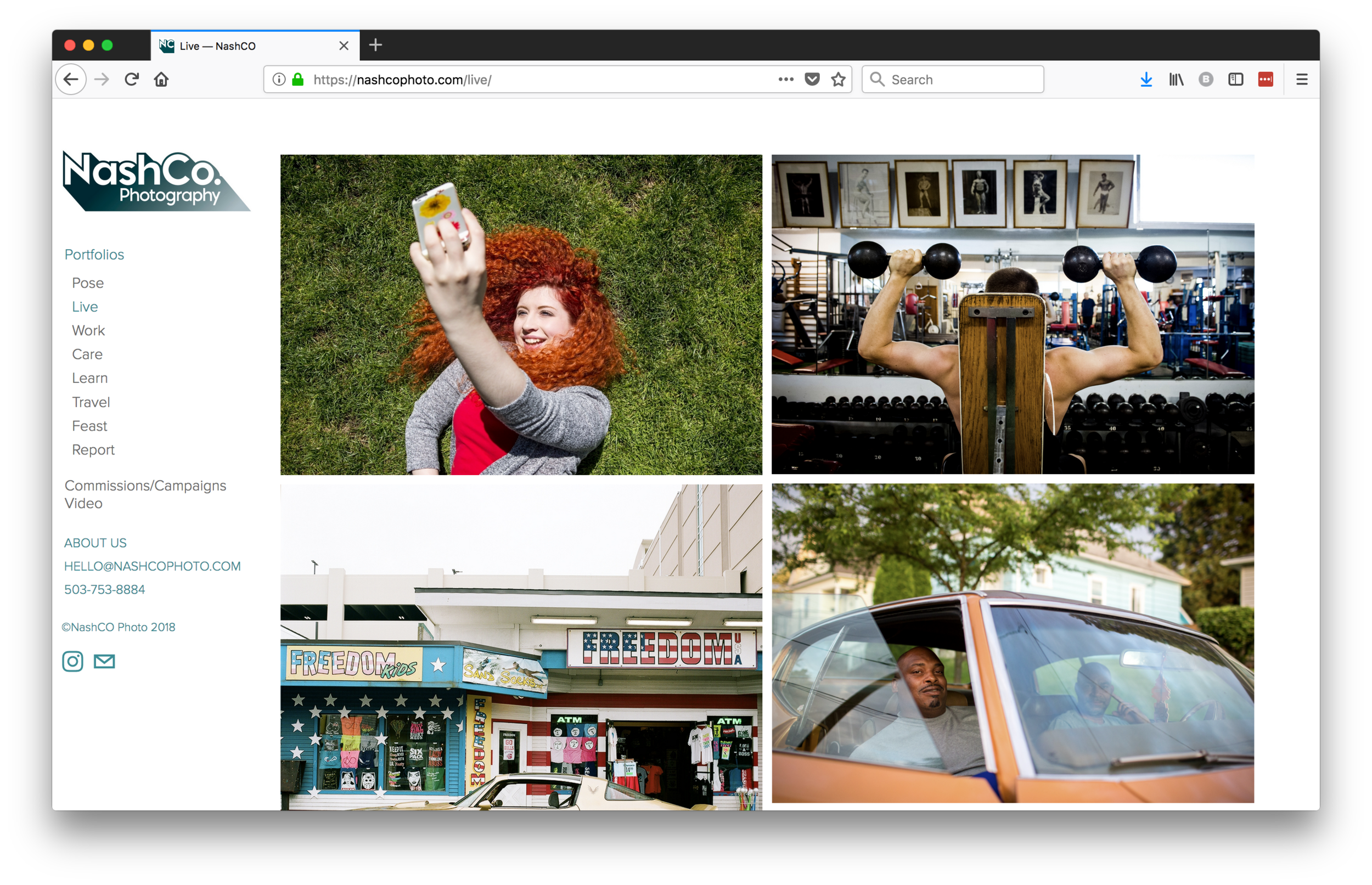
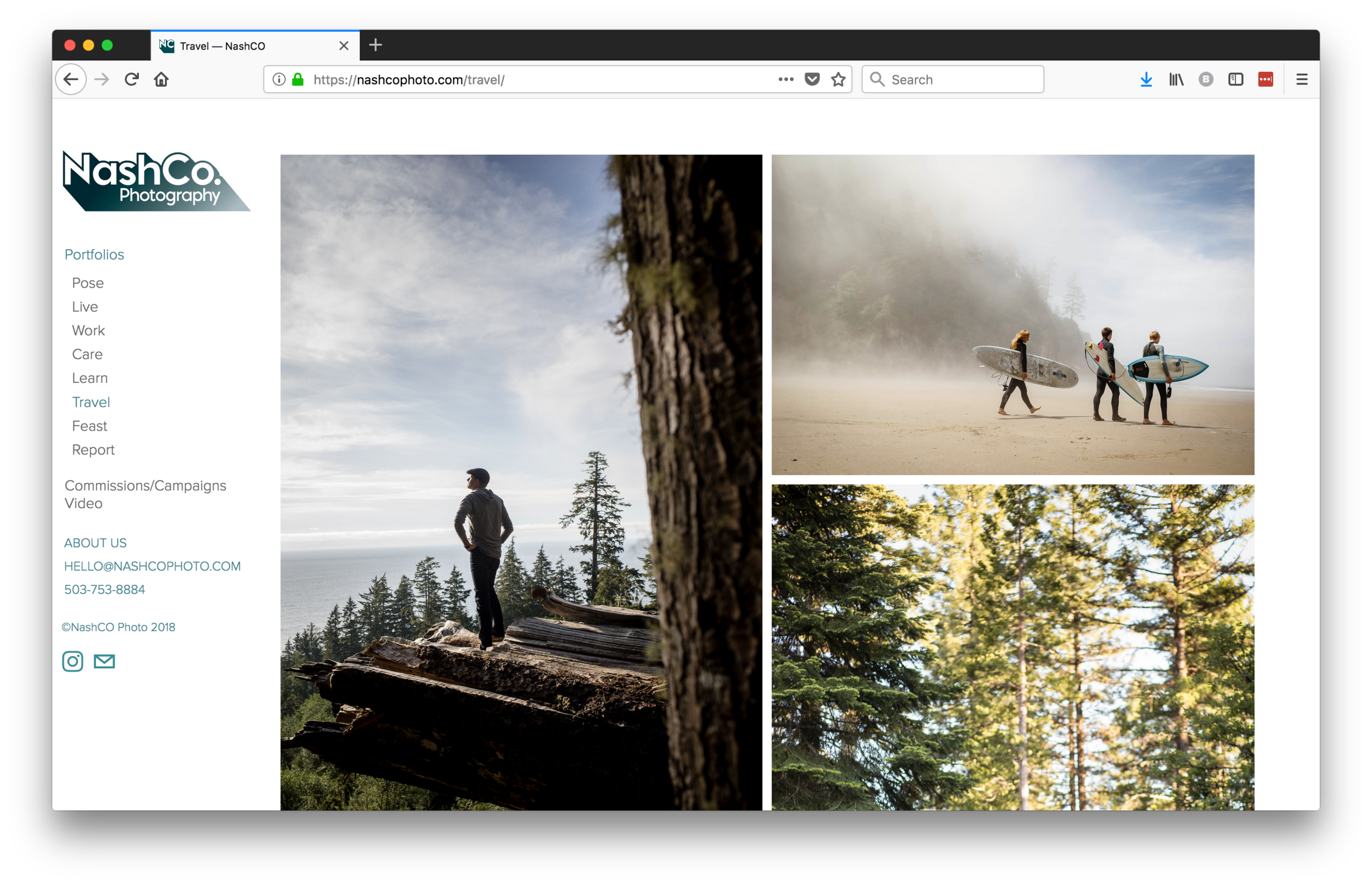
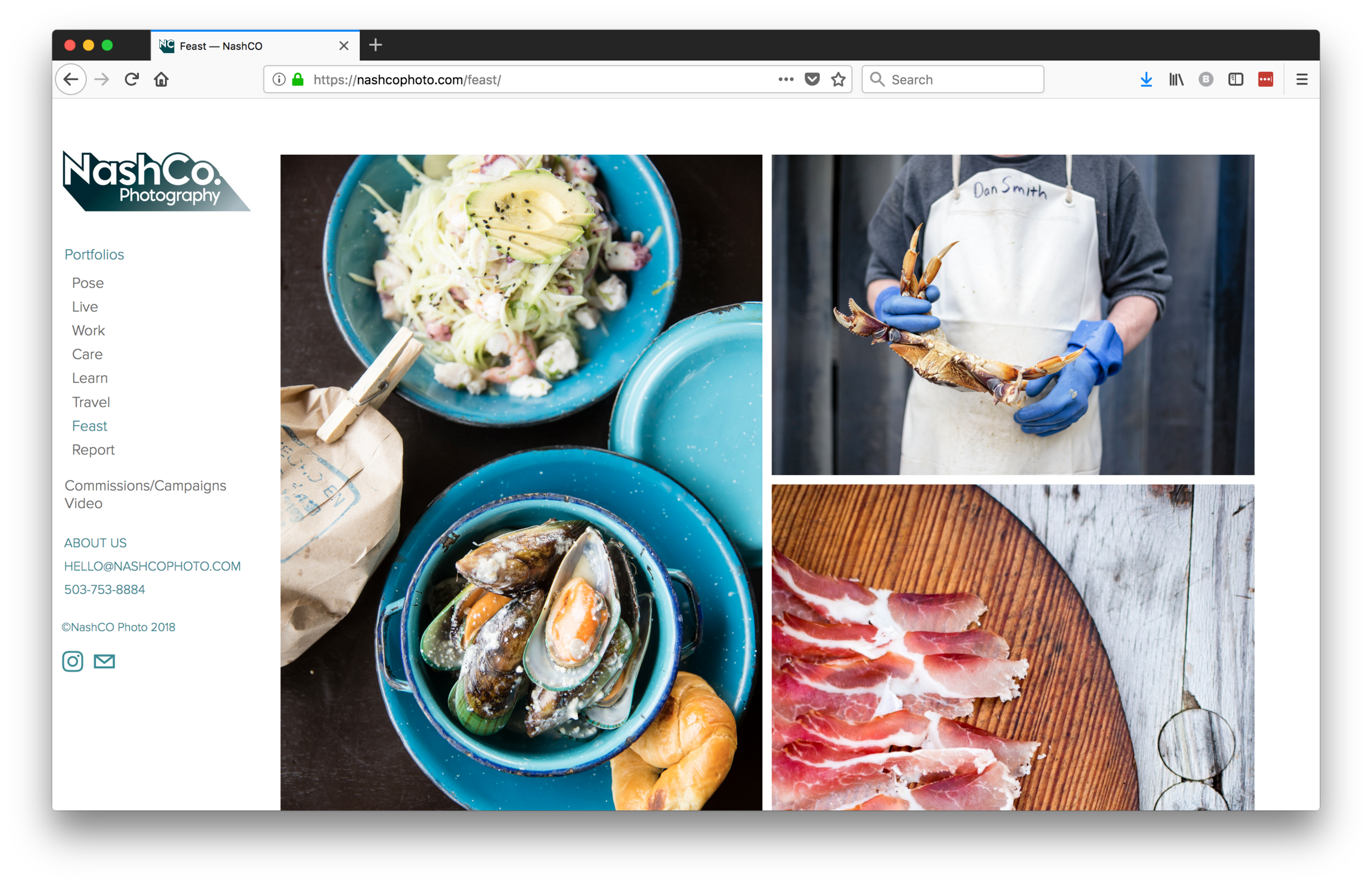
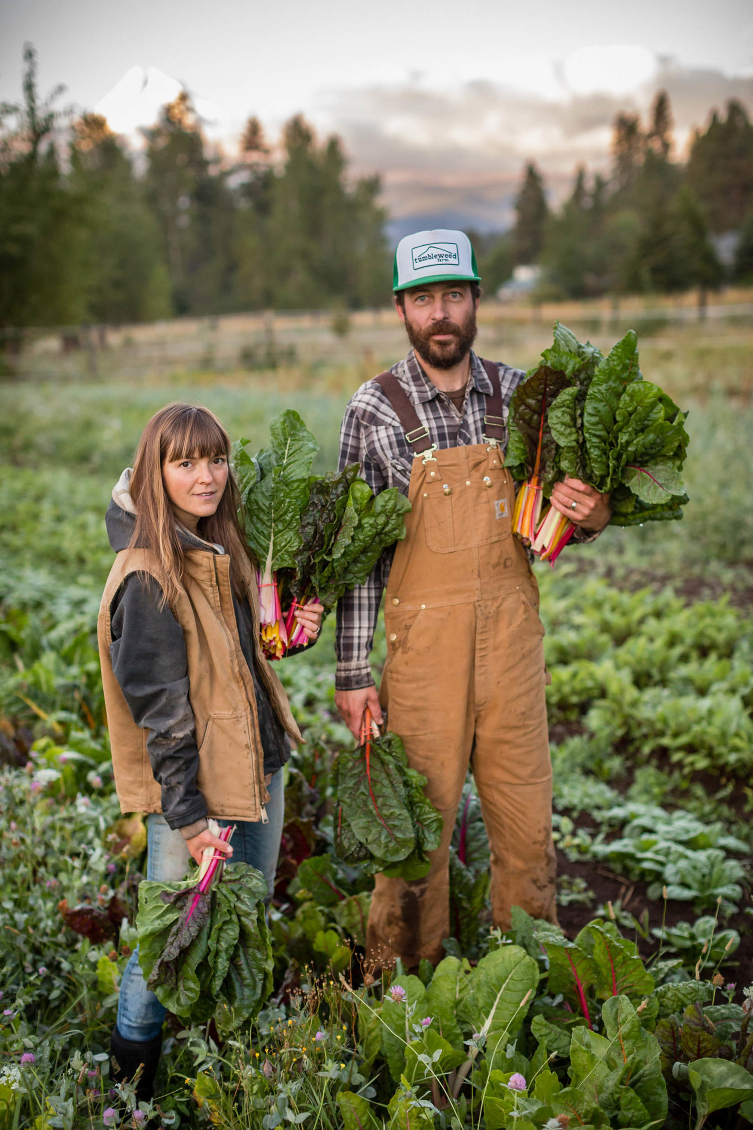
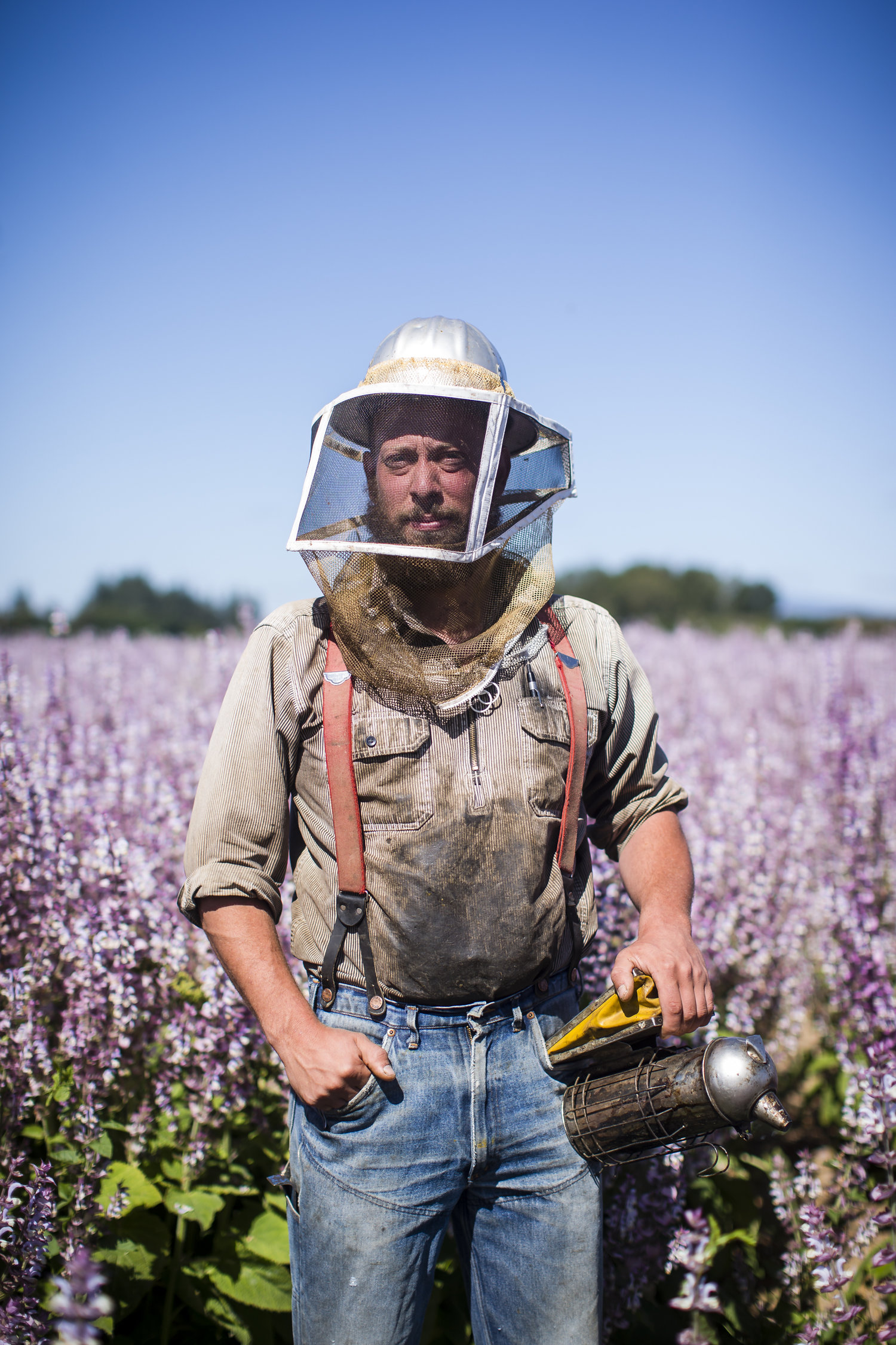
I’m so happy to share the updated website I edited for Portland, Oregon based @nashcophoto. I love their tagline, “We make real people look cool”!

From celebrities and students to doctors and farmers, they capture people in an effortless way.

Their portraiture is beautifully complimented by their storytelling.

You can see more of NashCo’s work here.

Portfolio Review Dos and Don'ts

Are you thinking of attending a portfolio review but aren’t sure what to expect? Many photographers have questions, even if they’ve done reviews before. Do reviewers expect to see gallery-quality prints? Can you bring an iPad? Should you have a leave behind? How do you decide what to show?

Having participated in many formal portfolio review events over the years, I’ve seen a lot of the same missteps and successes. Here’s a handy guide to my top dos and don’ts.

DO

Be honest with yourself about if you are really ready to show the work. Maybe you need another year of shooting before you start showing your book to art buyers, art directors and photo editors. You only get one chance at a first impression, don't rush it if it's not the right time. Ask people who you trust for their honest opinion.

Research your reviewers and make sure that your work is relevant to what they do. You have 15-20 minutes, often with some pretty influential and powerful creatives in the industry, don't waste it. Would you roll up to a job interview without knowing anything about the company?

Have a purpose for each review and communicate that purpose to the reviewer when you sit down. Example: "I've been following your magazine for years and feel my work would fit in. Do you think I'm ready to shoot for you, and if not, what needs improvement?"  Or, "I would love get feedback on the book and recommendations for colleagues in the industry who may respond to my style of work." Or, "This is a new personal project that I'm working on, would love to know if you think it's ready to show to galleries."

Come armed with 1 or 2 specific questions that are pertinent to your reviewer's area of expertise.

Do bring the actual portfolio that you intend to show to clients. Hopefully the reviewers you meet with are also potential clients. They're not going to give you a pass because you intend, later on, to make a better book. So don't bring a hastily thrown together book and then say that you are going to change it later. The whole point of the portfolio review is to get feedback and how can someone give you good feedback if what they are looking at isn't what you really want to show?

Make sure your prints look great. This is especially important when seeing galleries.

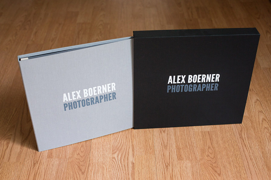
Leave behind a well-printed leave behind. Invest in a graphic designer to help you create something that looks professional. Just because you know Photoshop doesn't mean you are a designer. If you are seeing a dream client, kick it up a notch and leave something more unique than a postcard. However, keep in mind that not everyone will want a promo. See below.

Keep notes. By the end of a long day, all the reviews can start to blend together. Make a separate page for each reviewer and mark down which images they pointed out liking, where they paused a bit longer, what questions they had about your work and specific feedback they gave you. You may also want to record audio of each meeting, if the reviewer is cool with that.

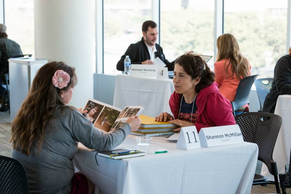
Photographers and creatives gather at the Texas Photo Roundup Portfolio Reviews in Austin, TX. Photos by David Weaver.

DON'T

Don't default to an iPad presentation. An iPad is not necessarily the best way to show still photography.  The glare in some rooms makes it very hard to see the photos, especially if your images tend to be dark. I often find myself looking at my own reflection instead of the photos.

Also, unless the iPad presentation is really slick, it can feel like not enough care was put into the portfolio. I mean, let's admit it, how hard is it to create a folder of images for someone to flip through? When I see a beautifully printed portfolio, it lends the photographer some legitimacy, makes them at least appear to have invested a lot of time and effort into their work, all which helps me take them more seriously.

Everyone spends so much time on their phones now, consuming an almost endless stream of imagery. It doesn’t feel as unique to be swipe through an iPad. Print feels special.

All that said, pay attention to your budget and don’t spend the extra money on printing if you can’t afford it.

Don't force your leave behind on the reviewer. Some people flew in for the event and may not want to tote a bunch of promos and books back. Or they may feel it's environmentally wasteful and rather not have the extra 'stuff' in their lives. Or they just may not have liked your work enough to want to take a promo. Ask if they'd like a card, but don't push it. Also don't just offer a huge and bulky leave behind. If you want to make something big, it's also nice to offer something small like a postcard.

Don't make excuses. Popular examples include: "I didn't bring my strongest work." "I didn't have time to put together much, but this should give you an idea." or "I just found out about this event."

Don't argue with constructive criticism The people looking at your work know what they are talking about. They may all have different opinions, but that is valid considering that people come from different backgrounds and that visual art is very subjective. You may not agree with someone, and that is ok, but don't tell them that they are wrong.

Want to get ready for a portfolio review? Contact me to learn how we can fine tune your portfolio, create a great promo and get the most out of the time and money you're investing.
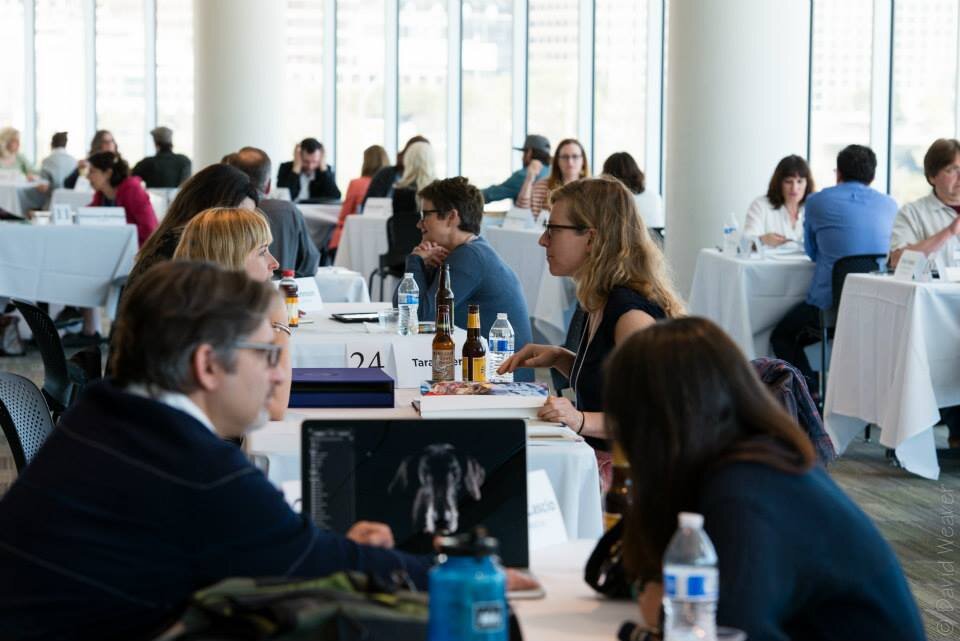
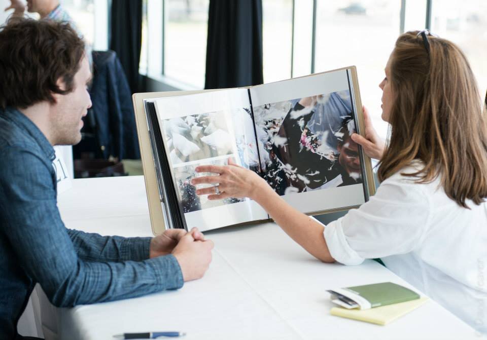
New Orleans Photo Alliance's PhotoNOLA portfolio review session. Photo by George Long http://GeorgeLong.com (used with permission)
IMG_7839-copy.jpg
New Orleans Photo Alliance's PhotoNOLA portfolio review session at the International House Hotel conference facility. Photo by George Long, used with permission.

Jason Elias Postcard Flipbook Featured on aPhotoEditor.com

I recently wrapped up some marketing work with LA-based Jason Elias. He chose to do a postcard flipbook with Paperchase, and we wanted the edit to take the viewer on a journey through his work. From the "hero" images to the more quiet moments, the piece captures the dynamic, fun and sometimes intense work that Jason does for clients like Discovery Channel, Showtime, and others.

Read the interview with Jason at http://aphotoeditor.com/2017/12/11/the-daily-promo-jason-elias/

jason-elias-aphotoeditor.jpg
...the edit was done by a great editor based in Texas, Jasmine DeFoore – https://www.jasminedefoore.com/. I really like Jasmine’s take on things and she always helps me see my work with fresh eyes. Once she knew I was going to do the postcard book, she also had the great idea of having an animated GIF in flipbook form on the back. So I found a great animator in DC named Travis Pietsch to build me one – https://www.travispietsch.com/. I kind of had an idea and he helped craft it and make it. Once I had it on there I realized that as much as you try to stand out in some way, there is also something to just having fun and enjoying being creative for the sake of being creative, and that’s why I loved the flip book so much.
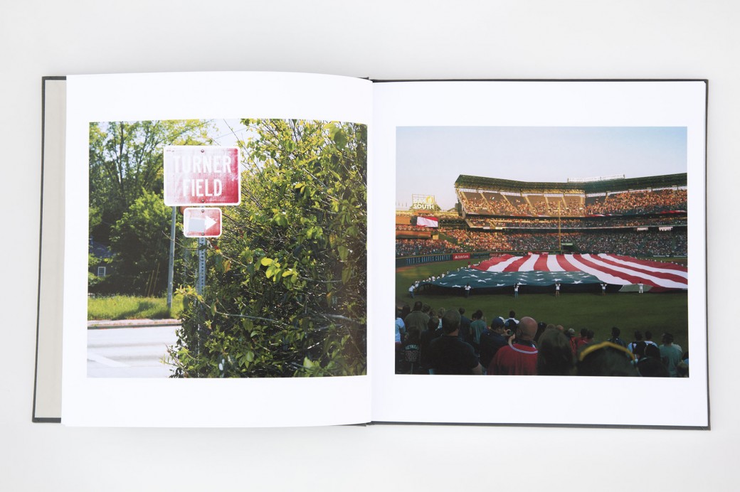
— Jason Elias on aphotoeditor.com

Great Promo Ideas

Looking for some self-promo inspiration?

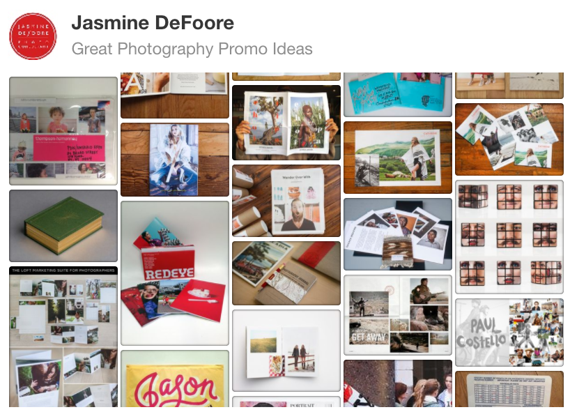
Check out my pinterest board of great photography promo ideas. From large-format newspaper promos to simple postcards, this board features examples of great design and image choices.

Have something you'd like to add? Contact me!

Other great resources include:


Want to make a cool promo that will grab clients' attention? 

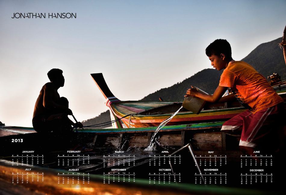
Jonathan Hanson Print Portfolio & Print Promo

jhanson_blog-05.jpg

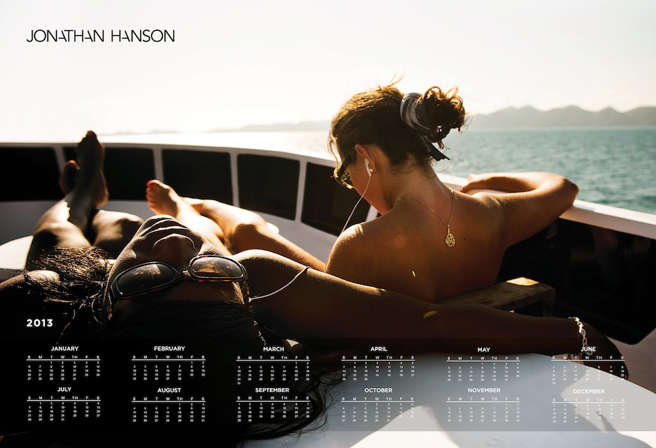
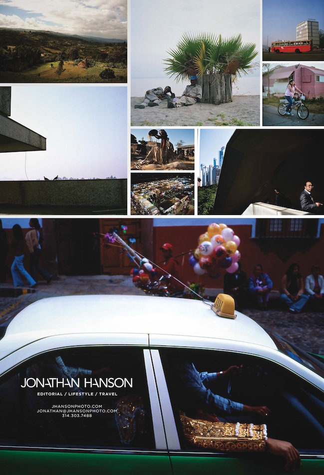
I've been working with Baltimore & NYC-based Jonathan Hanson since 2011 on a variety of projects. We started by re-editing all of his work, then creating a new website and logo, custom print portfolio and printed marketing pieces. In January, Jonathan sent out some beautiful calendars to a select group of clients he is interested in working with. He has consistently updated his blog, sent out email promos and personally updated appropriate clients about his latest work, travel updates and other relevant news.

His web analytics are telling a great story of the success of his marketing efforts. The average time spent on site has increased by more than a minute, the number of unique visitors is up 51% since a year ago and his page views are up 142%.


Make Promos out of Your Instagram Photos

printstagram.jpg

There are so many companies popping up that are making stuff out of your Instagram photos. Here are a few we've tried recently. Do you have any favorites? Please post in the comments below or upload a photo of your promo to instagram and use the hashtag #igphotogpromos so everyone can see.  

Sticky Gram magnets


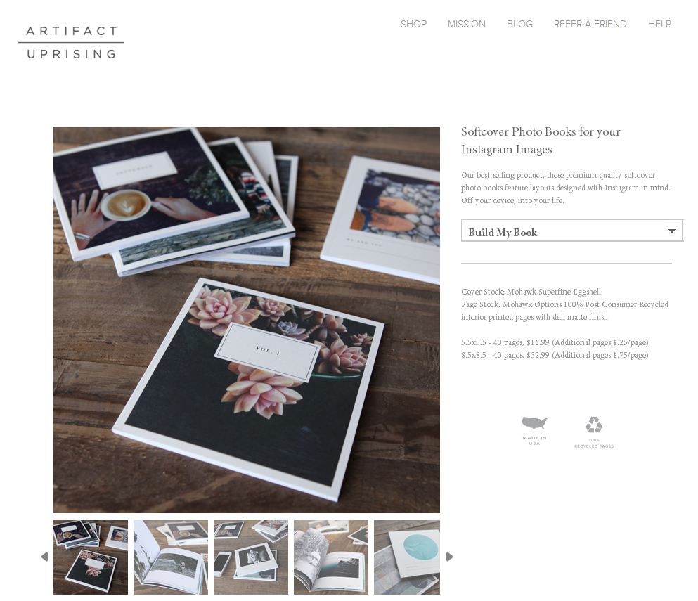
Artifact Uprising - photo books, prints, calendars and more


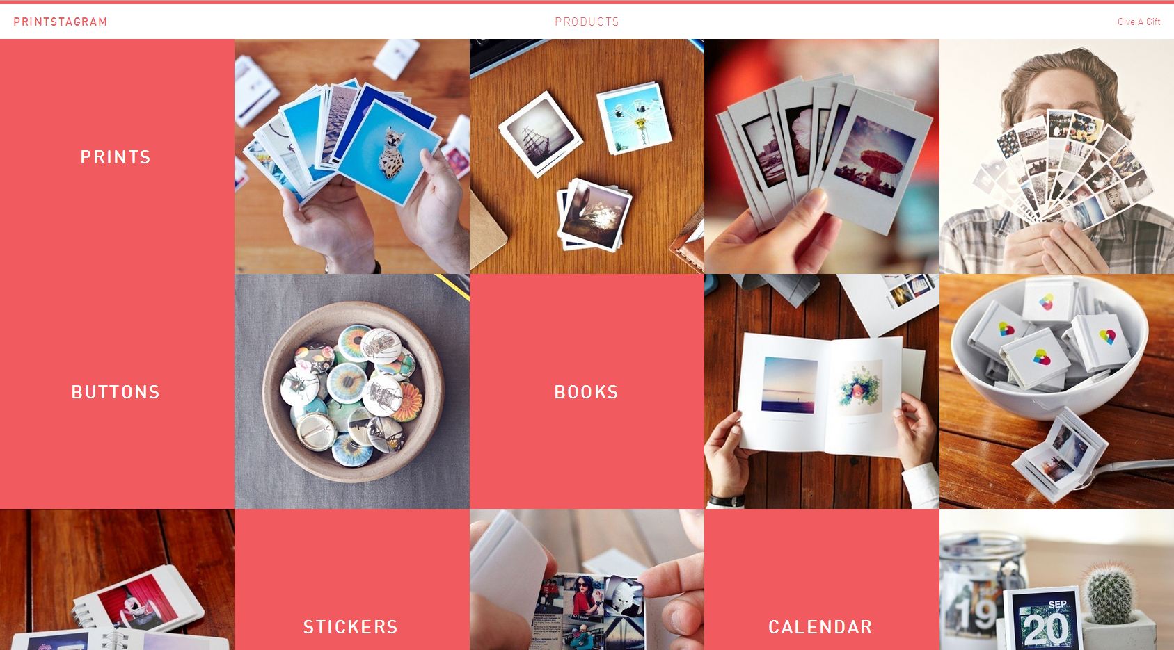
Printstagram - from teeny tiny photo books to photo strips and larger books


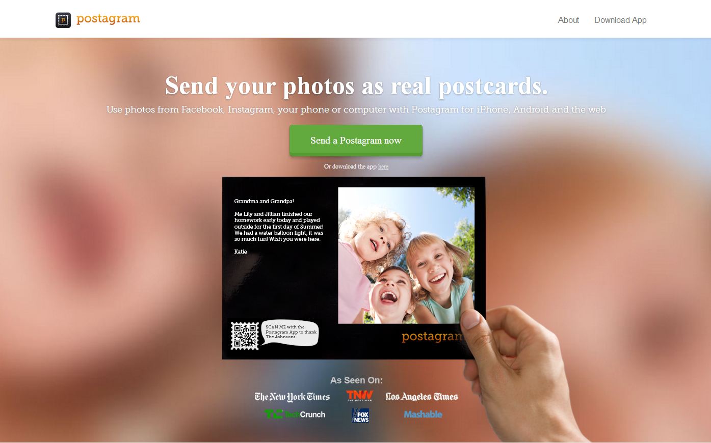
Postagram - Site is geared toward the consumer, but you could customize the  postcard to be appropriate for clients.


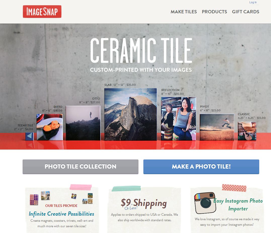
ImageSnap - Ceramic tiles (with or without magnetic backing)


Emilie Malcorps

Screen-Shot-2013-08-27-at-3.11.39-PM.png

Emilie Malcorps is a Nice, France based editorial and corporate photographer. Together we built a new website, highlighting her vibrant, seaside location, as well as a print promotion and email campaign. We also created a new body of lifestyle work shot in Morocco. Emilie has started contacting clients for meetings and has already been given assignments from international magazines who were on her dream clients list.

Andy Reynolds Portfolio

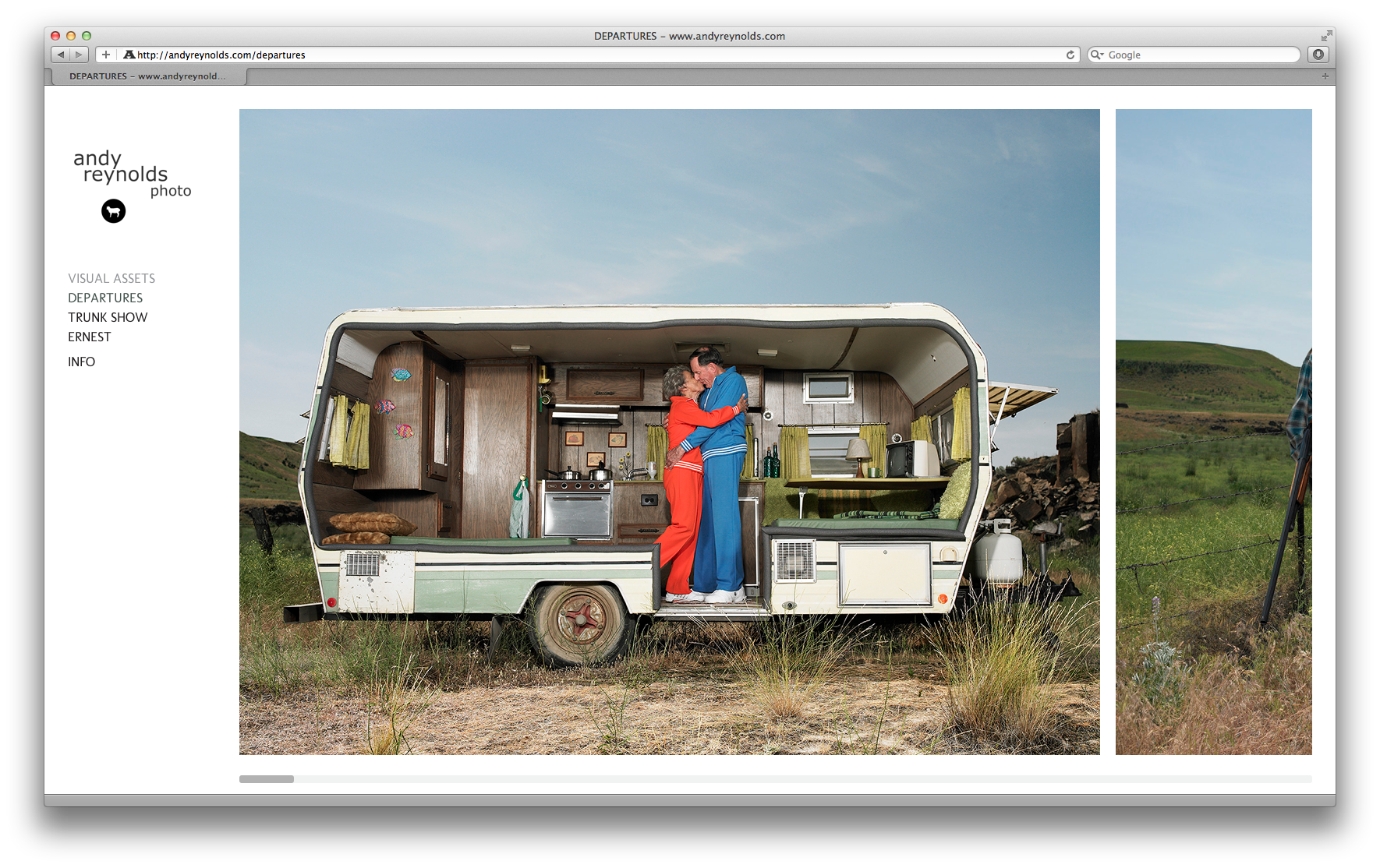
I've recently wrapped up editing Andy Reynolds' work for his website relaunch. We created 3 galleries with distinctly different moods. Andy is based in Seattle and works with a variety of commercial and editorial clients who appreciate his quirky concepts and ability to capture every day life with wink.

Screen Shot 2013-07-11 at 11.57.13 AM

Screen Shot 2013-07-11 at 11.57.13 AM

Screen Shot 2013-07-11 at 11.56.40 AM

Screen Shot 2013-07-11 at 11.56.40 AM

Guardian Picture Editor on Finding and Hiring Photographers in the US

John-Oliver2.jpg

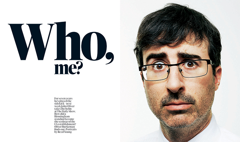
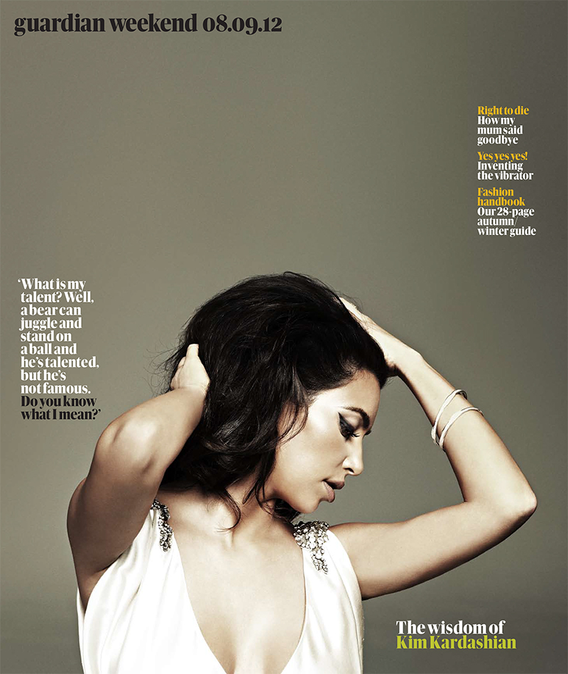
Caroline Hunter is Deputy Picture Editor of The Guardian's Weekend Magazine which features gorgeous photography. I recently spoke with Caroline about the process of finding and hiring American photographers from her vantage in the U.K. How often are you hiring U.S.-based photographers? We hire U.S. photographers every week. I work on a busy picture desk and we often feature contributors and celebrities who are based in the US. Sometimes it feels as though we commission more photography in that part of the world than anywhere else!

Are you more likely to look for someone who is located in the city you have an assignment in, or to fly someone in who has the perfect style for the story? Does that depend on if it’s a big feature or a smaller front of the book story? Yes, basically if it's a big feature or a cover shoot or a very important subject, we'll almost always use someone that we've used before. If the flights aren't too expensive or the distance too great, we'll often fly someone to a particular location - it's just safer and more reassuring to use someone whose work you know very well. If on the other hand, it's for a smaller feature or a a fairly straightforward shoot/job, we'll always prefer to use a local person. This saves massively on budgets - although the end result can be unpredictable !

Walk us through a typical shoot. You get the story from the editorial team. What comes next? If you don’t have someone in mind, where do you begin your search? What are some of your favorite resources for finding people? How much do you rely on recommendations from colleagues? A typical shoot can work in many different ways. Sometimes we'll have the written copy/feature already. This is the best way to commission as you know exactly what the story is about. Quite often though, I might not know much about the feature as it hasn't been written yet. On other occasions, I might commission a shoot that is part of a much bigger and ongoing feature - which will often change as time goes on. Sometimes it will be a celebrity shoot that will require styling, hair and make-up and location scouting.

I'll discuss the shoot with one of the commissioning editors as well as the Art Director and then will have a think about ideas and photographers. I might do some research on the internet for visual ideas as well as looking at online portfolios. If I don't have someone in mind, I might look at the Wonderful Machine website or recent editorial shoots for other magazines that I like. I'll also have a look through the sites of photographers who have contacted me recently - just to refresh my memory. I like looking at websites like Nowness, which is great for visual ideas. I don't rely too much on recommendations - sometimes it's nicer to discover fresh talent.

How can a US photographer get on the radar of an editor in Europe? Obviously they can’t network with you at parties, and planning trips to show their portfolio can be time and cost prohibitive. With all the noise online, how can they get through to you in a memorable way? I think it's quite hard. The most effective way is a meeting - but I know that this is very tricky and expensive to set up. Photo-festivals are a good way of potentially seeing/contacting many editors/agents in a short space of time - but these too can be expensive. Being located in a city where there isn't much competition and you're a 'big fish' in a small pond is quite a good way to get stand out.

Most of the photographers we use are based in NY and LA - two of the most competitive cities for creatives on the planet ! Having an interesting and consistently high standard of work will ensure your work always stands out - and a well-designed, easy to navigate website is essential. Being well-connected and getting known in certain circles is important too. I often get recommendations from other photographers and editors.

Do you have favorite blogs that you follow to stay up to date on what is happening in the US photo scene? I like looking at the NYT lens blog as well the New Yorker Photo booth, Time magazine and blogs like Flak photo and Lens Culture.

Do you make trips to photo festivals or portfolio review events to meet new photographers? I know in the past a lot of European editors went to Visa pour l’Image and Arles, but it seems like travel budgets aren’t what they used to be.  Yes, I regularly attend photo festivals. I find them really energizing. I like doing portfolio reviews as it gives me a chance to meet and spend time with new and existing photographers.

What are some of the trends that you’re seeing when it comes to the kinds of photographers that are getting assigned? Any trends in promos you receive? I get a lot of monthly newsletters (always emailed) from photographers who have just done a shoot or e-zines where they're telling me what they've been up to in the last few weeks. I think the trend for highly retouched, digitally remastered images will be with us for some time. This seems to have replaced the very natural-looking painterly style imagery that was fashionable around a decade ago.

Can you share some pet peeves when it comes to photographers courting you? For a photographer, I think that it's important to know the market that you're pitching to. If you're ringing up a photo editor, agent or art buyer - don't expect them to give you a page-by-page description of their product. You should already know which sections you'd like to contribute to and be able to ask questions and comment on recent work that was featured. It's really no point pitching a lifestyle or travel feature to a magazine that only deals with current affairs. It might sound like commonsense but you'd be amazed at how many times this happens.


Caroline Hunter is a magazine photo editor and Deputy Picture Editor of The Guardian's Weekend Magazine. She has over fifteen years experience of commissioning and art-directing portraits, photo-journalism, celebrity shoots, still-life, interiors, beauty and conceptual photography. Previous to the Guardian, she worked for Time Out London, Emap publications and The Saturday Telegraph magazine.

 She has degrees in Fashion Journalism and English Literature from the London College of Fashion and the University of London respectively. She is a regular portfolio reviewer and judge at international photo-festivals. She lives and works in London.

Jennifer Whitney's Spring Promo

JAWX2282.jpg

Jennifer Whitney's spring promo is out, and it's a beautiful custom envelope with four different bodies of work each with its own trifold insert. The themes of each card are: Everyday moments that make up our daily lives, commercial work she shot for Cooking Channel during SXSW 2012, food, and her series on election season called “the vote”, including coverage of RNC 2012 in Tampa.


Dennis Burnett

DB_editorialcommercial_promo_02.jpg

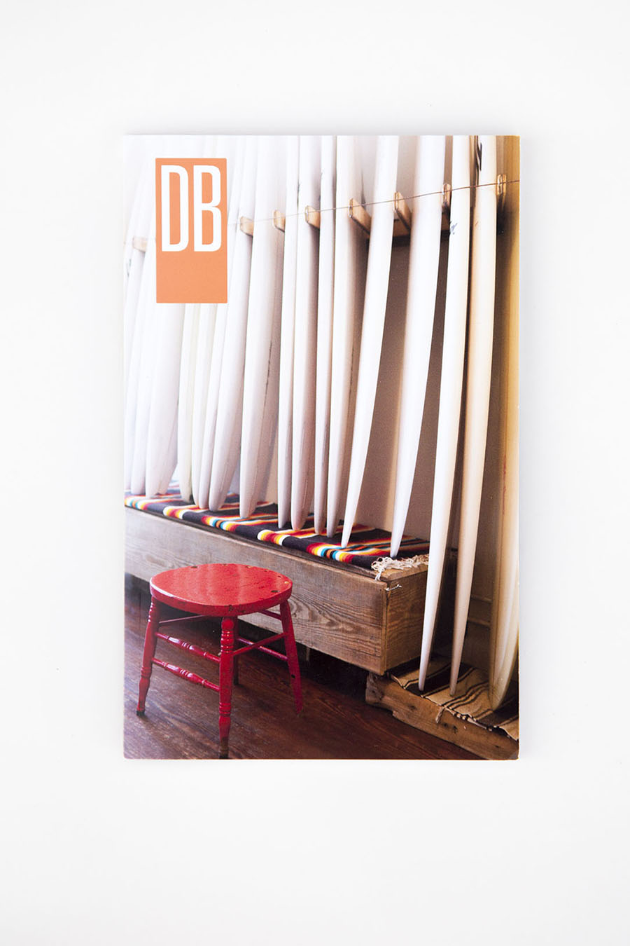
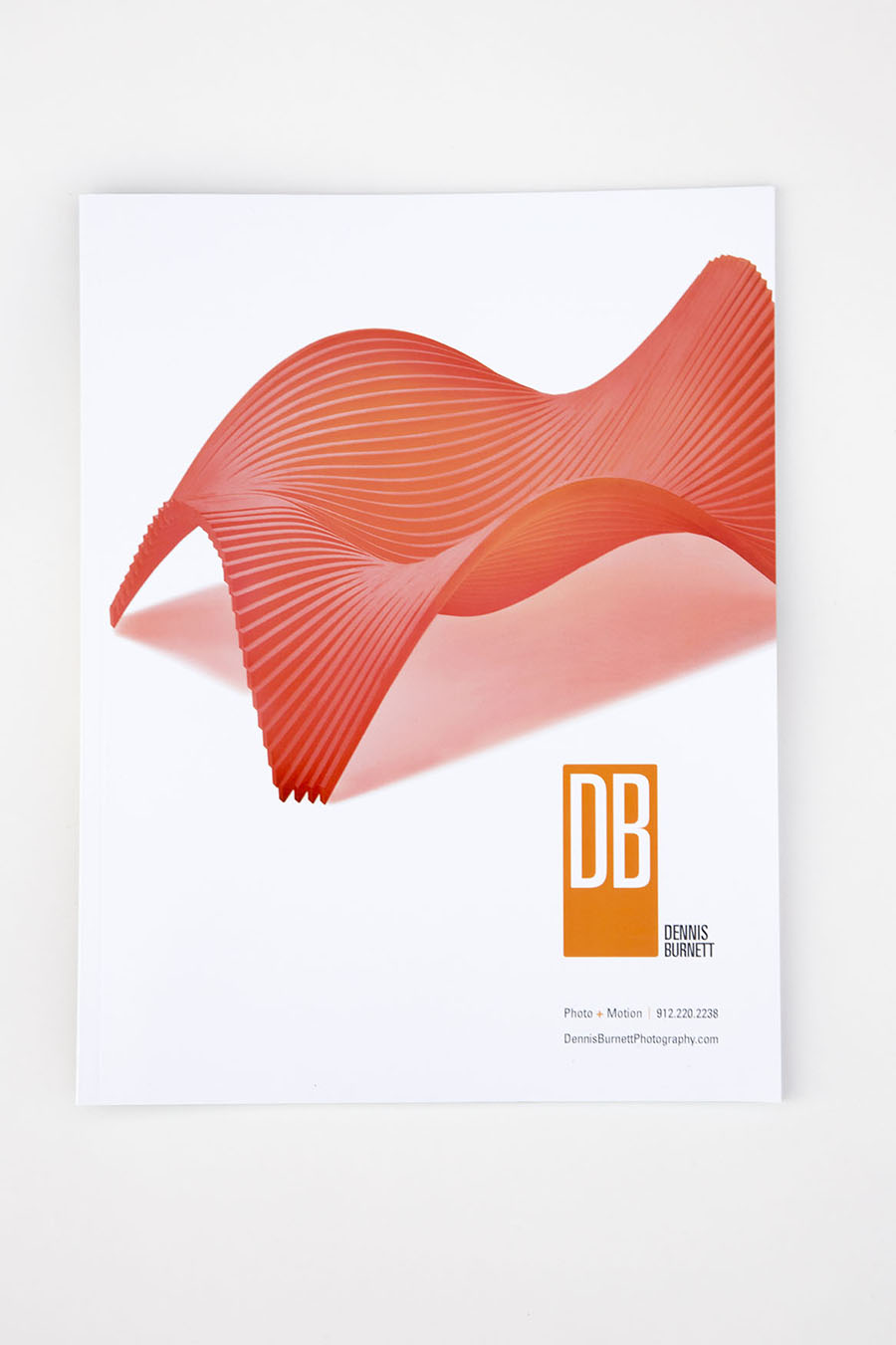
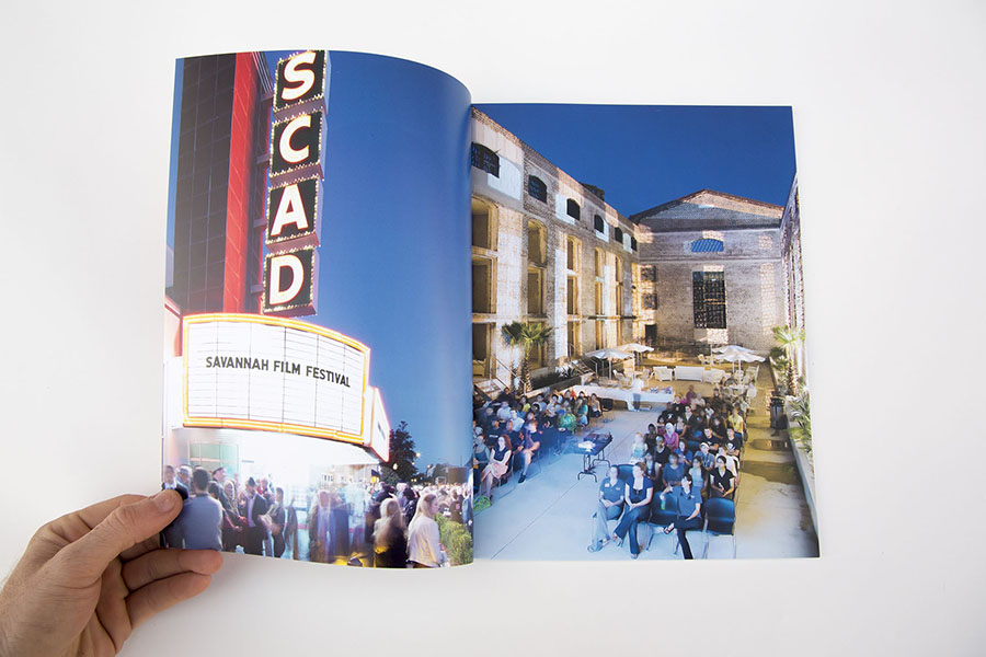
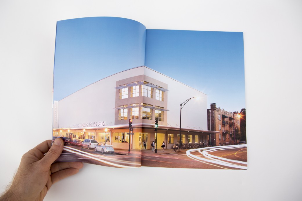
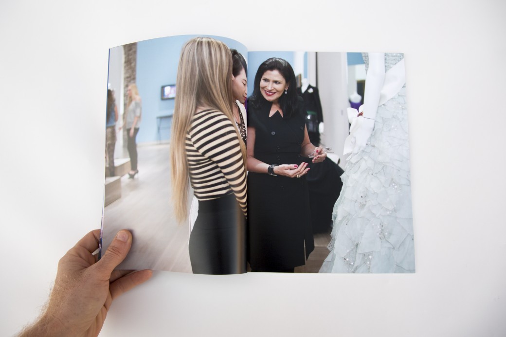
Dennis Burnett recently relocated to Austin from Savannah and was looking for help with editing and presenting his work. We put together three presentations:

  • A personal projects book (printed by blurb on their new proline paper with cloth cover)
  • An iPad presentation of his editorial work
  • An editorial magazine leave behind (printed by magcloud)
  • A magazine highlighting the work lifestyle, architectural and interiors work he did for SCAD (also printed by magcloud)

Dennis showed this work at the Texas Photo Roundup portfolio reviews and received very encouraging feedback.