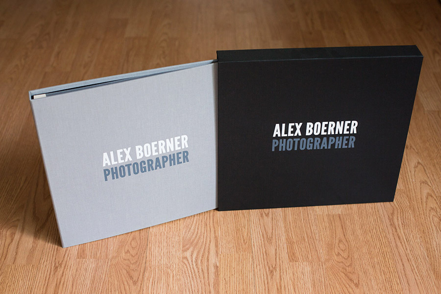
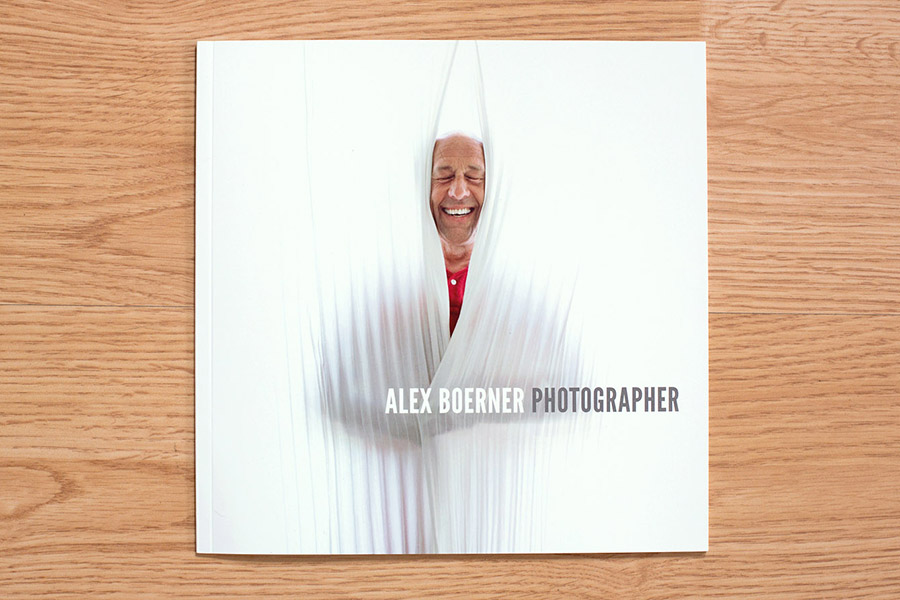
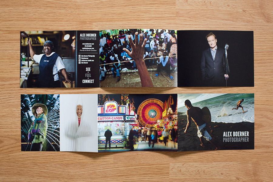
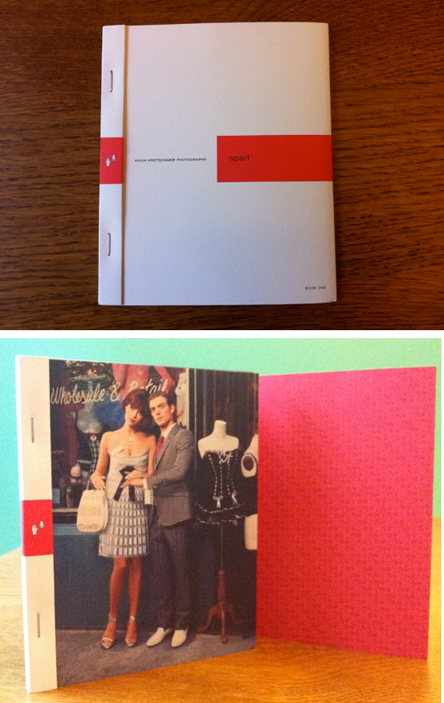
One of my favorite things is working with photographers over the course of many years. Buff and I first did a print promo together in 2015. This fall, we worked on a Volume II of her How We Live zine. The zine is designed by https://beckyplante.com/ and beautifully printed by Paper Chase Press.
Alex Boerner Website and Print Portfolio
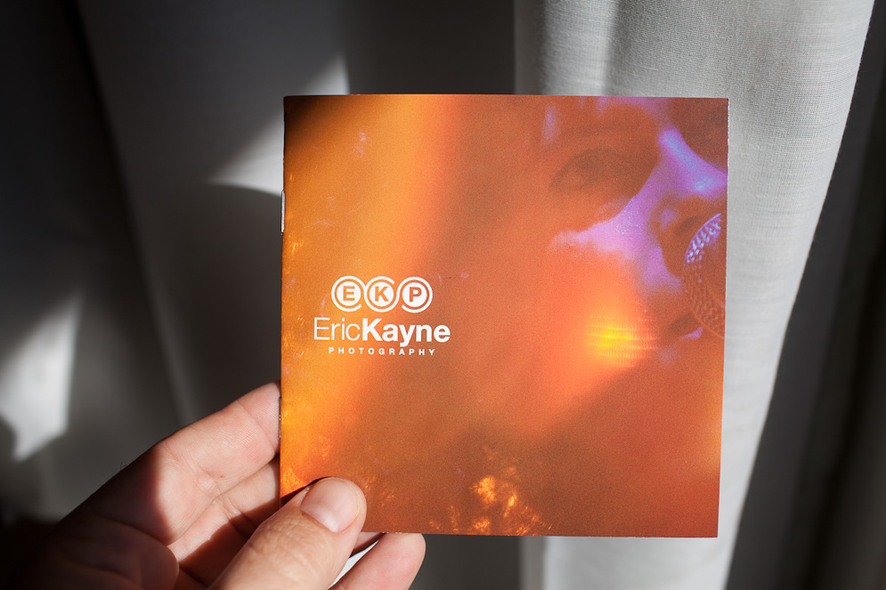
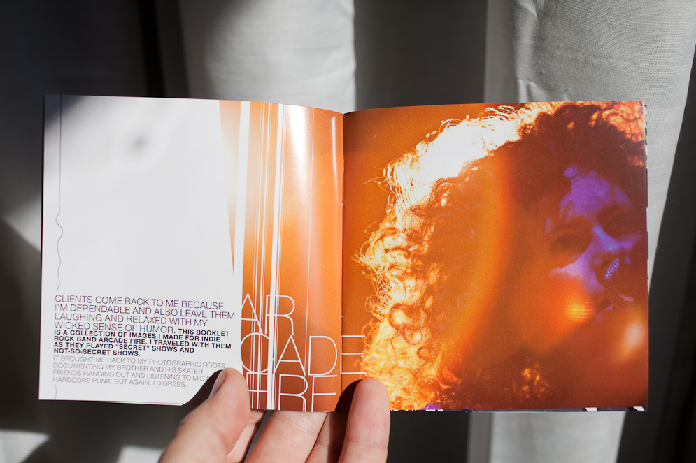
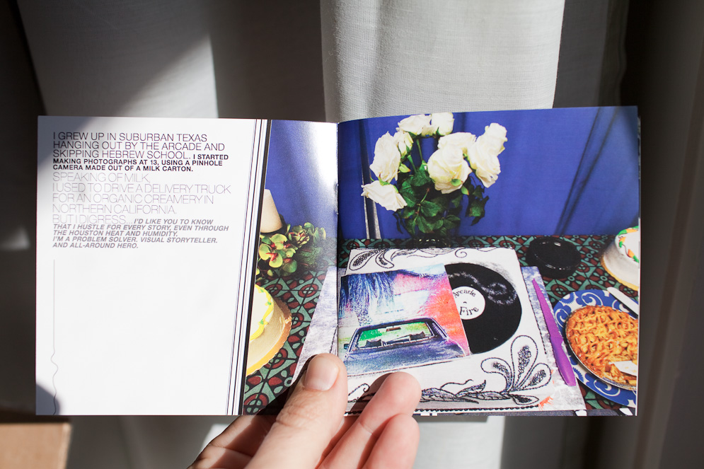
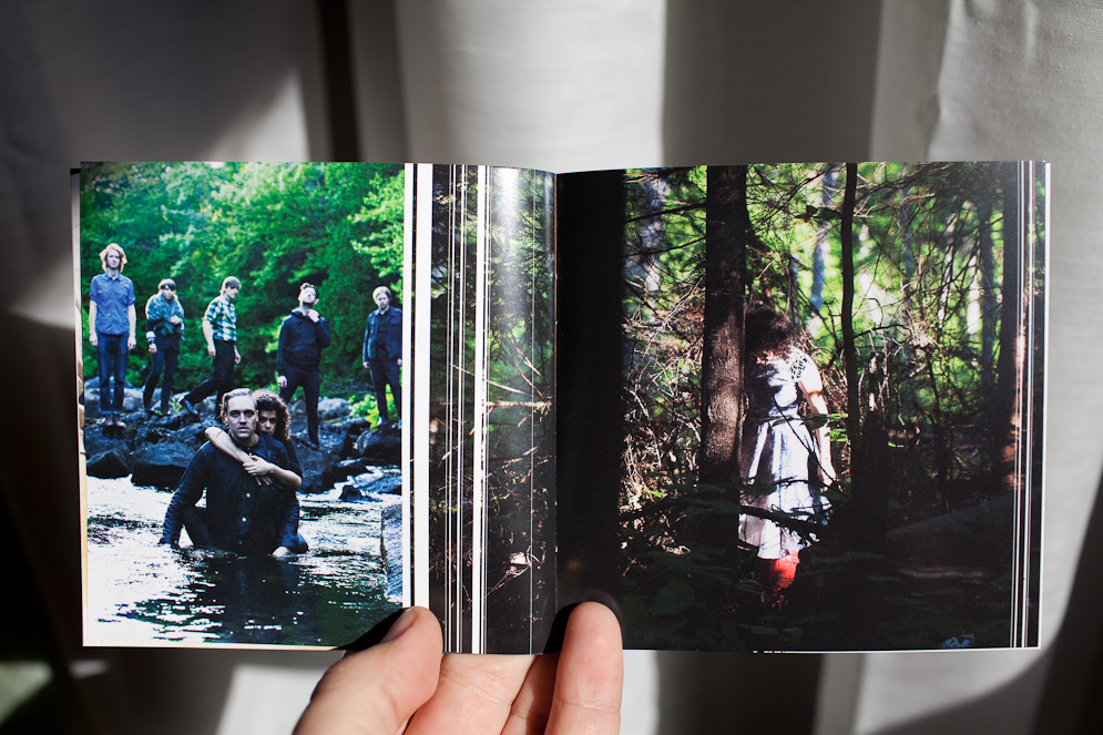
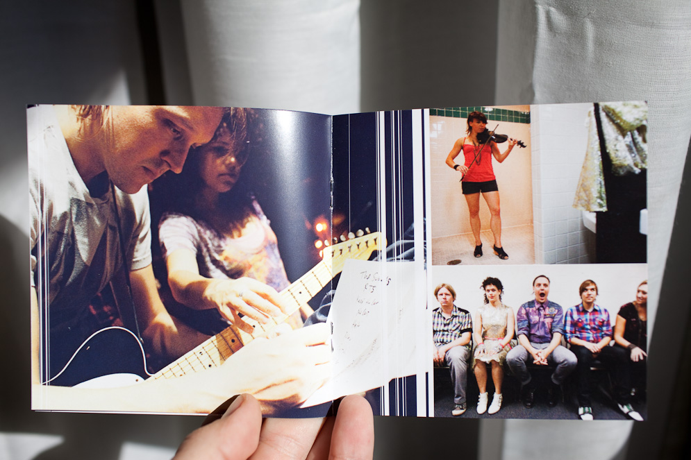
Eric Kayne Promo Booklet
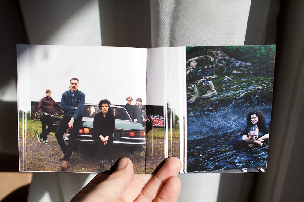
16-page booklet designed to reference a CD book insert, highlighting recent work by Houston-based photographer Eric Kayne. Eric was hired by indie band The Arcade Fire to shoot publicity stills, behind the scenes reportage and concert images.
Q&A with GSD&M Senior Art Producer Shannon McMillan
Shannon, thank you for taking the time to share your opinions about self-promotion with the photographers and illustrators who read this blog. Can you start by describing a typical day for you at GSD&M?
Every day at GSD&M is different, which is nice because it keeps the work-life scenario interesting. Production is hectic, fun, stressful, an adrenaline rush, and a love/hate relationship. There is definitely never a dull moment!
Each job is a different can of worms but, you learn something new every time. I spend most of my days answering emails, putting together bids, submitting estimates, negotiating with reps or photographers, doing stock searches, chasing down creatives, and looking at Good & Not-So-Good work. However, there are some days that I'm not at my desk due to meetings, which is a challenge, because you still have to find the time to squeeze in all the administration required for the entire business. Keeping a list of "To-Do's" really helps me keep it all check because otherwise the small details can get missed. The best part of my job is that I do have days when I DO spend all day searching for hot new talent. I have a long list of photographers categorized by Conceptual, Fashion, Lifestyle, Portraits, Landscape, etc., but I'm always on the look-out for additions to the list. My job is challenging, frustrating, detail-oriented, and ultimately rewarding... I love it!
How many unsolicited emails do you get every week from photographers?
I probably get about 50 emails a day.
How do you handle all of those? Do you bookmark any sites because of them?
If an image or two pops up, I do take the time to review. If I like the work I do bookmark the work. If the email has a long drawn out message + a link, I'll either quickly click the link or just delete it. I do like to give everyone an opportunity but some days I'm just way too busy to read and review the work.
How many print promos do you get each week? How does that compare to a couple of years ago?
It's a joke how much mail I still receive and toss out. Let's just say sometimes the mailroom has to bring me my mail in a box. Compared to a couple of years ago, I feel it hasn't changed much except that I've noticed promos aren't as elaborate. I'm seeing more posters, larger postcards with multiple images and accordion style promos.
Most of the samples of promos you gave me that you liked feel more special and custom. How do you respond to the more simple postcard promos?
Most of the time the single picture postcards end up in the trash, unless the subject is interesting, unique or funny and it's just a damn good shot. I like to be inspired and intrigued. The postcards with multiple images can give you a better idea on the quality of the work. I also feel sometimes the one picture postcards end up being a 'one hit wonder'. (see examples of single postcards in gallery at bottom of page)
Which format, print or email promos, do you prefer?
I still like both. Some of the promos I see as an art piece. I love when a promo is a well designed cohesive piece (paper, design, 3+ images). Oh, and I LOVE the coffee table books!
How do you feel about unconventional or gimmicky promos: boxes of candy, matches, treasure hunt maps, ransom letters, etc. These seem to be very popular lately because they have the potential to garner a lot of attention on blogs. But do they really make a better impression with you than simpler printed promos?
The gimmicky promos do get my attention but doesn't necessarily convince me to save the work.
If you could change one thing about the way photographers reach out to you, what would it be?
Limit the number of times you send emails per month. I get emails from the same group of reps/photographers every week to every two weeks. I think once a month to every 3 months is sufficient. When emails start to come every week, I just end up deleting and not taking the time.
What are some of your favorite ways to learn about new photographers?
I think what Wonderful Machine is a great idea for agencies and photographers. I also recently sourced AtEdge, FoundFolios, PDN and we sent a group to LeBook.
I know you have participated in portfolio reviews in the past. do you think those are a good investment for photographers? Have you formed any new relationships with photographers because of them?
I really do think the reviews are a good investment. I personally try to be honest and provide constructive criticism. I've kept in touch with several photographers and continue to provide feedback. I want to helpphotographers grow and further their career.
During her 14 years in Advertising Shannon McMillan has worked as an Art Producer with worldwide clients (BMW, Kohler, Brinker, The US Air Force, Southwest Airlines, AT&T, AARP, Harrah's, and others), talented photographers and production teams, and reviewed hundreds of portfolios, websites and promos. She has been a juror for panels such as: PDN’s PIX, PDN’s Photo Annual, and the Palm Springs Photo Festival. She enjoys the sense of satisfaction and accomplishment that comes creative power and strives to maintain her artistic integrity. Photography is her personal passion and she looks forward to any opportunity to create.
Self-Promo Round Table (Part 3 of 3)
It's the last of my three part series on what creatives love and hate when it comes to photographers' self promos. Hope you have found it helpful so far. Today we get the dish from people in the marketing and advertising world. If you missed the previous installments please check them out. Monday was editorial and Tuesday was entertainment.
Today's panelists are:
Sandy Boss Febbo, Executive Art Producer, Carmichael Lynch
Prentice Howe, SVP, Executive Creative Director, Door Number 3
Elise Robins, Executive Print Producer, Publicis West
Jon Setzen, Creative Director, Something Massive
Blair Thompson, Creative Director, Believe in
Sandy Boss Febbo, Executive Art Producer, Carmichael Lynch
I receive dozens of mail promos and an average of one hundred email promos daily. For me, it's all about the image. Period. It's that simple, and that hard. The image must be compelling enough to get my attention and with the vast talent producing and promoting their work - standing out is a big deal. But they do. It can be as simple as a postcard with a single strong image or an email blast with a similarly simple format - that's all it takes. I've received more elaborate pieces from photographers that feature a strong body of work - a published book, set of postcards, blurb book, etc., as well as a several pieces recently from agents and artist collectives that are stunning.
[nggallery id=4]
Of these Just Add Water and Giant are certainly worth mentioning. The first was a great collection of folded posters with a range of work from each of their artists and the latter a bound book with again a range of work from each of their artists. In both cases, again, the quality of the imagery was the hook.
My only pet peeve is overly designed promotions. It's about the image, not the package, the extras, or investment. I would rather see a simple promo than one where the imagery becomes secondary or lost. I also cringe when a promo isn't recyclable.
Just Add Water promo specs:
designer - Rinse Off Wallace
printer - Capitol Press (www.capitolpress.com)
quantity - 1500
Giant Artists specs:
Designers: Megan Steinman & Eric Roinestad
Printer: Oceanic Graphic Printing
Quantity Mailed Out:1,000
Elise Robins, Senior Print Producer, Publicis West The type of self promos that I have kept and generally hold onto for longer periods of time are ones that are beautifully printed and have something very unique about them. The images selected to be show cased on the piece are obviously extremely important, but almost as important is the presentation. The promo piece does not have to be particularly expensive, but it needs to stand out.
This can be done with "show stopping" photography that is unusual or dramatic. But it can also be done by formatting the piece differently. I believe that the presentation of the piece also shows the originality of the photographer and I particularly like those pieces that are cut differently, folded differently, printed on a unique stock or with a unique technique. I also like to see more than one image displayed in these pieces so that I can get a sense of the photographer's style which is not always easy from one shot. The key takeaway is an emotionally moving picture on a unique platform.
I have no real pet peeves when it comes to photographers marketing themselves other than the frequency of their communications. I think hearing from a photographer 3-4 times per year is adequate. Having my mailbox cluttered with promotional pieces each week and sometimes the same promotional piece is overwhelming and not appreciated. I realize that in a digital age, this is a weird thing to say, but I actually prefer to receive promos in the printed form versus electronic. Printed pieces seem to have more impact and evoke more emotion than an email.
I think the only place for more elaborate promos is during a portfolio showing. I definitely gravitate toward well made books and ones that are more unique. One photographer showcased his work using a scrapbook theme which allowed him to show a variety of work in an unusual way that stuck with me. Along with books, the leave behinds at portfolio shows are usually more elaborate and that feels good to me, as if I am part of a select audience that is important enough to get those special promo pieces.
Prentice Howe, SVP, Executive Creative Director, Door Number 3
I get bombarded by photographers' mailers. Most of them are postcards or simple fold-out pieces. With so many hitting my desk, it's hard to tell them apart. Honestly, most go straight to the recycling bin. The ones that really stand out? They have a killer image that just begs to be stared at.
I love when photographers pick an interesting topic and then deliver a photographic narrative around that. The more interesting the topic, the better. Rather than just sending beautiful shots from a scenic coastline, they're actually digging in and telling a story through their shots and showing many different sides of their skill sets along the way. It shows creativity and the ability to tell a story through the lens. Those kinds of pieces get passed around the creative department the most.
[nggallery id=2]
One photographer who always sends beautiful, well designed mailers is Dana Neibert. He sent an incredible book a while back, printed on very tactile paper with hand stitched binding.
Dana designed his book himself. Printed by Neyenesch in San Diego. Quantity 7,500 (!)
Jon Setzen, Creative Director, Something Massive LA
The best promo pieces for me are always the most simple. When you get numerous promo pieces a week the last thing you want to do is follow instructions to see a photographer's work. I once had to do a paint by numbers sort of exercise to see a photograph of NYC at dusk. I also never understood the corporate gift sort of promos - matchbooks, calendars etc. I understand why it's nice to have something to use and reuse, but for me I only ever saved things I thought were well designed. Recently I have kept promos from Amanda Marsalis (samples of newest promo below), Jim Franco and Kang Kim.
[nggallery id=5]
I always open envelopes and when you have to open an envelope your attention is always fully given to what is inside. When sending out my own promo pieces in the past I've always hand-written the addresses. People will generally open a hand-written envelope before a machine printed one. If you put a postcard with a short hand-written note in an envelope, it will get looked at and read. I would argue that your website (which hopefully appears prominently on the back of the card) will most likely be visited.
This definitely requires more work, but it's better to spend the time writing the note and addressing the envelope then it is trying to figure out which photo will look best on the mass-produced journal you're thinking about sending out. Work with a designer to think about layout and typography on the back of your card. If you have a logo (which you really should) have a custom stamp made and use that as your return address. Custom stamps cost about $30. It makes you look organized and invested in yourself and your brand.
Blair Thompson, Creative Director, Believe in
Being in the position of hiring photographers for projects, I am contacted fairly regularly. This can manifest itself in many forms. No particular medium has a better chance of attracting my attention. The main, and most obvious, distinction between those that succeed and those that fail is that they understand our visual direction and approach. We should be targeted because the photographer feels there is a 'good fit' and that their creativity 'mirrors' ours. Failing to understand this and subjecting me to irrelevant and unconsidered marketing is wasting both or time and money.
Ultimately we are most impressed by the work. That speaks loudest. Your capabilities and experience are all important but nothing speaks more loudly that the pictures! How it is presented is not necessarily the issue as long as it is confident and resonates with us. Usually this is most likely if the photographer is creative and resourceful and is not afraid to take risks — much like ourselves.
Focusing on particular mediums of delivery — here are my thoughts:
Digital Brilliant on the side of the photographer in terms of tracking and monitoring click throughs etc. But easy on the side of the recipient to ignore or intend to revisit — and never does. This approach requires considered design and imagery, working in harmony to cut above the sheer level of mail an average recipient gets on a daily basis and create an impression. Clicking through is step one. Having a site which then fully satisfies the users interest is what will make the biggest difference of all.
I am also a fan of the 'this is what I've been up to' email route. It's honest and allows the recipient to feel a privileged view into the photographers world. A bit like a blog but less frequent and again highly considered. It definitely provides a strong opportunity for building positive brand awareness. Don't overdo it though — there are still limits which border on annoying. About every 6 weeks is good.
Print A simple and creative approach works best here. Don't spend fortunes on elaborate brochures. Go with something which is cost effective and easy to replace with newer or targeted content. Think about what your customer is likely to best respond to. Also think responsibly in terms of the materials you print on and the lifespan of your materials. Beautiful images and design will stand a greater chance of being retained for longer — or even passed on, which is ultimately what you are looking for.
General Show your best work and try not to show everything and anything. Focus on what you do best or what you want to do more of. You will appear confident and professional and more likely to command a decent fee as a result.
Contributor Bios
Sandy Boss Febbo is the Executive Art Producer at Carmichael Lynch in Minneapolis where she has produced for a great range of clients for over fourteen years. Sandy has a degree in Art History and English Literature. Her background includes time with the Minnesota State Arts Board and she has volunteered as a docent at the Walker Art Center for over fifteen years.
Elise Robins: Born and raised in the suburbs of Chicago Graduated from Illinois State University with a BA in Marketing Graduated from Depaul University with an MBA in Marketing Management Has worked in the advertising industry for about 18 years Currently lives in Seattle with her husband Interests are reading and travel
Blair Thomson is Creative Director of independent design and branding agency Believe in. Established in 1996 Believe in exist to articulate engaging, provocative and effective brand experiences driven by ideas and solid research. They push boundaries and exploit possibilities, working in partnership with ambitious clients to realize the full potential of their brands. Experience encompasses branding, identity, print, packaging, illustration, art direction, digital, advertising and environment.
Prentice Howe is the head visionary and trailblazer at Door Number 3 in Austin, responsible for leading the indie ad agency’s creative team while playing an integral part in the overall company operations. As Executive Creative Director, Prentice supervises all art direction and copywriting, while developing strategic campaigns that communicate a brand’s truth to a desired audience.
Jon Setzen is the Creative Director of Something Massive, an interactive advertising agency with offices in LA, NYC and Buenos Aires. His personal work has appeared in numerous magazines, blogs and rock posters have been exhibited worldwide including London, Tokyo, Copenhagen, NYC and LA. He lives and works in Los Angeles where he also runs the Los Angeles chapter of Creative Mornings.


