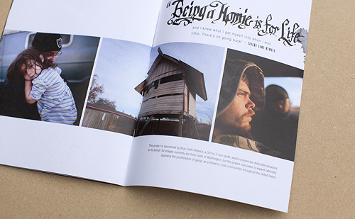
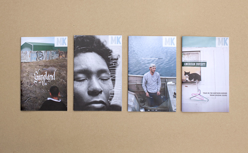
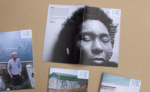
Mike Kane recently sent me four zines he self-published. They're really lovely. Small, well-designed and edited, with a clear point of view. I love that photographers are taking the time to craft something that can be handheld, and that leaves an impression among the chatter of our online lives. From the newspapers to the foldout posters to the zines, it shows that people care about making a lasting statement with their work.
I talked with Mike about the process of creating these zines:
What inspired you to make your series of zines?
I was gearing up for a trip to New York this spring, trying to figure out something interesting that I could leave with editors. Originally I thought I'd do a card or something. But then I started talking with Mary Virginia Smith, through my involvement with Blue Earth Alliance. She recently published a great book about self-publishing, and she told me about Allison V. Smith's zines. Allison hooked up with a designer and started doing these really cool iphone photo zines. Mary's book describes how they are collectables now. And that just totally appealed to me- try to make something that someone might actually want to keep around for a little while. Also the format suits the kind of shooting I do. I definitely like to present things as an essay or series- I've always had trouble selecting just one or two images for a card.
Were you involved in the pre-internet zine scene? I remember reading Maximum Rock n Roll when I was in high school and thinking that the there was this big world out there and all you had to do to connect with it was order some zines out of the back of MRR. Did the DIY ethos influenced your photography career?
Yeah I remember seeing some pretty intense zines come through Yellow Springs when I was in college. It was all a little above me but I totally understood the notion of just making the thing that you want to see. You can get so frustrated trying to communicate your vision, or express the potential you see in yourself - it feels so good to just say look, this is what I'm talking about! This is how it should look! I love that control. Blogging kind of has that same release, you can publish the stuff that gets passed over, show things the way you want to show them. Zines are kind of an extension, a print version of that maybe.
What was the biggest challenge in making these?
Time. You really can't sit down one afternoon and bang it out. At least I couldn't. I second guess everything. I come back a few days after doing something and just cringe. And once you involve a designer, and then a printer...it's a lot of back and forth. And everybody's busy. So I had to learn to give myself way more time than I would have expected.
Do you collect zines from other photographers or artists? Who?
Not really, but only because I don't personally know anyone else who's doing it. I wish there was some sort of zine swap I could go to. I'd love to trade and see what other folks are doing.
Who are you sending these zines to?
So far I've just left them with people that I've met personally. But this summer I'll probably send a small number around to people I missed in New York, or have had some kind of contact with. They are a little pricey and I don't want them to get tossed without opening.
How did you choose the four topics you did for the zines?
Well it was my newest, decent work basically. A few essays, and the portrait portfolio. Together they kind of represent everything I do for editorial and documentary work. One project is self-funded, one is all foundation commissions, and the other was done with grant money. Most of the portraits were editorial assignments. Who designed them? They look great!
Thanks. The design was definitely collaborative between myself and a great graphic designer I used to work with at the Seattle Post-Intelligencer, Andrew Saeger. He runs his own letter press and t-shirt company now, and I was able to barter some T-shirt fashion photography for help with the zines. I had the basic idea for lay out, and he worked the typography magic. He definitely took the project to a level that I could never have gotten it to on my own. Where'd you have them printed and how much did it cost?
I shopped around a little, tried MagCloud first, which was super inexpensive. But I didn't like the paper and they don't customize, so I ended up at AlphaGraphics in Seattle. The unit cost varies depending on how many I print, but at 30 it's $10 a pop, including proofs and set-up, etc. Not cheap but I really love the paper, and the images look right. Do you think this is something you will continue to do annually, or more often?
I'm definitely going to keep this up for awhile. Like I said it really suits the work that I'm producing right now, and until that changes, or until I find something that works better, I'll keep at it.

Any advice for someone thinking of self publishing something similar?
Give yourself plenty of time. It's amazing how long the process can be- photographers are perfectionists when it comes to their images. Getting the perfect proof can take some time. And you should find a printer you work well with, that's not going to give you a lot of guff when you keep asking for another proof because an image is too dark.
Even though a professional printer is used to tweaking files and matching colors, photographers working with their own images, on a project they're shelling out a fair amount of money on, are going to be insanely particular. If your printer doesn't understand that you might have problems.


